I stood in our inspection room three years ago staring at 600 women's blouses that were supposed to be dusty rose. They were salmon. Not a subtle salmon that a forgiving customer might accept. A bright, aggressive salmon that looked like it belonged on a fishing lure, not a boutique rack. The Pantone code on the tech pack was 15-1611 TCX. The dye house had matched to 15-1611 TPX, the paper version, not the textile version. The two versions of the same Pantone number are visually different because paper and fabric reflect light differently. The brand owner was flying in from London the next day for a shipment approval. I had to call her and explain that 600 units were wrong and we would eat the cost of the fabric, the sewing, and the lost time. The mistake cost us $8,400. It cost the brand a two-week delay. It cost me a night of sleep and a permanent obsession with color accuracy.
You guarantee manufactured apparel colors match the required Pantone codes exactly by building a color management system that controls every variable between the designer's specification and the finished garment. The system starts with specifying the correct Pantone system for textiles, not graphics. It continues through a lab dip approval process that evaluates fabric samples under standardized lighting against the physical Pantone reference. It requires spectrophotometer verification of color coordinates before bulk dyeing begins. It accounts for fabric composition because the same dye recipe produces different visual results on cotton, polyester, and nylon. And it includes a production shade band that defines the acceptable tolerance range, because zero deviation from a Pantone standard is physically impossible. The goal is not perfection. The goal is consistency within a tolerance that the human eye cannot detect and that a retail buyer will never question.
Color matching is not art. It is physics measured with instruments and managed with process. Every brand owner has a story about a color disaster. The navy that looked purple under store lighting. The cream that looked yellow next to a true white trim. The burgundy that was perfect on the lab dip and inexplicably brown on the bulk production. These disasters are not mysteries. They are failures in a specific link in the color management chain. Find the broken link, fix the process, and the disaster does not repeat. I want to share the system we built at Shanghai Fumao after that $8,400 salmon blouse disaster, a system that has produced exactly zero color rejections in the two years since we implemented it.
What Are the Critical Differences Between Pantone TCX and TPX Color References for Textile Production?
A brand owner sent me a tech pack last year with a color specification that read simply "Pantone 19-4052 Classic Blue." No suffix. No TCX or TPX designation. Just the number. I emailed her immediately: "Is this TCX or TPX?" She did not know the difference. She had picked the color from a Pantone website screenshot. This is how color disasters begin. Not with a bad dye house. Not with a lazy inspector. With a specification that is fundamentally ambiguous. Classic Blue exists in at least four Pantone systems: TCX for textiles, TPX for paper, the Formula Guide for graphic design, and the Plastics system. Each system uses different pigments, different substrates, and produces a slightly different visual result. A factory that receives "Pantone 19-4052" without a suffix has to guess which system the designer intended. The factory guesses wrong about 50% of the time.
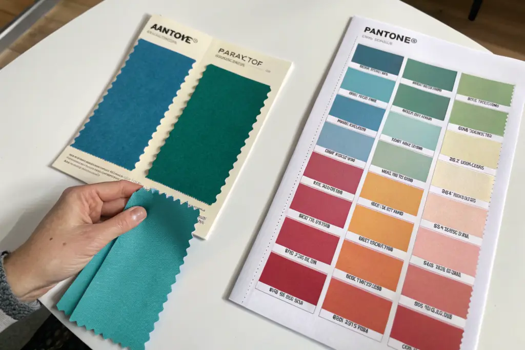
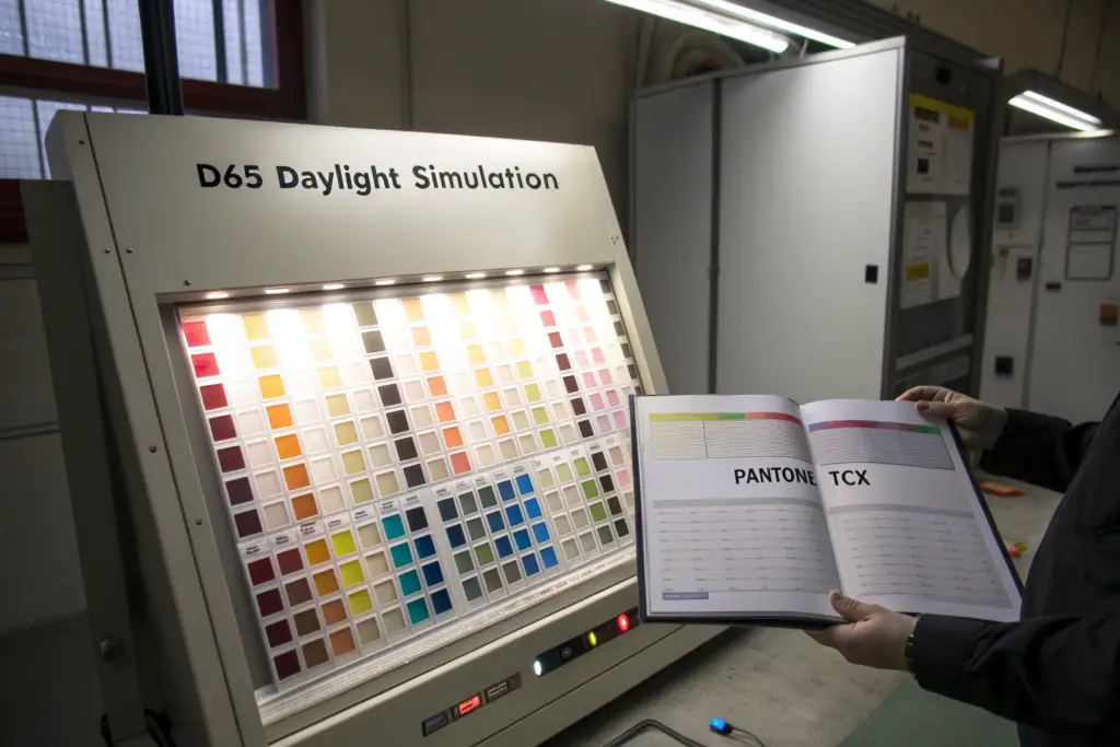
The critical difference between Pantone TCX and TPX is the substrate on which the color is printed. TCX swatches are dyed onto cotton fabric. TPX swatches are printed onto paper. The same Pantone number will appear different on fabric versus paper because fabric absorbs light differently than coated paper stock. For apparel production, the brand must specify TCX codes because TCX is the textile standard. The factory's dye house uses TCX references to formulate dye recipes. If a brand specifies a TPX code, the dye house must translate from a paper reference to a fabric reference, which introduces subjective judgment and error. The brand should own a current TCX swatch book and specify every color with the full code including the TCX suffix. Anything less is gambling with the color outcome.
The Pantone Fashion, Home + Interiors system includes both TCX and TPX versions of every color. The color numbers are identical. The suffix is the only difference. 19-4052 TCX and 19-4052 TPX are the same color formulated on different substrates. The visual difference is subtle under some lighting conditions and dramatic under others. A brand that specifies TPX for a textile product is asking the dye house to perform a cross-substrate color match, which is one of the hardest tasks in color science. The dye house will get close. They will not get exact. The resulting production will be "close enough" to the paper reference and potentially "not close enough" to what the designer envisioned.
Why Does the Same Pantone Number Produce Different Visual Results on Different Fabric Compositions?
A dye is a chemical that bonds to a fiber. Different fibers bond with dyes differently. A reactive dye that produces a perfect navy on 100% cotton will produce a pale, washed-out blue on 100% polyester because the dye chemistry does not bond to synthetic fibers. To achieve the same navy on polyester, the dye house must use a disperse dye with a completely different chemical formulation. The two dye recipes, the reactive recipe for cotton and the disperse recipe for polyester, can both be matched to Pantone 19-4023 TCX. They will look identical under daylight. Under store lighting, they may diverge slightly because different dye chemistries reflect light wavelengths differently. This phenomenon is called metamerism. A color pair that matches under one light source but not under another is a metameric pair. The only way to ensure consistency across fabric compositions is to evaluate lab dips under multiple light sources. The standard evaluation uses three: D65 daylight, TL84 store lighting, and incandescent home lighting. A lab dip that matches the Pantone reference under all three light sources is non-metameric and will look consistent regardless of where the customer views the garment. A spectrophotometer analysis quantifies this by measuring the reflectance curve of the sample. Two samples with identical reflectance curves will match under all light sources. Two samples with intersecting reflectance curves will match under some and not under others.
How Should a Brand Build and Maintain a Physical Pantone Reference Library for Production?
A digital Pantone reference is not a reference. It is a photograph of a reference. The colors on a computer screen are created by mixing red, green, and blue light. The colors in a Pantone book are created by pigments absorbing and reflecting light. The two color systems are fundamentally different. A color specified from a screen capture will never match a dyed fabric because the screen cannot accurately represent the reflectance properties of a physical textile. Every brand producing custom apparel should own a physical Pantone TCX swatch book. The current version is the FHIP210N series, which includes over 2,600 colors on cotton fabric swatches. The swatch book costs approximately $1,200 and should be replaced every 12 to 18 months because the fabric swatches fade with exposure to light and handling. A faded reference is worse than no reference because it leads the brand to approve lab dips that are too bright or too saturated. The physical Pantone reference management protocol should include storing the swatch book in a closed drawer away from direct light, handling swatches by the edges to avoid skin oil transfer, and replacing the book on a scheduled calendar cycle regardless of visible wear. The cost of replacement is trivial compared to the cost of a bulk production color rejection.
What Lab Dip Approval Process Ensures the Dye House Understands Your Color Standard Exactly?
A brand owner once emailed me a one-sentence lab dip approval: "Dip #3 looks good, proceed." That was the entire approval. No mention of the light source under which she evaluated it. No mention of whether she compared it to a physical Pantone reference. No mention of whether she evaluated it wet, dry, or both. The dye house proceeded with bulk production based on her approval. The bulk fabric arrived. Under the store lighting at the brand's retail partner, the color looked visibly different from the approved sample. The brand owner insisted the dye house had made an error. The dye house insisted they matched the approved lab dip exactly. Both were telling the truth. The lab dip had been approved under warm home lighting. The store used cool fluorescent lighting. The color was metameric and the approval process had failed to catch it. The brand owner ate the cost of the bulk fabric because the approval was her responsibility.
A rigorous lab dip approval process requires the brand to evaluate physical fabric samples under standardized D65 daylight in a lightbox, comparing the dip directly against the physical Pantone TCX reference. The evaluation must include a wet sample and a dry sample because wet fabric can appear significantly darker. The approval must be documented with the date, the light source used, the evaluator's name, and specific comments about any visual difference noted. A simple "approved" is not sufficient. The brand should request three lab dip submissions per color, each a slight variation of the dye recipe, and select the best match rather than accepting or rejecting a single submission. The three-dip option costs the dye house slightly more in sampling but dramatically increases the probability of achieving an acceptable match on the first bulk production.
The lab dip is the color contract between the brand and the factory. The approved lab dip becomes the reference standard against which bulk production is evaluated. If the lab dip is approved under incorrect conditions, the entire bulk production will be measured against an incorrect standard. The error compounds. The lab dip process is the highest-leverage moment in the entire color management chain. An extra hour of careful evaluation at the lab dip stage saves weeks of rework and thousands of dollars at the bulk production stage.
What Standardized Lighting Conditions Are Required for Professional Color Evaluation?
Human color perception is entirely dependent on the light source illuminating the object. A fabric that looks navy under daylight can look black under warm home lighting. A fabric that looks cream under daylight can look white under cool fluorescent lighting. Professional color evaluation removes this variability by using a standardized light source in a controlled viewing environment. The industry standard is a D65 lightbox that simulates natural daylight at a color temperature of 6500 Kelvin. The lightbox interior is painted Munsell N7 neutral gray to prevent colored reflections from contaminating the visual evaluation. The fabric samples are viewed at a 45-degree angle from a distance of approximately 30 centimeters. The surrounding room is dimly lit to prevent ambient light from influencing the perception. The evaluator should wear neutral-colored clothing, ideally gray or black, because a bright red shirt will reflect red light onto the sample and skew the perception. Professional color evaluators also take periodic breaks because the human eye fatigues after approximately five minutes of intense color comparison. A fatigued eye loses the ability to discriminate subtle shade differences. The evaluation process should include checking the match under D65 daylight first, then under TL84 store lighting, then under incandescent home lighting. A sample that passes under all three is approved. A sample that passes under daylight but fails under store lighting is rejected as metameric.
How Should a Brand Document and Communicate Lab Dip Approvals to Prevent Production Drift?
Verbal approvals cause disputes. Written approvals prevent them. The lab dip approval documentation should include the brand's name, the style number, the Pantone code, the lab dip submission number, the date of evaluation, the light sources used, the evaluator's name, and a specific approval statement with any conditions noted. An example: "Lab dip #2 for Pantone 15-1611 TCX approved for bulk production. Evaluated under D65, TL84, and Incandescent. Matches Pantone reference under all three light sources. Slightly lighter than reference when wet; acceptable when dry. Approved by Sarah Chen on March 15, 2025." This documentation travels with the production order. The dye house uses the approved lab dip as the target for bulk dyeing. The factory's quality control team uses the approved lab dip as the reference for incoming fabric inspection. If a dispute arises later, the documentation provides a clear record of what was approved and under what conditions. The lab dip approval documentation system eliminates the "he said, she said" arguments that plague color dispute resolution. The physical approved lab dip sample is stored in a sealed, light-protective sleeve and retained until the bulk production is shipped and accepted by the brand.
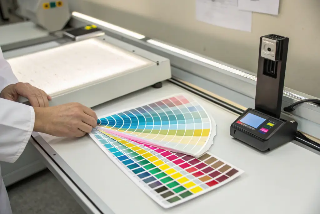
How Do Spectrophotometers and Digital Color Readings Remove Subjectivity from Color Approval?
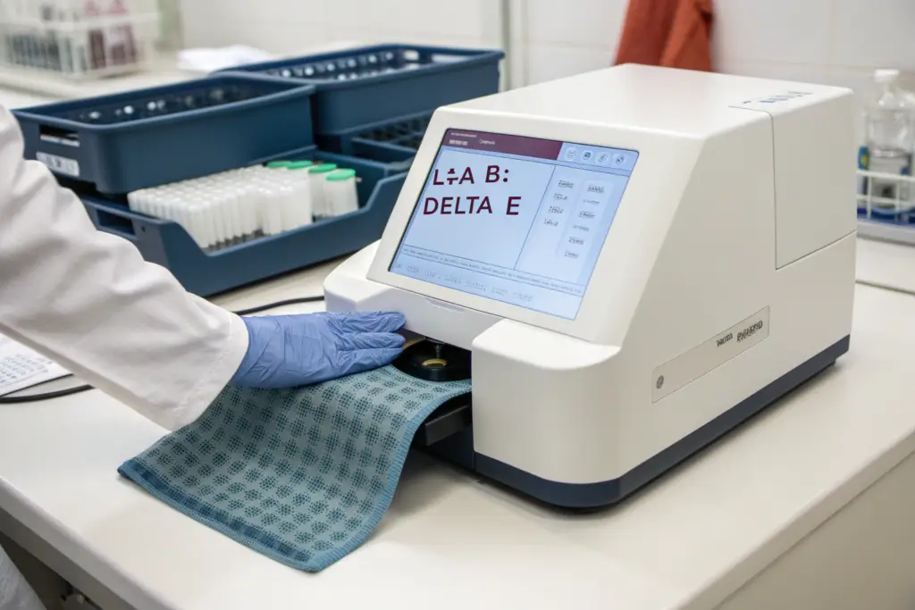
Two people can look at the same fabric and disagree about whether it matches the reference. This is not incompetence. It is human biology. Color perception varies between individuals based on age, gender, eye health, and even mood. A 55-year-old evaluator and a 25-year-old evaluator will perceive the same blue slightly differently because the lens of the human eye yellows with age, filtering out blue wavelengths. A tired evaluator will perceive colors differently than a fresh evaluator. Two evaluators with normal color vision can both be honest, both be professional, and still disagree about whether a fabric matches the standard. The solution is to remove the human eye from the pass-fail decision entirely and replace it with an instrument that measures color as physical data.
Spectrophotometers remove subjectivity from color approval by measuring the precise light reflectance of a fabric sample across the visible spectrum and outputting standardized color coordinates in the CIELAB color space. The instrument provides an L value for lightness, an a value for red-green position, and a b* value for yellow-blue position. It calculates the Delta E value, which is the mathematical distance between the sample color and the reference color in three-dimensional color space. A Delta E of less than 1.0 is imperceptible to the human eye. A Delta E between 1.0 and 2.0 is perceptible only under close examination. A Delta E above 2.0 is visibly different. The brand and factory agree on a maximum acceptable Delta E tolerance before production begins. The instrument makes the pass-fail decision. The human evaluator's opinion becomes secondary to the numerical data.
Spectrophotometers have been standard equipment in paint, plastics, and automotive manufacturing for decades. The apparel industry has been slower to adopt them because fabric is a more challenging substrate to measure. Fabric has texture, pile direction, and transparency that affect the reflectance reading. Modern spectrophotometers with larger measurement apertures and multiple reading angles have solved these challenges. The spectrophotometer color measurement process for textiles is now reliable, repeatable, and accessible to factories and brands of all sizes.
What Is the Acceptable Delta E Tolerance Range for Premium Apparel Production?
Delta E is the unit of color difference in the CIELAB color space. A Delta E of zero means the sample is mathematically identical to the reference. A Delta E of 1.0 means the difference is just barely perceptible to a trained observer under ideal viewing conditions. A Delta E of 2.0 means the difference is visible to an untrained observer. The acceptable Delta E tolerance depends on the brand's quality positioning and the specific color. For premium apparel, the standard tolerance is a Delta E of 1.5 or less for the lab dip stage and 2.0 or less for bulk production. Neutrals, grays, and beiges require tighter tolerances because the human eye is more sensitive to color differences in these ranges. A Delta E of 1.0 in a gray fabric is visibly obvious. The same Delta E in a bright red is barely noticeable. For critical neutral colors, the tolerance should tighten to 1.0. For dark colors like navy and black, the tolerance can relax slightly to 2.5 because the human eye discriminates dark colors less precisely. The Delta E tolerance specification should be written into the production agreement between the brand and the factory. The factory's quality control team measures every incoming fabric lot against the approved lab dip and rejects any lot that exceeds the agreed Delta E. This is an objective, instrument-based decision. There is no argument. There is no opinion. The number passes or the number fails.
How Should a Factory Integrate Spectrophotometer Readings into Incoming Fabric Inspection?
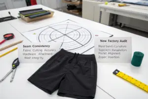
The incoming fabric inspection is the last opportunity to catch a color error before the fabric is cut. Once the fabric is cut, the cost of rejection multiplies by five to ten times. The spectrophotometer integration into incoming inspection follows a standard operating procedure. When a fabric roll arrives at the factory, the QC inspector cuts a swatch from the beginning, middle, and end of the roll. Each swatch is measured against the approved lab dip reference stored in the spectrophotometer's database. The instrument calculates the Delta E for each swatch. If all three swatches are within the agreed tolerance, the roll is accepted. If any swatch exceeds the tolerance, the inspector cuts three additional swatches from different points on the roll. If the additional swatches confirm the out-of-tolerance reading, the roll is quarantined for review. The review includes a visual evaluation under the D65 lightbox to confirm the instrument reading and a consultation with the brand if the deviation is borderline. The fabric inspection protocol with spectrophotometer also includes shade banding, where fabric rolls from the same dye lot are grouped together and rolls from different dye lots are separated. Even rolls that individually pass the Delta E check may show visual differences when cut parts from different lots are sewn together in a single garment. The lot separation prevents this by ensuring that each garment is cut from a single dye lot.
What Production Shade Band System Prevents Unacceptable Color Drift Across Bulk Orders?
A brand owner once received a bulk shipment of 1,200 cotton T-shirts in what was supposed to be olive green. The shirts were olive green. Every single one of them. The problem was that they were not all the same olive green. The production had been cut across three fabric dye lots. Lot A was slightly lighter. Lot B was slightly darker. Lot C was slightly yellower. Individually, each lot was within tolerance. When the shirts were unpacked and hung on a retail rack together, the shade variation between lots was visible and unacceptable. The brand had to sort the 1,200 shirts by dye lot, package them with lot-specific labels, and communicate to the retail buyers that the color might vary slightly between shipments. The administrative cost was $2,100. The brand credibility cost was higher.
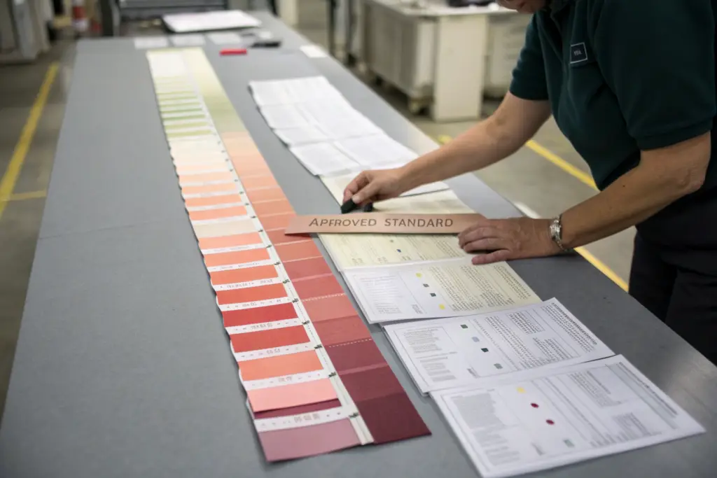
A production shade band system prevents unacceptable color drift across bulk orders by defining the acceptable lightness and tone variation around the approved standard before bulk production begins. The dye house produces a shade band of typically five to seven fabric swatches: the center swatch is the approved lab dip, two swatches are progressively lighter, two are progressively darker, and one or two show acceptable tone variation. The brand approves the entire shade band, not just the center. Bulk production dye lots that fall within the approved shade band are accepted. Dye lots that fall outside are rejected. The shade band system acknowledges the physical reality that textile dyeing is a batch process with inherent variation and manages that variation within controlled, pre-approved boundaries rather than pretending it does not exist.
The shade band is the contract between the brand's expectations and the dye house's capabilities. A brand that demands zero variation is demanding something that is physically impossible in textile dyeing. The dye house will promise zero variation and then deliver what they can actually achieve, which will be some variation. Without an agreed shade band, the brand will be disappointed and the dye house will be defensive. With an agreed shade band, both parties know exactly what acceptable looks like.
How Is a Shade Band Created and Approved Before Bulk Dyeing Commences?
The shade band creation process begins after the lab dip is approved. The dye house uses the approved dye recipe to produce a series of intentional shade variations. They adjust the dye concentration slightly to produce swatches at 90%, 95%, 100%, 105%, and 110% of the standard recipe depth. The 100% swatch is the approved lab dip standard. The lighter and darker swatches define the acceptable lightness range. The dye house may also produce swatches with slight tone adjustments if the standard is particularly sensitive to tone drift. The complete set of swatches is mounted on a shade band card and sent to the brand for approval. The brand evaluates the shade band under the same standardized lighting conditions used for the lab dip approval. The brand approves the band by signing the card and returning it to the factory. The approved shade band becomes the reference for bulk production quality control. Every bulk dye lot is compared against the shade band. Lots that fall within the band are accepted. Lots that are lighter than the lightest approved swatch or darker than the darkest approved swatch are rejected and re-dyed. The shade band approval process typically adds three to five days to the pre-production timeline. The time invested prevents weeks of dispute and rework after bulk production.
What Lot Separation and Tracking Procedures Prevent Shade Mismatch Within a Single Style?
Shade variation between dye lots is manageable if the lots are kept separate and tracked through the production process. The problem occurs when cut parts from different dye lots are mixed in the sewing line, creating a single garment with a sleeve from Lot A and a body from Lot B. The shade difference between the sleeve and the body is immediately visible and unacceptable. The prevention system is lot separation and tracking. Each fabric roll is labeled with a dye lot number at the dye house. The fabric warehouse stores rolls grouped by dye lot. The cutting room cuts one dye lot at a time, keeping the cut parts bundled with the lot number. The sewing line receives cut parts from a single dye lot for each production batch. The finishing and packing departments maintain the lot separation through to the carton level. The cartons are labeled with the dye lot number. The brand's warehouse receives the goods with the lot information and can fulfill wholesale orders from a single dye lot to ensure color consistency within each retail shipment. The dye lot tracking system requires discipline at every stage of production. One broken link in the chain, one mixed bundle on the cutting table, one carton packed with pieces from two lots, and the shade variation becomes visible to the customer. The discipline is enforced by lot verification checks at each handoff point.
Conclusion
Color accuracy in apparel manufacturing is not achieved by hoping the dye house gets it right. It is achieved by controlling every variable in the chain from the designer's Pantone book to the finished garment. The correct Pantone system must be specified. The lab dip must be evaluated under standardized lighting against a physical reference. The spectrophotometer must verify the color coordinates numerically. The shade band must define the acceptable variation range before bulk production begins. The dye lots must be tracked and separated through every stage of production. Each of these steps is individually important. Together, they form a system where color errors become extremely unlikely.
The $8,400 salmon blouse disaster I experienced three years ago was not caused by a single failure. It was caused by a cascade of failures. The brand specified TPX instead of TCX. The lab dip was approved under home lighting. No spectrophotometer reading was taken. No shade band was established. The system had no defenses. Today, that cascade cannot happen at Shanghai Fumao because we have built the defenses at every step. We require TCX specifications for every color. We provide standardized lightbox evaluation for every lab dip. We take spectrophotometer readings of every incoming fabric lot and compare them against the approved lab dip. We create shade bands for every color before bulk dyeing. We track dye lots from fabric receipt through finished carton packing.
If your brand has experienced a color disaster, or if you want to prevent one from happening on your next production order, we can demonstrate our color management system to you. At Shanghai Fumao, we will walk you through our lab dip process, our spectrophotometer measurement protocol, and our shade band system. We can show you the physical documentation from a recent production order so you can see exactly how we control color from specification to shipment. Contact our Business Director, Elaine, at elaine@fumaoclothing.com. She can arrange a video tour of our quality control laboratory and share our color tolerance specification document. Your brand's colors are your visual identity. Protect them with a system, not a hope.