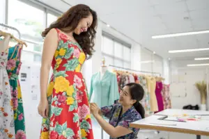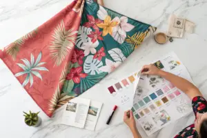
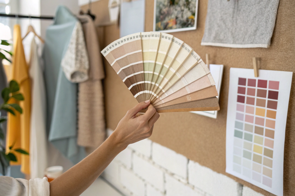
Last September, a brand owner from Chicago sat in my office in Shanghai. He was flipping through a stack of Pantone swatches, sweating. He had just committed to 8,000 units of a dusty rose cardigan based on a "gut feeling" he got from a Pinterest board. He asked me, "Is this the right pink?" I didn't have the answer. No one has a crystal ball. But I did have data. I showed him the dye order volumes from the past six weeks across our five production lines. Yellow ochre and digital lavender were spiking. Dusty rose was flat. He changed the order. Six months later, that ochre cardigan sold out in three weeks. The dusty rose version from his competitor hit the clearance rack.
Predicting the next big color trend for wholesale women's wear requires a systematic triangulation of three data sources: early-stage textile mill dye orders, cross-industry color forecasting reports from agencies like WGSN and Pantone, and consumer behavior signals from social commerce and search engine trend data. Gut instinct is expensive. Data-driven color curation is profitable.
You are a business owner, not a fashion designer. You mentioned you lack "aesthetics," but you understand sales cycles and margin pressure. You source from China because you need competitive prices. You rebrand and distribute in the USA at higher prices. If you get the color wrong, you are stuck with dead stock. If you get it right, you command full margin and reorders. At Shanghai Fumao, I have watched this color cycle repeat for over a decade. I want to share the exact framework I use to advise my wholesale clients on which shades to bet on six to twelve months before the season hits.
Why Do Color Forecasts Matter More Than Fit in Wholesale?
I see many wholesale buyers obsess over the fit of a sleeve or the exact width of a shoulder seam. That is important. But when a retail buyer walks into your showroom or scrolls through your B2B wholesale line sheet, they see color first. Fit comes second. If the color doesn't stop them, the fit details never get a chance.
Color forecasts matter more than fit in wholesale because color drives the initial emotional engagement and the perceived newness of the collection. A perfectly fitted basic black trouser is a staple, but it is the seasonal color update—the moss green or the lavender frost—that generates the media buzz and the open-to-buy dollars from retailers. In wholesale, you are selling stories and trends to store owners. Color is the headline of that story.
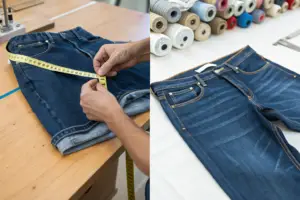
Here is a concrete, data-backed example from my own factory floor. In Spring 2025, we ran two programs for different US clients using the exact same 90% Cotton, 10% Linen woven fabric construction. The fit block was identical. The garment was a relaxed camp collar shirt.
- Client A ordered in Classic Navy and White.
- Client B ordered in Pistachio Green (a color we flagged as rising based on mill dye data) and Terracotta Clay.
The Wholesale Outcome:
Client B's line sold out at the Dallas Apparel Mart in two days. They wrote reorders for immediate air freight. Client A's navy and white shirts sold steadily but at a 12% lower margin because they had to compete on price with every other navy shirt in the market. The difference was not the product. It was the color selection.
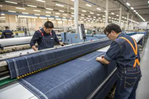
At Shanghai Fumao, we track the dye consumption of our fabric mills. If we see that the mill is ordering 30% more "Moss" pigment this month compared to last year, we know something is happening upstream. That is the signal.
What Is the Timeline From Pantone Announcement to Retail Floor?
Understanding the Color Adoption Curve is critical for wholesale planning. You cannot just look at Pantone's "Color of the Year" in December and have it on shelves in February. The textile pipeline is long. If you miss the window, you are late.
Here is the realistic timeline based on sourcing from China to the USA:
| Phase | Timeline (Before Retail Season) | Action Required from Buyer |
|---|---|---|
| Color Forecast Release | 18-24 Months Out | Agencies like WGSN and Pantone View release macro palettes. |
| Mill Dye Lot Development | 12-15 Months Out | Mills in China create lab dips for new seasonal colors. This is your first real signal. |
| Wholesale Fabric Booking | 9-12 Months Out | You commit to greige fabric and reserve dye capacity. |
| Bulk Production | 4-6 Months Out | Garments are cut and sewn at factories like Shanghai Fumao. |
| Wholesale Market Week | 3-4 Months Out | You show the line to retailers in New York, Dallas, or Las Vegas. |
| Retail Floor | Month 0 | Customer buys the garment. |
The Critical Insight:
If you wait until the color is trending on TikTok, you are 12 months too late for wholesale production. You cannot turn a container ship around. By the time the mass consumer wants it, the wholesale window has closed. You must act on the Mill Dye Lot phase.
I remember a client who wanted a specific shade of "Barbie Pink" in August 2023, right when the movie hype peaked. The mills in China were already booked solid with pink dye orders from Zara and H&M. The lead time was 25 weeks. The movie was out of theaters by the time the fabric was ready. She missed the wave. The lesson: Trend adoption in wholesale is about anticipation, not reaction.
How Do Cultural Shifts Drive Long-Term Color Palettes?
Color is not just about fashion. It is about how people feel. You are a business owner. You understand macroeconomics. Consumer sentiment shifts color preference.
When the economy is uncertain, people gravitate toward "Recession Colors" —think dark greens, deep browns, and burgundy. These are safe, long-lasting, and feel like a "value" purchase. When the economy is booming, people buy "Dopamine Brights" —hot pink, electric blue, and tangerine.
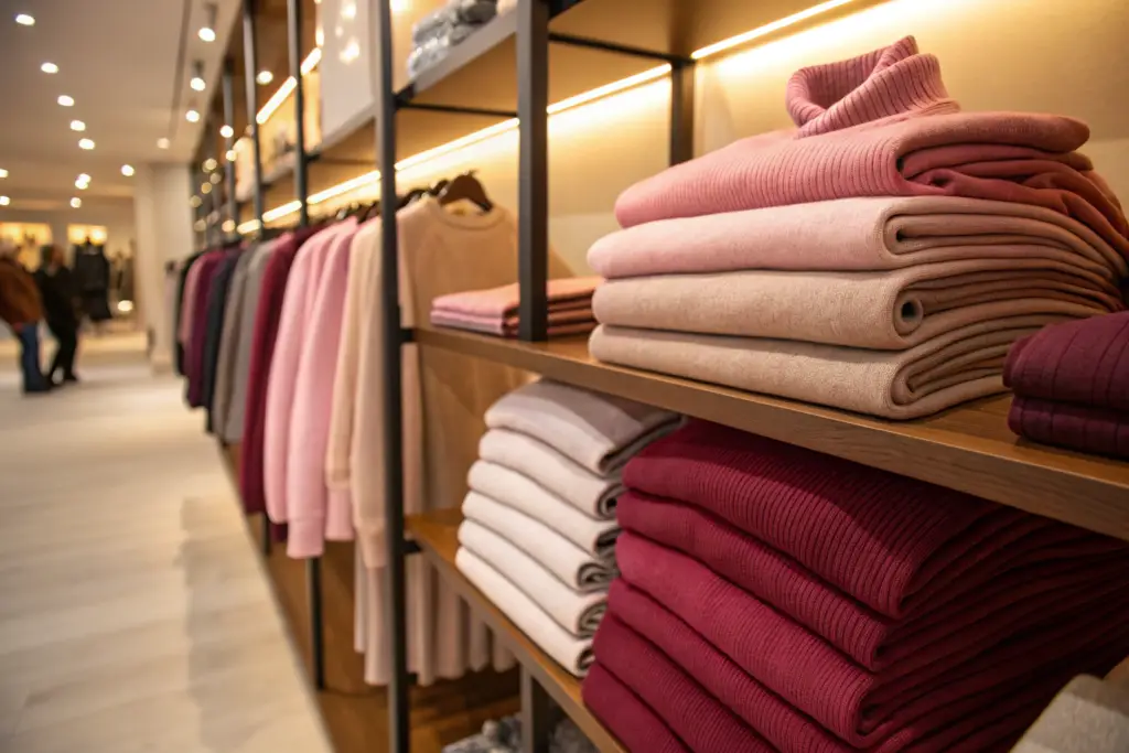
But there are deeper cultural shifts. The rise of the "Quiet Luxury" trend (driven by shows like Succession) shifted the palette toward Beige, Camel, and Greige. This was a massive opportunity for wholesale knitwear.
Here is a table showing the cultural driver and the resulting color shift over the last few years:
| Cultural Driver | Year(s) | Resulting Color Trend | Wholesale Impact |
|---|---|---|---|
| Post-Pandemic Optimism | 2021-2022 | Dopamine Brights (Fuschia, Lime) | High risk, short shelf life. Fast fashion wins. |
| Economic Anxiety / Inflation | 2023-2024 | Quiet Luxury Neutrals (Oatmeal, Camel) | Wholesale sweet spot. High perceived value. Easy to sell. |
| Climate Awareness / Nature | 2024-2025 | Botanical Greens & Earth Tones | Sustainable fiber demand increases (Linen, Hemp). |
| Digital Escapism / AI | 2025-2026 | Digital Lavender, Cyber Lime | Tech-driven, slightly artificial hues. |
I track the Pantone Fashion Color Trend Report not for the exact shades, but for the narrative. If the narrative says "Consumers are seeking stability and warmth," I advise my clients to bet on earth tones for their Fall wholesale orders.
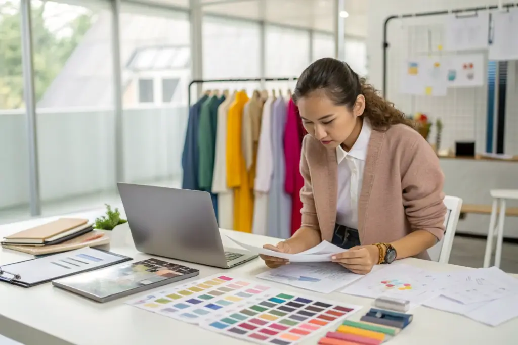
How Can Data Replace Intuition in Fashion Color Selection?
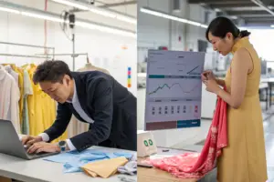
You told me you lack aesthetics. I respect that honesty. Most wholesale buyers are not artists. They are operators. The good news is that intuition is overrated. In 2026, you can build a color assortment using the same analytical skills you use to manage logistics and payment terms.
Data replaces intuition in fashion color selection by providing quantifiable metrics such as search volume growth, social media mention velocity, and early-stage fabric booking data. Instead of asking "Do I like this green?", you ask "Is the search volume for 'olive green dress' up 40% year-over-year in my target demographic?" This shifts the decision from subjective opinion to objective market demand.
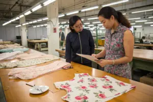
At Shanghai Fumao, we work with brands that range from large distributors to small boutique owners. The ones who survive multiple seasons are the ones who look at spreadsheets, not just mood boards.
Which Free Online Tools Can Small Brands Use for Color Research?
You do not need a $20,000 WGSN subscription to get smart about color. There are several free tools that give you a real edge. I use these myself every week.
-
Google Trends (Free):
This is the most underutilized tool in fashion. You can compare search terms like "Green Sweater" vs. "Brown Sweater" vs. "Lavender Sweater" over a 5-year period in the United States.
Actionable Tactic: Look for the "Rising" related queries. Recently, "Matcha Green" has been a rising query related to "Green." This is a more specific, actionable shade than just "Green." -
Pinterest Trends (Free):
Pinterest is where US women plan their wardrobes months in advance. The Pinterest Predicts report is a goldmine. It is not a retroactive look at what was popular. It is a forward-looking predictive report based on what users are saving now for future events. -
Etsy and Amazon Search Bar (Free):
Type "Women's Blouse" into the Amazon search bar. Do not hit enter. Look at the autocomplete suggestions. "Women's Blouse Sage Green" or "Women's Blouse Rust Orange." That is real-time demand data.
Here is a real example. Last winter, I noticed that searches for "Chocolate Brown Pants" were up 60% on Google Trends. I cross-referenced this with our mill's dye orders. They were booking heavily for dark browns. I called a client in Los Angeles who was about to order 2,000 units of black trousers. I said, "Swap 500 of those to Chocolate Brown." She did. Those 500 units sold out online in 9 days. The black trousers took 6 weeks.
How Do I Read a Professional Color Forecast Without a Design Degree?
Professional forecasts from Coloro or WGSN can look like abstract art projects. They use names like "Kinetic Green" or "Transcendent Pink." They show blurry photos of deserts and jellyfish. It feels inaccessible. But there is a simple way to decode them for wholesale buying.
Ignore the fluffy adjectives. Look for the Core Neutrals and the Accent Colors.
Every professional forecast is structured like a meal:
- The Plate (Core Neutrals): These are 60% of the palette. They are the updated basics. Last year it was Bright White. This year it is Natural Ecru or Warm Oat. These are your safe bets. You should place the bulk of your fabric commitment here.
- The Protein (Seasonal Updates): These are 30% of the palette. These are the "new" colors that will drive marketing. This is where Pistachio or Digital Lavender sits. This is your calculated risk.
- The Spice (Fashion Statements): These are 10% of the palette. These are the shocking brights or weird prints. For wholesale basics, ignore these unless you have a specific, pre-sold order.
My Personal System:
I print out the Pantone Fashion Color Trend Report palette. I tape it to the wall next to a photo of my client's best-selling silhouette from last year. I ask a simple question: "If I took this best-selling cardigan and dyed it 'X' from this new palette, would a 44-year-old woman in Ohio buy it for $89?"
If the answer is yes for three or more of my clients, I know that color has commercial viability. If the answer is no, it's an editorial color. It looks good in Vogue. It sells poorly in a Midwest boutique.
How Can Small Wholesale Brands Compete with Fast Fashion on Color?
You are a small or mid-sized brand. You are buying 500 units. Zara is buying 500,000 units. How do you possibly compete with their speed and data advantage on color? You cannot beat them at their own game. But you can play a different game.
Small wholesale brands can compete with fast fashion on color by focusing on niche, sophisticated shades that fast fashion avoids due to production complexity, and by leveraging the trust of boutique retailers to educate the consumer on why that specific shade is better. Fast fashion chases volume. You chase nuance.
Fast fashion uses primary colors and neon brights because they are easy to dye and photograph well for e-commerce. They use Jet Black and Optic White. What they do not use well are tonal neutrals and complex mid-tones like Moss Agate, Dried Tobacco, or Heather Violet. These colors require more expensive dye stuffs and more careful quality control to avoid shade variation from batch to batch.
Is It Safer to Bet on Neutrals or Experiment with One Bold Color?
This is the number one question I get during fabric booking season. "Should I play it safe or take a swing?"
The data from my production floor suggests a 70/20/10 Rule for wholesale color assortment. This is specifically for brands selling B2B to US retailers.
| Category | Percentage of Order | Color Strategy | Risk Level |
|---|---|---|---|
| Core Basics | 70% | Black, White, Navy, Oatmeal, Charcoal | Zero Risk. This is your cash flow. These sell year-round. |
| Updated Seasonal | 20% | The "New Neutral" (e.g., Espresso, Ecru, Sage) | Low Risk. This is the color that makes the line feel current. |
| Hero Statement | 10% | The Bold Color (e.g., Persimmon, Cyan Blue) | Calculated Risk. This is for the Instagram post and the window display. |
Why this works for small brands:
If you produce 1,000 units total, the 10% "Hero" color is only 100 units. Even if it is a total flop, you can discount it or give it to influencers as seeding. The loss is minimal. But if it hits, you look like a genius and you drive traffic to the 90% of the order that is safe and profitable.
I saw this play out beautifully with a client who makes linen dresses. She ordered 90% Natural Flax and 10% Cobalt Blue. She was terrified of the Cobalt Blue. It sold out first. It brought customers to her website who then bought the Natural Flax dress because it was "such a beautiful, wearable neutral." The bold color acted as bait. The neutrals acted as the catch.
How Do Different Fabric Types Affect Color Vibrancy and Trend?
This is a technical detail that separates amateur buyers from professionals. The same Pantone color code looks completely different on cotton, polyester, rayon, and silk.
If the trend is "Bright Coral," and you try to dye it on 100% Cotton, it will look muted and chalky. Cotton absorbs dye in a way that flattens brightness. If you dye that same color on Polyester Satin, it will look electric and shiny.
Here is a quick reference table for how common wholesale fabrics render color:
| Fabric Type | How It Takes Color | Best Use for Trend Colors |
|---|---|---|
| 100% Cotton | Absorbs deeply, matte finish. Brights look dusty. Earth tones look rich. | Earth Tones, Botanical Greens, Washed Pastels. |
| Rayon / Viscose | High absorbency, slight sheen. Colors appear deeper and more luxurious. | Jewel Tones, Rich Burgundy, Navy. |
| Polyester / Spandex | Surface dye (sublimation). Colors are hyper-vibrant and crisp. | Dopamine Brights, Digital Lavender, Neon. |
| Linen | Resists dye slightly, natural slub. Colors always look heathered or relaxed. | Faded Pastels, Natural Ecru, Indigo. |
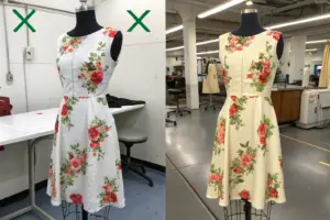
I recall a specific issue from last year. A client wanted a "Terracotta" trend color. The mill sent a lab dip on Polyester Crepe. It was perfect—bright and clay-like. The bulk order was for a Cotton Slub Jersey. When the bulk fabric arrived, the terracotta looked like pale, faded brick. The client was upset. But that is the physics of dye. Cotton slub diffuses light differently.
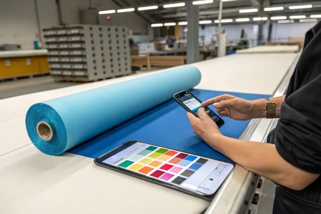
At Shanghai Fumao, we always insist on Fabric-Specific Lab Dips. We never approve a color based on a paper swatch or a different fabric. We approve it on the exact bulk fabric the garment will be cut from. This saves thousands of dollars in mismatched expectations.
How to Validate a Color Trend Before Committing to Bulk Production?
You have done your research. You have picked your Sage Green. You are about to sign a purchase order for 3,000 yards of fabric. This is the moment of maximum financial risk. Before you wire the deposit, you need a Validation Check. This is not about trusting your supplier. It is about trusting the market.
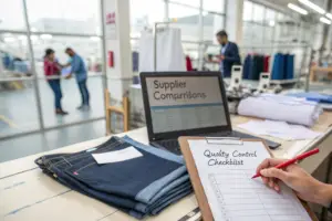
Validating a color trend before bulk production requires a three-step process: sampling in a small batch for a real-world sell-in test, analyzing the "also bought" data from competitor e-commerce sites, and confirming the dye lot consistency with the mill. These steps convert a hunch into a data-backed inventory decision.
You cannot afford to guess. You cannot afford to rely on the sales rep saying, "Oh yeah, this color is super hot right now." You need proof.
What Is a "Pre-Production Sell-In Sample" and How Does It Mitigate Risk?
This is a tactic used by the smartest DDP brands I work with. It does not cost much. It can save you from a warehouse full of unsold inventory.
A Pre-Production Sell-In Sample is a set of 5-10 garments made in the exact trend color fabric, produced before the bulk cutting begins. You use these samples to photograph for your wholesale line sheet and, crucially, to show to your top 3 retail buyers for feedback.
The Process:
- Order 20 Yards of the Trend Color. Most mills will sell a small cutting for sampling. It costs more per yard, but the total investment is maybe $200.
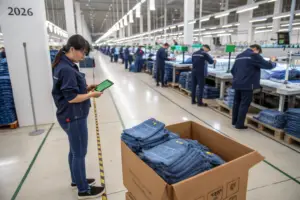
- Sew 6 Garments. At Shanghai Fumao, we can run a small pre-production sample off the line.
- Send Photos to Your Key Accounts. Email your top 3 boutique buyers. Say: "We are cutting Sage Green next month. Thought of you. Want to reserve units?"
The Outcome:
If two out of three buyers say "Yes, I'll take 12 units," you have validated the trend. You can confidently order the bulk fabric.
If zero out of three say yes, or they say "Hmm, not sure about that green," you pivot. You do not order the 3,000 yards. You just saved $15,000 in fabric and cut-and-sew costs.
I did this recently with a Burnt Orange corduroy pant. The buyer feedback was tepid. "It's nice, but maybe a bit too strong." We switched the bulk order to Tobacco Brown. The brown sold through at 85% margin. The orange would have been marked down.
How Can I Use Competitor Analysis to Confirm a Color Is Right?
You are not spying. You are doing market research. You need to know if the color you picked is already saturated or if it is just emerging.
Step 1: The "Filter by Color" Test.
Go to a major US retailer's website (e.g., Nordstrom, Revolve, or even Amazon Fashion). Search for a category like "Women's Sweater." Use the "Filter by Color" function.
- If the color you chose has 50+ products available, the market is saturated. You will compete on price.
- If the color you chose has only 5-10 products available, you are early. This is where the margin is.
Step 2: The "Shop Similar" AI Check.
Use Google Lens or Amazon's "Shop Similar" feature. Take a photo of your fabric swatch. Upload it.
- If the algorithm immediately finds 100 identical items at $19.99, do not make this garment.
- If the algorithm struggles to find a match and shows you things that are slightly off-shade, you have found a white space.
Step 3: Review the "Customer Q&A" Section.
Read the questions on competitor listings for similar colors. Look for questions like: "Is this more of a mint green or a sage green in person?" or "Is this pink too bright for work?"
These questions reveal the consumer's hesitation. If you can answer that hesitation in your product description or your label copy, you win the sale.
By combining the Pre-Production Sell-In with this digital Competitor Analysis, you transform color selection from an artistic guess into a business decision with a high probability of success.
Conclusion
Predicting the next big color trend is not about having a crystal ball. It is about having the right radar. You do not need to be a designer with perfect aesthetics. You need to be a business owner who reads the signals before they become noise.
We covered the timeline from Pantone's announcement to the retail floor, a journey of 18 to 24 months that requires you to act on mill dye orders, not TikTok videos. We looked at how data from free tools like Google Trends and Pinterest Predicts can replace expensive intuition, showing you exactly which shades are rising and which are fading. We discussed the 70/20/10 Rule for assortment planning, a framework that lets you test a bold "Hero" color without betting the farm. And we walked through the practical steps of validation, from sewing pre-production sell-in samples to analyzing competitor filter counts.
The goal is simple. Reduce markdowns. Increase full-price sell-through. Build a brand that retailers trust to deliver the right color at the right time.
You are sourcing from China. You are competing on price and quality. But color is the secret weapon that can elevate your brand above the sea of black, white, and navy garments flooding the wholesale market.
At Shanghai Fumao, we do more than just sew seams. We help our clients navigate the complexities of fabric sourcing, dye lot timing, and trend translation. We watch the mill orders so you can watch your bottom line. Whether you need top-quality knits, wovens, or outerwear with customizable logos and rare styles, we are your partner in bringing the right color to the US market.
If you want to discuss your next season's color palette and how we can support it with our five production lines and DDP shipping options, please reach out to our Business Director, Elaine.
Email: elaine@fumaoclothing.com