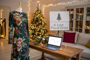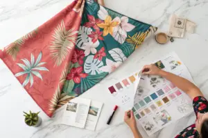
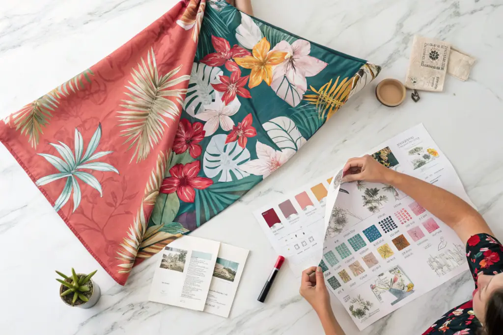
You are staring at two floral print options for your next collection. One is a bold, oversized tropical print in neon coral and electric blue. The other is a muted, vintage-inspired ditsy floral in dusty rose and sage green. Your gut says the bold print is the statement piece. Your logic says the muted print is the safe, wearable choice. Your entire season's cash flow depends on this decision. A wrong bet means a warehouse full of dead stock, deep markdowns, and a strained relationship with your retail buyers. I have sat in countless design meetings with U.S. brand owners paralyzed by this exact moment. The floral print is the single highest-risk, highest-reward element in a dress collection. It can be a viral sell-out that defines your brand's season, or it can be a quiet, expensive disaster that no one wants.
Predicting a fast-selling floral print is not about guessing the next trend; it is a systematic, data-driven process of analyzing three converging signals: the print's objective visual architecture and its proven historical sell-through rates, the specific customer psychographic and search-intent data for the target modest or mainstream market, and the print's technical compatibility with the intended fabric base and garment silhouette, a combination that transforms an artistic guess into a commercially forecastable outcome.
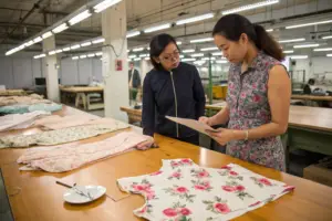
This predictive ability is what separates a consistently profitable brand from one that lurches from one season's lucky hit to the next season's write-off. Over my years running Shanghai Fumao's production floor and working directly with brand owners on their pre-season fabric sourcing, I have learned that a sell-out floral print is not a mysterious work of artistic genius. It's a product of observable, repeatable commercial rules. The print must do a specific job on the body. It must photograph well on a smartphone screen. It must answer a specific, searchable need in the customer's mind. And it must be technically reproducible at a quality level that matches the customer's expectation when she pulls the dress out of the shipping box. When a brand brings me a print and asks, "Will this sell?" I don't give them an opinion. I walk them through a series of tests, starting with the print's own structural DNA and ending with a hard look at the e-commerce search data.
The Visual Architecture of a Commercially Viral Floral Print
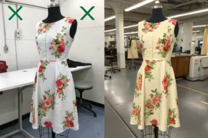
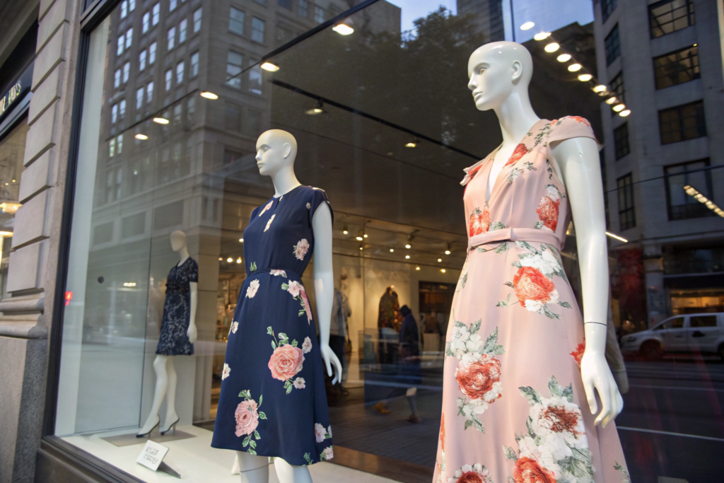
A floral print that sells out is not just a collection of pretty flowers. It has a specific, analyzable visual architecture that triggers a consistent, positive psychological response in the target customer. This architecture is governed by scale, color contrast, and motif density. I remember a project with a brand that had a 60% sell-through rate on their floral category, a number that was slowly choking their business. We analyzed their best-selling print from two years prior and their worst-selling print from last season, laying both fabric swatches side-by-side on our light table. The difference was stark and immediately measurable. The winner was a medium-scale floral with a dark navy background, crisp, well-defined petal edges, and a clear 15% spacing between each motif cluster. The loser was a large, blurry watercolor print on a white background, with motifs that bled into each other and created a chaotic, undefined visual texture on the body. The customer couldn't "read" the print at a social distance, so she didn't buy it.
The visual architecture of a commercially viral floral print is defined by a clear ground-figure relationship, a motif scale that creates a flattering visual rhythm on the body, and a strategic color contrast that photographs cleanly on a smartphone screen, making the dress look instantly desirable in an e-commerce thumbnail and on a hanger.
This concept of "readability" is the single most underappreciated driver of floral print sell-through. A customer scrolling on her phone sees your dress as a tiny thumbnail image first. If the print reads as a muddy, indistinct blob of color, she scrolls past. If it reads as a crisp, clearly defined floral pattern with a beautiful, identifiable hero flower, she stops and clicks. This is not about artistic merit. It's about visual communication speed. The print must do its job in 0.3 seconds on a 2-inch screen. This is why dark-ground florals consistently outperform white-ground florals in the modest and mainstream dress markets. A dark background creates immediate, high contrast that pops on a screen. The flowers appear to glow. A white background, especially with a watercolor or tonal print, washes out and looks flat and undefined in a thumbnail. This is also why clear, defined petal edges outsell soft, blurry, watercolor edges by a significant margin. The human eye is drawn to sharp edges and clear shapes. A blurry print requires cognitive effort to process, and a scrolling customer gives you zero cognitive effort.
Why Do Dark-Ground Florals Consistently Outsell Light-Ground Prints?
The dominance of the dark-ground floral is not a seasonal trend; it is a visual physics phenomenon rooted in how cameras and screens work. A dark background—navy, black, deep burgundy, charcoal—absorbs light, while the lighter floral motifs reflect it. This natural contrast ratio creates a self-optimizing image. When a customer photographs herself wearing the dress, or when your brand shoots the e-commerce flat-lay, the phone camera's auto-exposure locks onto the bright flowers, and the dark background recedes into a rich, deep, slimming shadow. The result is an inherently flattering, high-contrast, editorial-looking photograph with zero editing effort. The dress photographs itself.
In contrast, a light-ground print on a cream or white base fights the camera. The phone's auto-exposure sees a large, bright field and dims the entire image, muting the floral colors and washing out the background detail. The dress looks flat, untextured, and cheaper than it actually is. This is a disaster for e-commerce conversion. Beyond the photography advantage, the dark ground has a well-documented, psychologically slimming effect. The dark color recedes visually, creating a narrower, more elongated silhouette on the body. For the modest fashion customer, this is a powerful, often unspoken purchasing motivator. She wants coverage and a flattering shape. A dark-ground floral delivers both simultaneously. The bright flowers provide the femininity and visual interest, while the dark base provides the secure, confident, slimming foundation. I advise my brand partners at Shanghai Fumao to always anchor their fall and transitional collections with a minimum of 60% dark-ground floral options, saving the light grounds for the peak summer resort window where the sun-drenched context makes them look appropriate.
What Is the Ideal Motif Scale for a Fast-Selling Dress Print?
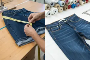
Motif scale is the silent determiner of whether a floral dress looks expensive and flattering or cheap and overwhelming. The scale interacts directly with the wearer's body size and the dress's silhouette. There is no single "perfect" scale, but there is a commercially optimal range for the women's dress market, and it is a medium scale. A medium-scale floral is defined by a hero flower motif that is roughly the size of the wearer's palm, between 3 and 5 inches in diameter. This scale achieves three critical commercial objectives simultaneously. First, it is large enough to be clearly "read" and identified as a floral at a social distance of 6 to 10 feet, the distance of a conversation across a room. Second, it is small enough that the pattern repeat, typically 12 to 16 inches, creates a pleasing, balanced rhythm around the body without large, awkward blank spots or jarring motif cut-offs at the side seams. Third, it is universally proportional on a wide range of body sizes, from a US size 2 to a size 16.
An oversized, large-scale print, with hero flowers 8 to 12 inches across, is a high-risk, niche product. On a smaller body, a single giant flower can overwhelm the entire torso, wearing the customer rather than the customer wearing the dress. On a curvier body, the large motif can distort and stretch in unflattering ways over the bust and hip curves, creating a funhouse mirror effect. This print will often generate strong initial social media engagement because it's striking, but it translates into a high return rate and a low sell-through. A micro-scale, ditsy floral, with motifs under 1 inch, has the opposite problem. It reads as a textured solid from a distance, losing all the visual impact of a floral. It can look juvenile or like a home-decor fabric. The medium-scale print sits in the commercial sweet spot. It is visually legible, universally flattering, and photographable. This is the scale that I guide my clients toward when they are building their core, volume-driving floral dress programs.
Decoding Customer Psychographics Through Search Intent Data
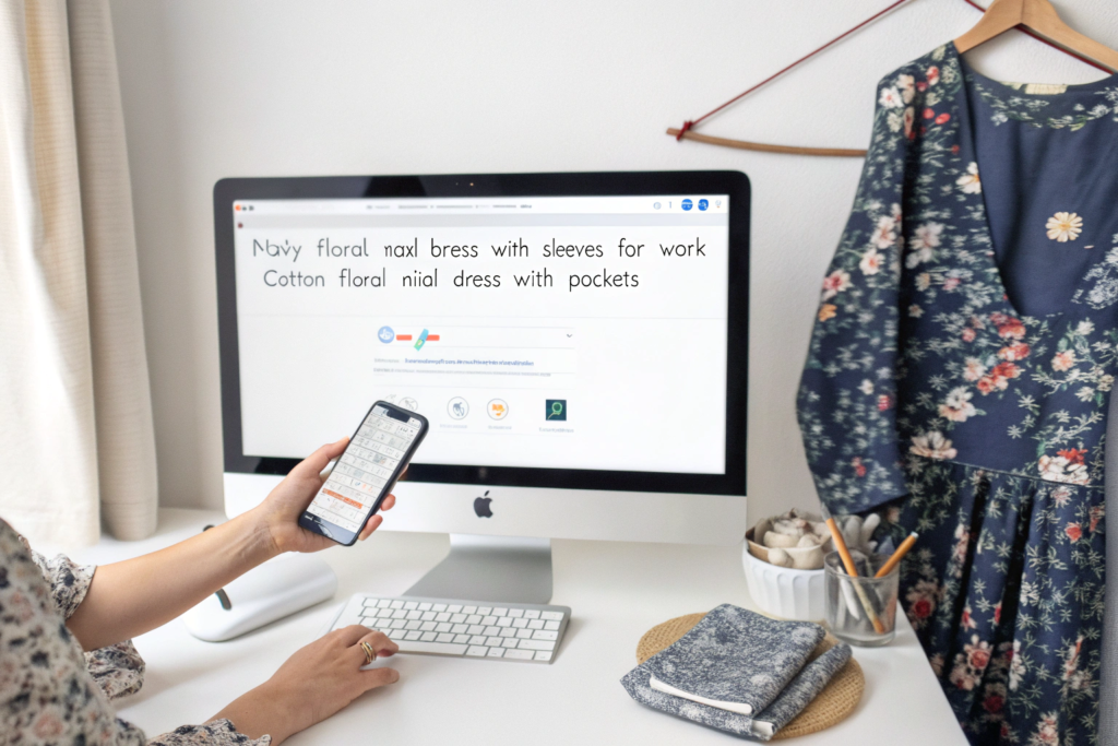
Your customer tells you exactly what she wants to buy, not through your brand's social media comments, but through her search bar. The Google search query and the Amazon search query are the most honest, unfiltered focus group you will ever have access to. A customer typing "navy floral midi dress with bishop sleeves for wedding guest" is not browsing. She is on a mission. She has a specific event, a specific body concern, and a specific look in her mind. She has self-identified her psychographic profile: she is a modest dresser, she needs a formal option, and she values sleeve coverage. The specific floral print she will ultimately buy is the one that visually answers this very specific, typed plea. At Shanghai Fumao, I constantly push my brand partners to start their design process not with a Pantone book, but with a keyword research tool. The data tells you what print colors, scales, and contexts your customer is actively seeking.
Decoding customer psychographics through search intent data means moving beyond broad demographic assumptions and directly analyzing the specific, long-tail keyword modifiers your target customer uses, such as "for church," "for wedding guest," "with long sleeves," or "cotton floral maxi," each of which reveals a precise and commercially actionable intersection of print preference, silhouette need, and life context.
The volume and trajectory of these long-tail search terms provide a real-time demand forecast. A sudden, sustained spike in searches for "dark floral midi dress for fall wedding" in July is a direct, buyable signal for your fabric sourcing in August. A consistent, year-over-year baseline for "floral cotton day dress with pockets" is a signal to make this a permanent, always-in-stock core program. This data-led approach completely inverts the traditional, risky model of a designer creating a print in isolation and hoping the market likes it. Instead, you start with a verified, active demand pool and design the print to be the best possible answer to that search. This method is particularly powerful for the modest fashion market, where the search terms are highly specific and the purchase intent is exceptionally strong. A woman searching for a modest dress for a religious ceremony or a conservative workplace knows exactly what her coverage requirements are, and her search query reflects a complex, layered set of needs that a well-designed floral print can answer.
How Do "Occasion-Specific" Search Terms Predict Floral Print Winners?
Generic searches like "floral dress" are high-volume but low-intent. They are the digital equivalent of window shopping. Occasion-specific search terms are the digital equivalent of a customer walking into a store with her credit card already in her hand, asking for a specific solution. The occasion itself dictates an entire subset of visual cues for the floral print. A search for "floral dress for baby shower" heavily biases toward soft, pastel-toned prints, smaller scales, and a cheerful, optimistic feel. A search for "floral dress for evening church event" pulls toward darker, richer jewel tones, medium to larger scales, and a more formal, sophisticated print architecture.
By mapping the top 20 occasion-specific search terms for your niche, you can build a predictive matrix. If "fall wedding guest floral dress" is a high-volume search term, you can predict with high confidence that a dark-ground, medium-scale floral in burgundy, navy, and blush tones, printed on a fluid, formal fabric like viscose crepe, will have a strong, ready-made market. The customer has already pre-sold herself on the idea. Your product simply needs to visually match the mental image her search term implies. This also guides your product title and description SEO. The dress must be named and described using the exact search term the customer used. The print's visual architecture—its dark ground, its formal scale, its color story—becomes the visual proof that fulfills the search promise. This alignment between search intent and visual product is the single most powerful e-commerce conversion engine I have observed across dozens of brand partners.
Does "With Pockets" in a Search Query Signal Higher Print Sell-Through?
Yes, and the signal is stronger than most brand owners realize. The "with pockets" modifier is not a trivial request for a functional add-on. It is a powerful psychographic marker indicating a high-intent, practical, everyday-wear customer who will likely become a repeat buyer. This customer does not want a delicate, high-maintenance dress for a single event. She wants a workhorse dress that integrates into her daily life. She wants to carry her phone, her keys, and her child's small toy without a handbag. The floral print that attracts this customer is fundamentally different from the print that attracts the "wedding guest" customer. The "pockets" customer's ideal print is durable, easy to care for, and versatile. She gravitates toward cotton poplin or linen-blend florals in medium-scale, multi-directional patterns that hide the slight wear and washing of daily life. She prefers prints where a small stain from a coffee splash won't be a catastrophe.
When I see a high search volume for terms like "floral midi dress with pockets for everyday," I advise my brand partners to develop a specific print capsule around this customer. The prints should be printed on a machine-washable cotton base. The motifs should be dense and all-over, with no large, vulnerable white spaces. The color palette should be forgiving—muted terracotta, olive green, and dusty blue tones that don't show minor dirt. This print is not the one that will stop a scroller dead with its editorial beauty. It's the print that will achieve a quiet, sustained, high-volume sell-through because it answers a deep, practical, recurring need. And because this "pockets" customer is so practical, she is highly likely to buy the same dress in two or three different prints if the silhouette fits her perfectly. Identifying her through her search language and designing a print specifically for her lifestyle is a repeat-revenue goldmine.
The Technical Marriage of Print and Fabric as a Sell-Out Driver
A beautiful floral print on paper is a work of art. That same print applied to the wrong fabric base is an unsellable, expensive mistake. The technical marriage of the print design, the print method, and the fabric substrate is the hidden engineering that transforms a beautiful image into a fast-selling dress. A watercolor print that looks ethereal and soft on a high-end, thick watercolor paper will look like a faded, blurry mess on a cheap, thin polyester georgette. The fabric's absorbency, its surface texture, and its drape characteristics fundamentally alter the final visual of the print. I recall a specific failure a brand brought to us to fix. They had printed a stunning, hyper-realistic, photographic floral onto a heavily textured slubby linen. The linen's irregular, bumpy surface shattered the fine photographic detail, making the print look cracked, broken, and years old on a brand-new dress. The print and the fabric were actively destroying each other.
The technical marriage of print and fabric is a sell-out driver when the print's visual style—its sharpness, its color saturation, its level of detail—is precisely matched to a fabric substrate that enhances those specific qualities, such as a crisp, high-definition digital print on a smooth cotton poplin for a sharp, photographic floral, or a soft, blended reactive print on a fluid viscose twill for a romantic, painterly floral.
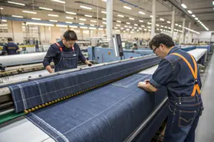
The choice between reactive printing and pigment printing is the first and most critical technical decision. Reactive dye printing chemically bonds the color to the fiber, becoming part of the fabric itself. The result is a print with a soft, invisible hand-feel, brilliant color penetration, and excellent wash fastness. The fabric remains breathable and fluid. This is the only acceptable method for a high-end floral dress. Pigment printing, in contrast, bonds a colored glue to the surface of the fabric. It sits on top, creating a slightly stiff, plastic-like hand-feel, limited breathability, and a tendency to crack and fade after repeated washing. It is cheaper, and it is a false economy. A customer who buys a floral dress online, expecting a soft, luxurious drape, will instantly return a pigment-printed dress the moment she touches the fabric. The return rate difference between a reactive-printed floral dress and a pigment-printed one is stark and directly impacts sell-through calculations. At Shanghai Fumao, we default to reactive printing for all floral dress programs and only use pigment on rigid, heavy-duty fabrics where a vintage, distressed look is the explicit design intent.
Why Does a Crisp Digital Print on Cotton Poplin Convert Browsers to Buyers?
Cotton poplin is the ultimate canvas for a high-definition, photographic, or sharply detailed illustrative floral print. The fabric's surface is smooth, flat, and tightly woven, with a fine, regular grain. It acts like a high-quality coated paper, holding every tiny dot of digital ink in precise, unblurred placement. A digital print on poplin achieves a resolution and color brilliance that a screen print simply cannot match. The result is a print with a hyper-realistic, almost 3D depth, where every petal vein and subtle color gradient is visible. This visual precision is the ultimate e-commerce conversion weapon. When a customer zooms in on the product image, she sees a level of detail and quality that screams "premium." This tactile and visual quality closes the gap between a hesitant browser and a confident buyer.
This combination is particularly effective for bright, bold, conversational floral prints that are meant to be the hero piece of an outfit. The crispness of the print on the clean poplin background creates a modern, graphic, confident look. It also offers a practical benefit that drives satisfaction: machine washability. A reactive-digital print on a high-quality cotton poplin can survive dozens of machine washes with minimal color fading, a crucial consideration for the "everyday wear" customer segment we identified in the search data. This durability makes the higher initial price point justifiable, and it drastically reduces the post-wash dissatisfaction returns that plague cheaper fabric-print combinations.
Can a Soft-Focus Floral on Viscose Crepe Double Your Sell-Through Rate?
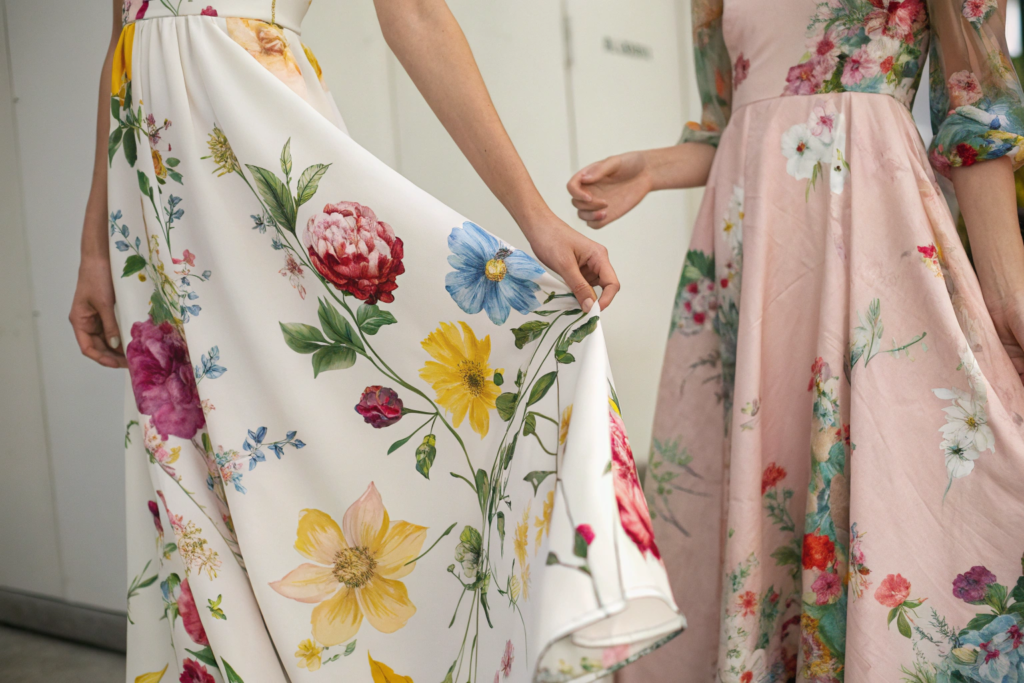
For a completely different aesthetic—the romantic, feminine, vintage-inspired look—the combination is not a crisp digital on poplin, but a softly diffused reactive print on a fluid viscose crepe. Viscose crepe has a gentle, pebbly texture and a liquid, gravity-loving drape. A print with a slightly soft focus, achieved not through poor printing but through deliberate design with gently feathered edges and blended color transitions, marries perfectly with this fabric. The fabric's movement and subtle texture soften the print further in real life, creating a mesmerizing, dreamy effect as the wearer moves. This is the ultimate "romantic garden party" or "date night" dress print.
The reason this combination can double a sell-through rate is that it solves a specific, high-volume customer need: the desire for a feminine, beautiful print on a dress that feels as good as it looks. A customer shopping for a romantic occasion dress is highly tactile in her expectations. She wants the dress to feel fluid, sensual, and luxurious against her skin. A stiff, pigment-printed poplin, even with a beautiful romantic print, will fail the tactile test. A reactive-printed viscose crepe passes it instantly. The fabric moves with her, it catches the breeze, and it photographs with a beautiful, soft luster. This combination also has a low return rate because the physical experience of the dress exceeds the already-beautiful online presentation. The customer receives more than she expected. This specific combination—soft-focus romantic print on fluid viscose crepe—is, in my experience, one of the highest-rotation, most reliable sell-out formulas for the mid-to-premium modest dress market.
Forecasting Sell-Out Risk Using Your Own Historical Data
The most predictive data set you own is not a trend report from a forecasting agency. It is your own brand's last three seasons of sell-through data, broken down by print attribute. Every brand has a unique, specific "print DNA" that consistently outperforms with their particular customer base. A brand serving a young, trend-driven customer might have a proven winner in neon-accented dark florals. A brand serving a classic, conservative customer might have a decade-long track record of success with blue-and-white toile-inspired florals. The task is to stop guessing and start treating your own sales history as a forensic laboratory. I sit down with my brand partners quarterly and pull their sales data not by style name, but by print attribute. We tag every dress with objective descriptors: "Dark Ground," "Medium Scale," "Reactive Print," "Cool Color Palette." The patterns that emerge are the most commercially valuable secret your brand possesses.
Forecasting sell-out risk using your own historical data requires a disciplined, attribute-level tagging system for every floral print, building a multi-season database that reveals your brand's specific, repeatable winning formula—such as "dark ground, medium scale, warm jewel tones"—and equally importantly, identifies the print types that consistently underperform and put your cash flow at risk.
This internal data analysis gives you the confidence to place bold production bets and the discipline to say no to beautiful but historically losing prints. A designer might fall in love with a large-scale, abstract watercolor floral. It's a work of art. But your last three seasons of data show that large-scale, abstract, cool-toned prints have a 45% average sell-through rate, while your medium-scale, defined, warm-toned florals hit 85%. The data gives you the hard, unignorable truth. That beautiful, losing print is not a creative risk; it's a predictable financial loss. This data-led approach also refines your relationship with your factory. When you come to Shanghai Fumao with a clear, data-backed print brief—"We need a dark-ground, medium-scale, reactive-printed floral on cotton poplin, with a warm jewel-tone palette, for a modest midi dress"—we can source exactly that. The brief eliminates the time and cost of sampling prints that have a historically high probability of failure. It compresses the development cycle and dramatically increases the odds that the final product will be a fast-selling hit.
How Do You Build a Print Attribute Sell-Through Scorecard?
The scorecard is a simple spreadsheet, but it is the most profitable document you will create this season. Its power is in its disciplined simplicity and its brutal objectivity. Every floral print dress you have produced in the last three seasons gets one row. The columns are the attribute tags. The process of filling it out forces you to see patterns you've only felt intuitively. The columns I mandate for my brand partners are: Season, Background Color (Dark, Light, Medium), Motif Scale (Micro, Medium, Large), Primary Color Palette (Cool, Warm, Neutral), Edge Definition (Crisp, Soft/Watercolor), Print Method (Reactive, Pigment), Fabric Base (Cotton Poplin, Viscose Crepe, Poly Georgette, etc.), and the final, most critical column: Sell-Through Rate (%).
Once this data is entered, you sort the sheet by Sell-Through Rate, from highest to lowest. The top 20% of rows are your "Win Zone." Look at the clustering of attributes in this zone. You will likely see a dominant pattern—for example, 8 out of the top 10 have a "Dark" background, a "Medium" scale, and a "Crisp" edge definition. This cluster is your brand's proven commercial print DNA. The bottom 20% of rows is your "Lose Zone." Look for the anti-pattern. You might see that 7 out of the bottom 10 have a "Light" background and a "Soft/Watercolor" edge. This is your red flag. A new print design that shares the majority of attributes with your Lose Zone has a statistically high probability of failing, regardless of how beautiful the artwork is. This scorecard gives you the data-backed permission to kill a losing design early, before it consumes precious sampling and production resources. It transforms the subjective, emotional debate in a design meeting into an objective, data-driven decision.
Why Should You Mark Down a Beautiful Print That Matches Your "Lose Zone"?
This is the most emotionally difficult, and most financially critical, discipline in fashion design. A beautiful print that perfectly matches the attributes of your historical "Lose Zone" is not a beautiful opportunity. It is a beautiful trap. Your designer presents it on the mood board. Everyone in the room loves it. The colors are stunning, the artwork is exceptional. But the data is staring you in the face. This exact type of print—light-ground, large-scale, watercolor-edge—has failed three times before. Marking it down, or killing it outright, is not an act of creative suppression. It is an act of financial responsibility. The cost of producing 1,000 units of this beautiful but historically losing print is not just the manufacturing cost. It is the cost of tying up your open-to-buy budget in inventory that will need to be deeply discounted, cannibalizing the sales of your proven winners, and eroding your brand's average sell-through metrics with your retail partners.
The discipline to walk away from a beautiful loser is what separates a consistently profitable brand from one on a permanent financial roller coaster. Use the scorecard as the neutral arbiter. Acknowledge the print's beauty, celebrate the designer's creativity, and then state the cold, hard fact: "This is a stunning print, but its attributes match our historical Lose Zone. We cannot gamble our season's cash flow on a repeat of a proven loser." This protects the brand's capital to invest more heavily in the prints that sit in the Win Zone. Those are the prints that deserve larger production runs, more marketing spend, and prominent placement. They are the prints that pay for the studio's rent. The beautiful loser is a luxury that an unprofitable brand cannot afford. A data-led brand knows that the most creative act is not designing a beautiful print, but designing a beautiful print that reliably turns into cash.
Conclusion
Predicting a fast-selling floral print is not a mystical art reserved for a few gifted creative directors. It is a repeatable, learnable commercial science. We have dismantled the visual architecture of a viral print, revealing why the dark-ground, medium-scale, crisp-edged floral consistently dominates e-commerce thumbnails and drives low return rates. We have tapped into the goldmine of search intent data, listening to the customer's own typed words to understand the exact print colors, scales, and contexts she is actively seeking for her specific life occasions. We have dissected the technical marriage of print and fabric, proving that a stunning design on the wrong substrate is a financial failure, while a well-matched reactive print on cotton poplin or viscose crepe is a tactile and visual conversion machine. And finally, we have built the ultimate predictive tool: your own historical sell-through scorecard, a document that reveals your brand's unique, proven Win Zone and gives you the hard, data-backed discipline to walk away from the beautiful prints that will predictably fail.
Your next floral dress program does not need to be a gamble. It can be a calculated, high-probability bet on a print that has been pressure-tested against visual psychology, customer demand, technical print science, and your own commercial history. This is the level of rigor that turns a collection into a consistent, cash-generating asset. At Shanghai Fumao, our role as your manufacturing partner is to bring this predictive print science to life on the production floor. We help our brand partners translate their data-driven print briefs into technically flawless, reactive-printed fabrics that match the visual and tactile promise that sells dresses.
If you are planning your next floral collection and want a partner who treats print selection as a shared commercial science, not a subjective art project, let's start that data-driven conversation. Contact our Business Director, Elaine, to discuss how we can engineer your proven Win Zone prints into your best-selling production run yet. Reach her directly at elaine@fumaoclothing.com. Let's build a collection where every print is a calculated sell-out.