I have been in the garment manufacturing business for over twenty years. I have worked with hundreds of American brands. And I can tell you, color is the thing that causes the most arguments. A brand sends me a Pantone code. They have a vision. They want that exact color. I make the sample. I send it to them. They look at it under their office lights. They say, "This is not right." I look at it under my factory lights. It looks correct. We go back and forth. Time is wasted. Money is wasted. Everyone is frustrated. Over the years, I have learned that color matching is not magic. It is science. And when both sides understand the science, we can get the colors exactly right.
Ensuring your apparel colors match Pantone codes exactly requires a systematic approach: using standardized lighting conditions, working with a factory that has spectrophotometer technology, establishing a clear approval process with physical samples, understanding the limitations of different fabrics, and maintaining proper documentation across production runs. Color matching is not a one-time event. It is a process that requires precision, communication, and the right equipment. When these elements are in place, your colors will be consistent and accurate.
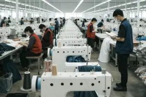
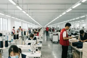
This is what I want to share with you today. I am a factory owner who has invested heavily in color management systems. I know what works and what fails. I will walk you through the steps to ensure your colors match. I will use real examples from my own factory floor. By the end, you will have a clear framework for getting the colors you want.
Why do colors look different under different lights?
The first thing I explain to every new client is lighting. The color you see in your office is not the same color I see in my factory. The color your customer sees in their home is different from both. This is not because the color changed. It is because light changes color.
What is metamerism and why does it matter?
Metamerism is a fancy word for a simple problem. Two colors look the same under one light but different under another light. This happens because fabrics absorb and reflect light differently. A color that matches under fluorescent light may look completely different in sunlight.
I remember a client from Chicago in 2021. They approved a red fabric sample under their office fluorescent lights. We produced 5,000 units. When the goods arrived, the client looked at them in natural daylight. The red looked orange. They were angry. They thought we made a mistake. I explained metamerism. The fabric was the same as the sample. But the sample was approved under the wrong lighting. We both learned a lesson.
Now, we have a strict rule. All color approvals must happen under standardized lighting. We use a light booth with D65 daylight lamps. This is the international standard for color evaluation. It simulates natural daylight. When we approve under D65, the color looks correct in most real-world conditions.
Here is how different light sources affect color perception:
| Light Source | Color Temperature | How It Affects Colors |
|---|---|---|
| D65 (Daylight) | 6500K | Standard for color matching. Most accurate. |
| Cool white fluorescent | 4100K | Makes blues look brighter, reds look duller |
| Warm incandescent | 2700K | Makes reds and yellows look warmer, blues look muted |
| LED home lighting | Varies | Can cause unpredictable color shifts |
How do you set up standardized color evaluation?
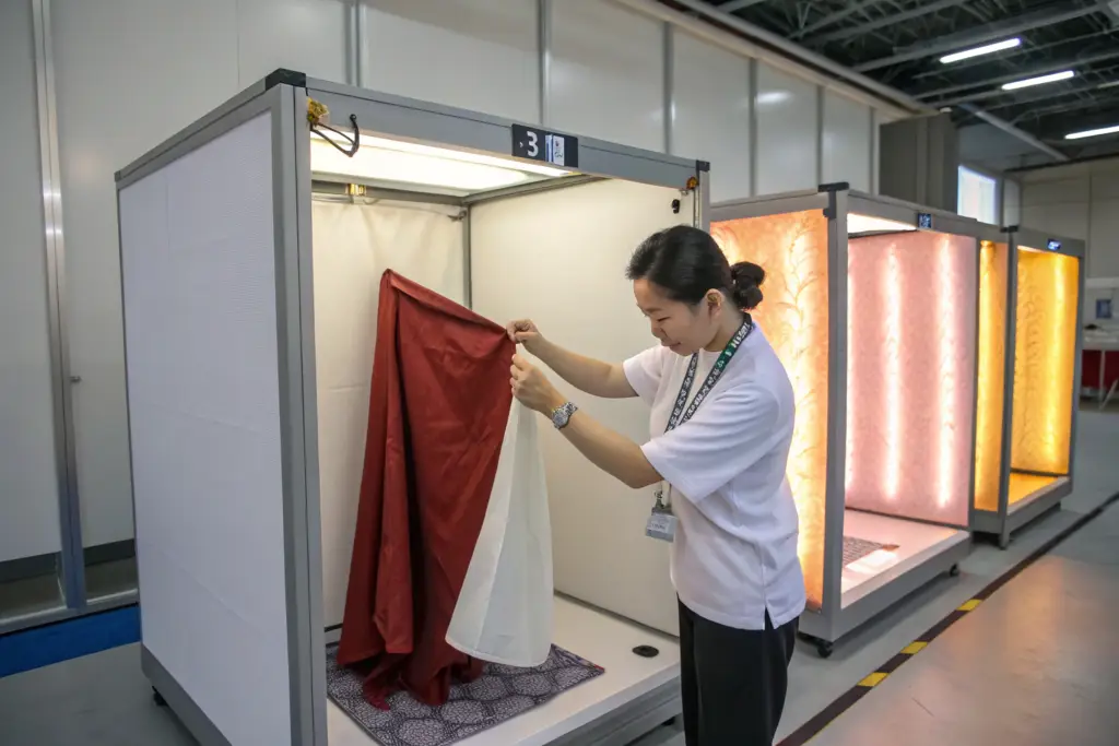
The solution is a light booth. This is a box with different light sources inside. You place the sample and the standard next to each other. You look at them under each light. If they match under all lights, you are safe. If they only match under one light, you have metamerism.
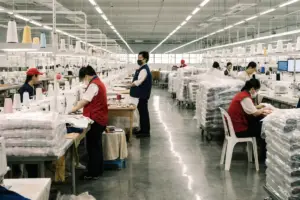
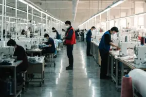
At Shanghai Fumao, we have light booths in our dye house and our quality control lab. Every fabric batch is checked under D65 light. We also check under TL84 (cool white) and A (incandescent) to catch metamerism problems. Before we ship any order, we verify the color under standardized lighting.
Here is our color evaluation process:
| Step | Action | Purpose |
|---|---|---|
| 1 | Place standard (Pantone swatch or approved sample) in light booth | Reference point |
| 2 | Place production fabric sample next to standard | Comparison |
| 3 | Evaluate under D65 light | Primary check |
| 4 | Evaluate under TL84 light | Check for metamerism |
| 5 | Evaluate under A light | Check for metamerism |
| 6 | Document results | Record for future reference |
How does fabric type affect color matching?
Not all fabrics take dye the same way. This is a basic fact of textile manufacturing. But many brands do not understand it. They expect the same Pantone code to look identical on cotton, polyester, and nylon. It does not.
Why does the same dye look different on different fabrics?
The fiber structure determines how dye absorbs. Natural fibers like cotton absorb dye into the fiber. The color is deep and rich. Synthetic fibers like polyester require different dyes. The color sits differently on the surface. Even with the same Pantone code, the visual result is different.
I had a client in Los Angeles in 2022. They wanted a matching set. The top was cotton. The bottom was polyester. They gave me one Pantone code for both. I explained that the colors would not match exactly. They insisted. I made the samples. The cotton came out as a deep navy. The polyester came out as a brighter, slightly greener navy. The client was upset. I showed them the samples side by side. They saw the difference. They understood. We adjusted the dye formula for the polyester to get closer. But it was never a perfect match.
Now, I tell every client the same thing. If you want exact color matching across different fabrics, choose similar fiber content. Cotton and linen match well. Polyester and nylon match well. Cotton and polyester will always be different.
Here is how different fabrics respond to dye:
| Fabric Type | Dye Type | Color Characteristics | Matching Challenge |
|---|---|---|---|
| 100% Cotton | Reactive dye | Deep, matte, rich | Good consistency |
| 100% Polyester | Disperse dye | Bright, slightly shiny | Different from cotton |
| 100% Nylon | Acid dye | Vivid, can be deep | Different from cotton and polyester |
| Cotton/Poly blend | Mixed dye | Complex, can have cross-staining | Hard to match to pure fabrics |
| Linen | Reactive dye | Similar to cotton but slightly duller | Matches cotton reasonably well |
How do you set realistic expectations for different fabrics?
The key is communication. I tell my clients to expect variation. If they need perfect match across multiple fabrics, I suggest they choose a color that is achievable. Black, white, and navy are more forgiving. Bright colors like neon or pastels are harder.
A client in Seattle learned this. They wanted a bright coral color across cotton, nylon, and spandex for a swimwear line. I explained that the cotton would be matte, the nylon would be brighter, and the spandex would be somewhere in between. They accepted this. They designed their line to use the variations as features, not problems. The cotton was the main fabric. The nylon was used for trim. The slight variation created a layered look. Their customers loved it.
At Shanghai Fumao, we guide our clients on these decisions. We do not just take orders. We advise. If a client asks for something that is technically difficult, we explain the challenges. We offer alternatives. We want them to succeed.
What is the right color approval process?
The color approval process is the most important step in ensuring your colors match. If you approve the wrong sample, you will get the wrong color. If you skip steps, you risk surprises.
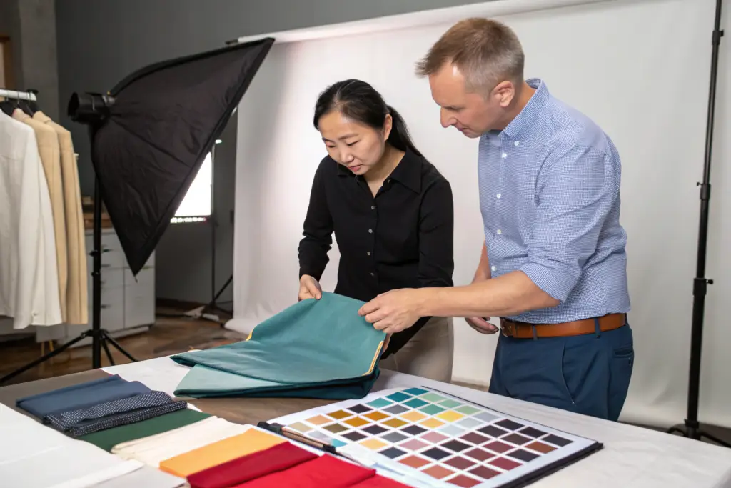
What are lab dips and why do you need them?
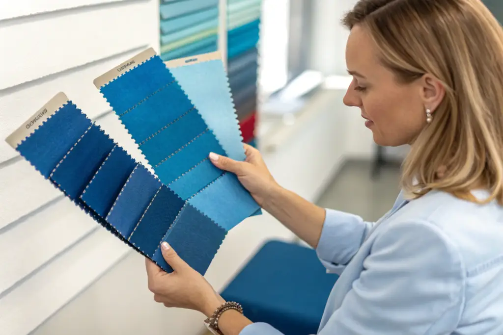
A lab dip is a small piece of fabric dyed to match your Pantone code. It is made before bulk production. This is your first chance to see the color on your actual fabric. You must approve the lab dip before we dye the bulk fabric.
I remember a client in New York in 2023. They were in a hurry. They said, “Skip the lab dip. Just go to production.” I advised against it. They insisted. We dyed 10,000 yards of fabric. The color came out slightly different from their Pantone. They were unhappy. We had to re-dye the fabric. It cost them $8,000 in extra labor and chemicals. They also lost three weeks. They never skipped lab dips again.
The lab dip process is simple. We take your Pantone code. We make a small dye batch. We dye a 10cm by 10cm piece of your fabric. We send it to you. You approve it or ask for adjustments. We make adjustments until it is right. Then we go to bulk.
Here is the lab dip approval process:
| Step | Action | Timeline | Responsibility |
|---|---|---|---|
| 1 | Factory receives Pantone code | Day 1 | Brand provides code |
| 2 | Factory makes first lab dip | 3-5 days | Factory dye lab |
| 3 | Brand reviews lab dip under standardized light | 1-2 days | Brand |
| 4 | If approved, proceed to bulk | – | Both |
| 5 | If not approved, factory makes correction | 2-3 days | Factory |
| 6 | Repeat until approval | Varies | Both |
How do you approve color for production?
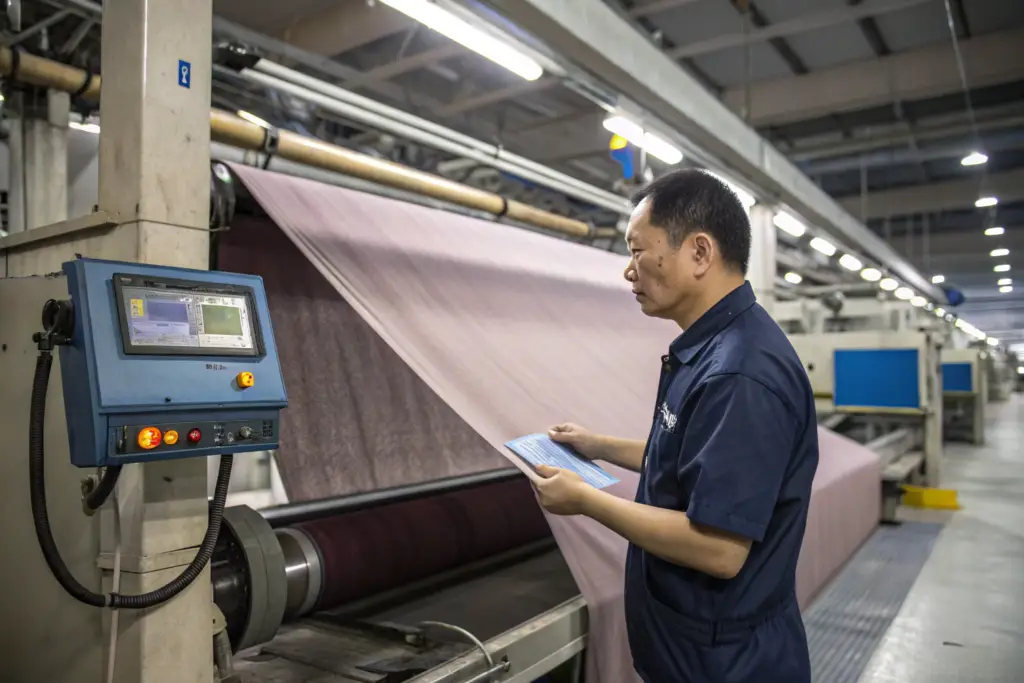
Once the lab dip is approved, we dye the bulk fabric. But the bulk fabric may not match the lab dip exactly. This is normal. Bulk dyeing is different from lab dips. The scale is different. The equipment is different. We need a second approval.
We send a bulk fabric sample to you. This is cut from the actual production fabric. You approve this before we cut and sew. This is your final check.
A client in Austin does this well. They have a simple rule. They never approve production without seeing a bulk fabric sample. They have a light booth in their office. They check every sample. If there is any variation, they tell us immediately. We adjust. Their colors are always consistent.
Here is the full color approval timeline:
| Stage | Sample Type | When | Action |
|---|---|---|---|
| 1 | Pantone standard | Before sampling | Reference color |
| 2 | Lab dip | Before bulk fabric | Approve color on fabric |
| 3 | Bulk fabric sample | After dyeing, before cutting | Approve production color |
| 4 | First production sample | During production | Verify color consistency |
| 5 | Shipment sample | Before shipping | Final verification |
At Shanghai Fumao, we require all five stages for new colors. For repeat colors, we streamline the process. But we never skip the bulk fabric sample. That is the most important checkpoint.
How do you maintain color consistency across large orders?
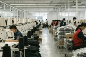
Dyeing 10,000 yards of fabric is different from dyeing 100 yards. The color can vary from batch to batch. It can even vary within the same batch. Maintaining consistency requires technology and process.
How does a spectrophotometer improve color matching?
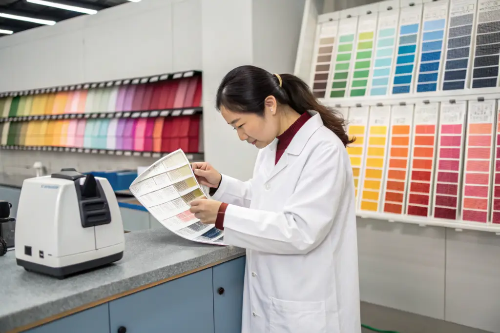
A spectrophotometer is a machine that measures color numerically. It does not rely on human eyes. It gives exact numbers for color. This is the most important tool for color consistency.
We invested in spectrophotometers in 2019. Before that, we relied on human eyes. Our color matching was good. But it was not perfect. Different inspectors saw colors differently. Fatigue affected judgment. Lighting conditions varied.
Now, every fabric batch is measured with a spectrophotometer. We measure the lab dip. We measure the bulk fabric. We measure production samples. The machine tells us if the color is within tolerance. If it is not, we adjust.
A client in Denver noticed the improvement. Their first order with us in 2018 had some color variation. Their order in 2020 was perfect. They asked what changed. I told them about the spectrophotometer. They were impressed. They now use the numeric color data in their own quality control.
Here is how spectrophotometer data helps:
| Measurement | What It Tells | How It Helps |
|---|---|---|
| L value | Lightness/darkness | Ensures depth of color |
| a value | Red/green balance | Ensures correct hue |
| b value | Yellow/blue balance | Ensures correct hue |
| Delta E (ΔE) | Total color difference | Pass/fail based on tolerance |
How do you manage multiple dye lots?
When an order requires multiple dye batches, we must ensure all batches match. We use a system called “lot control.” Each batch is numbered. We track which batch goes to which production run. We blend batches when needed.
I had a client in Miami in 2022. They ordered 20,000 t-shirts. This required four dye lots. We dyed all four lots. We measured each with the spectrophotometer. They were all within tolerance. But there was a slight difference between the first and the last. We blended the fabric. We mixed pieces from different lots in each carton. The variation was spread across the order. No customer received a batch of shirts that looked different from each other.
Here is how we manage multiple dye lots:
| Step | Action | Purpose |
|---|---|---|
| 1 | Dye in separate lots | Manageable batch sizes |
| 2 | Measure each lot | Verify color numerically |
| 3 | Compare lots | Identify any variation |
| 4 | Blend lots if needed | Spread variation across order |
| 5 | Document lot numbers | Traceability for future |
At Shanghai Fumao, we maintain records of every dye lot. If you reorder a color, we can reference the previous formula. We can match it exactly. This is how we ensure consistency year after year.
Conclusion
Ensuring your apparel colors match Pantone codes exactly is a process. It is not magic. It is not luck. It is a combination of the right equipment, the right process, and the right communication. You need standardized lighting to see colors correctly. You need to understand how different fabrics affect color. You need a clear approval process with lab dips and bulk fabric samples. You need technology like spectrophotometers to measure color numerically. And you need a factory that manages dye lots carefully to maintain consistency.
I have invested in these systems at Shanghai Fumao because I know how important color is to my clients. Your brand is built on color. Your customers recognize your colors. Inconsistent colors hurt your reputation. Consistent colors build trust.
When you work with us, you are not just getting a factory. You are getting a partner who takes color seriously. We will guide you through the process. We will show you samples under standardized light. We will give you spectrophotometer data. We will manage your dye lots. We will make sure your colors are right.
If you are looking for a factory that can deliver consistent, accurate colors, I invite you to talk to us. Let us show you our color management systems. Let us prove that we can match your Pantone codes exactly.
You can contact our Business Director, Elaine, directly. She can walk you through our color approval process. She can explain how we use spectrophotometers and light booths to ensure accuracy. Her email is: elaine@fumaoclothing.com. Let us get your colors right from the start.