I once stared at a shipment of 500 beautiful burgundy dresses that looked like they had been stitched with fluorescent pink thread. The thread was not pink. It was a standard "burgundy" from a generic thread supplier. But under the boutique's halogen spotlights, the slight chemical difference between the dye on the fabric and the dye on the thread became a screaming contrast. The fabric absorbed the light; the thread reflected it back. The dresses looked cheap and flawed. We had to pull every unit from the wholesale order and replace them. That $2,500 rework cost taught me a crucial lesson: matching thread to fabric is not a guessing game. It is a precise science of light reflection and dye chemistry. The perfect match is not a thread that looks the same in the box. It is a thread that disappears into the fabric.
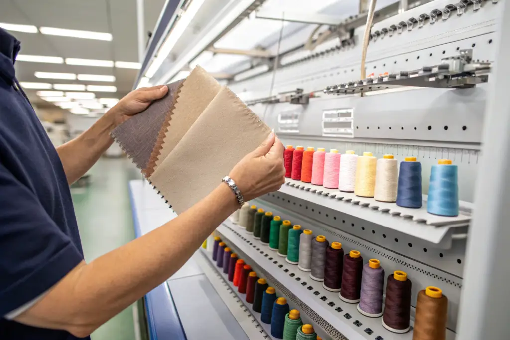
To perfectly match sewing thread colors to custom-dyed wholesale fabrics, you must abandon visual guesswork and adopt a controlled spectrophotometer-based matching system that accounts for metamerism. Metamerism is the phenomenon where two colors match under one light source, like the factory's fluorescent lights, but clash under another, like a boutique's halogen or a customer's daylight. The thread must be matched to the actual bulk fabric swatch, not the paper Pantone chip or the digital design file, because the fabric's texture and finish alter the perceived color. The standard protocol is to use a spectrophotometer to read the exact Lab* coordinates of the fabric, then select a thread that matches within a Delta E CMC tolerance of less than 1.0. Crucially, you must evaluate the match under at least three light sources: D65 daylight, TL84 store lighting, and Incandescent home lighting. A true perfect match is one that holds across all three, ensuring the thread vanishes regardless of where the garment is worn.
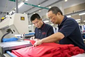
Thread color matching is the most underrated quality control step in garment manufacturing. A mismatched topstitching thread can ruin the perceived luxury of a $200 jacket. A poorly matched overlock thread can make the inside of a sheer summer dress look messy and cheap. I want to share the exact process we use at Shanghai Fumao to ensure every thread we sew is invisible or intentionally contrast-matched with perfect precision.
Why Is Metamerism the Arch-Enemy of Perfect Thread Matching and How Do You Defeat It?
I once approved a thread match in our Shanghai office under standard fluorescent ceiling panels. The thread blended flawlessly with the navy cotton twill. I signed the approval and sent the order to bulk. Two weeks later, I received a frantic photo from the brand owner. She had taken the sample to a tradeshow. Under the LED spotlights of her booth, the thread glowed a faint, sickly purple. The fabric stayed a deep, warm navy. It was a textbook case of metamerism. The thread and fabric had different spectral reflectance curves. They reflected the fluorescent light the same way, but the LED spotlight revealed the chemical mismatch. We had to stop production and re-dye the thread lot.
Metamerism occurs when two colors have different pigment compositions but produce the same visual sensation under a specific light source. In textiles, this happens when the fabric is dyed with one class of dye (e.g., reactive dye on cotton) and the thread is dyed with another (e.g., disperse dye on polyester). Under the factory's fluorescent lights, they look identical. Under the boutique's LED or the customer's daylight, they diverge. You defeat metamerism by evaluating every thread match under a standardized lightbox with at least three light sources: D65 (artificial daylight), TL84 (typical retail store lighting), and A or Incandescent (home lighting). A match is only approved if the thread "disappears" against the fabric under all three. A spectrophotometer provides the ultimate protection by analyzing the spectral reflectance curve of both the fabric and the thread. If the curves are parallel, the match is non-metameric and will hold under any light.
A brand cannot afford to have a garment look perfect on the factory inspection table and flawed on the sales floor. The lightbox evaluation is not an optional step. It is the only way to guarantee the thread match survives the journey from the factory to the customer's closet.
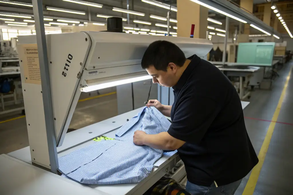
How Does a Spectrophotometer Identify a Spectral Match That the Human Eye Cannot See?
The human eye has three color receptors (red, green, blue) and can be fooled by metameric pairs. A spectrophotometer measures color across the full visible spectrum (31 points). It outputs a spectral reflectance curve, a graph showing how much light the surface reflects at each wavelength. Two colors that match visually but have different curves are metameric. The spectrophotometer detects this instantly and displays a Metamerism Index (MI). An MI below 0.5 indicates an excellent non-metameric match.
What Are the Ideal Light Sources (D65, TL84, A) for Approving a Thread Match for a Summer Retail Collection?
For summer retail, the primary evaluation should be under D65 (daylight), as summer clothes are most often seen outdoors. TL84 (cool white fluorescent) is critical for department store displays. A (warm incandescent) is useful for predicting how the garment will look in a customer's home in the evening. The thread must be invisible under all three. If the brand expects the collection to be sold in boutiques with LED lighting, a fourth evaluation under a specific LED source should be added.
What Is the "Visual Blindness" Effect of Fabric Texture and How Does It Affect Thread Color Selection?
A brand owner once sent me a confused email. She had used the exact same thread on two different fabrics dyed to the same Pantone "Sage Green." On the smooth cotton sateen, the thread looked slightly lighter and shinier. On the heavily textured slub linen, the thread was completely invisible. She thought the thread lot was inconsistent. The thread was identical. The fabric texture was the variable. The smooth sateen reflected light like a mirror, making the thread's slight sheen visible. The rough linen broke up the light into thousands of tiny shadows, hiding the thread within the texture. This phenomenon is what expert dyers call "visual blindness." A thread that looks too light on a flat, smooth surface can be absolutely perfect on a textured, napped, or brushed fabric.
Fabric texture alters perceived thread color because it changes how light scatters. A smooth, dense fabric like sateen, taffeta, or coated nylon reflects light directionally. This "mirror effect" highlights any slight difference in sheen or tone between the thread and the surface. A textured fabric like terry, linen slub, or brushed fleece scatters light in all directions, creating a shadow effect that traps the thread within its depth. When matching thread, you must use the exact bulk fabric, not a flat paper simulation. For smooth fabrics, the thread should be slightly darker than the fabric because the surface sheen will make it appear lighter when sewn. For heavily textured fabrics, the thread should be exactly the base tone because the texture will absorb any minor sheen difference. Ignoring texture leads to the "glowing outline" effect on smooth fabrics and the "dusty chalk line" effect on textures.
The thread must be tested on a sewn-out sample of the actual fabric, not just held against it in a skein. The tension of the stitch and the twist of the thread change how light reflects off it. A sample seam sewn at production speed is the only true approval tool.
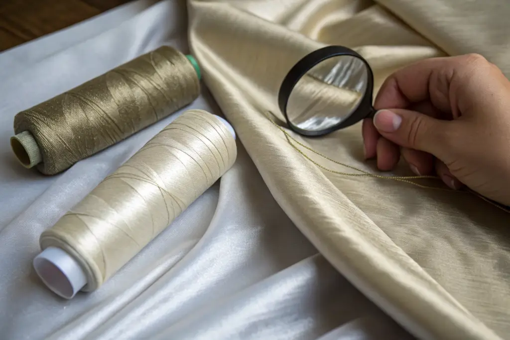
Why Should Thread Be Slightly Darker When Used on a High-Sheen Satin Compared to a Matte Linen?
Sheen adds perceived lightness. A thread that is a perfect tonal match on a matte card will appear lighter and more reflective when sewn onto a shiny satin because the satin's surface amplifies the thread's inherent luster. By selecting a thread that is 0.5 to 1.0 shades darker (in visual assessment), you compensate for the light reflection. When sewn, the thread sinks into the fabric visually and disappears. On matte linen, no such compensation is needed because the matte surface absorbs the thread's luster.
How Does Thread Twist (Z-Twist vs. S-Twist) Affect Light Reflection and Color Visibility?
The direction of the thread's twist interacts with the direction of the weave and the light source. A Z-twist thread reflects light at a slightly different angle than an S-twist thread. In machine sewing, the twist direction affects how the thread sits on the fabric surface. For topstitching, a Z-twist is standard because it unpacks slightly under the needle, flattening out to cover more surface area and reducing highlight reflection. The wrong twist can create a subtle, unwanted sparkling effect along the seam line.
How Do You Specify and Document a Thread Match to Guarantee Consistency Across Multiple Dye Lots?
I once had a production disaster where the thread supplier changed their dye recipe between orders. The "Navy #305" thread we had used for three seasons suddenly looked purple against our standard navy cotton. We had not kept a sealed reference sample of the original thread. We had no physical record of the original match. We spent two days scrambling to find a new thread source. Now, we never approve a thread match without sealing a physical sample and documenting the exact supplier specifications.
Consistency across multiple dye lots is guaranteed by creating a physical "Thread Match Standard" for every fabric color. This standard consists of a piece of the approved bulk fabric, a 2-meter sample of the approved thread wound on a card, and a specification sheet listing the thread supplier, the color code, the dye lot number, the approved date, and the Delta E reading from the spectrophotometer. This standard is sealed in a tamper-proof bag, signed by the brand owner and the factory manager, and stored in the QC department. For every new thread dye lot, the incoming lot is checked against this sealed standard. If the visual match and the spectrophotometer reading are within tolerance, the lot is approved. If not, it is rejected and re-sourced. This physical standard prevents "color drift" over multiple seasons of production.
The thread is just as susceptible to dye lot variation as the fabric. A documented, sealed standard is the only way to hold the thread supplier accountable and ensure that every production run matches the approved sample.
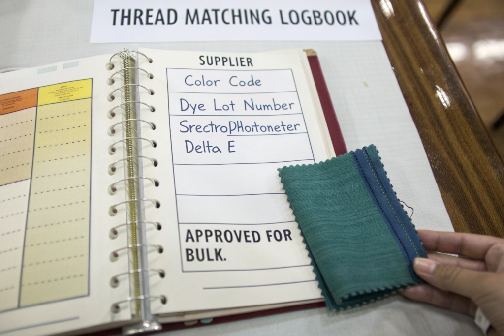
Why Must You Keep a Sealed "Thread Standard" Swatch Book for Every Season's Custom Colors?
Fabric colors change slightly season to season as mills adjust their base dyes. A "Navy" dyed in 2024 might be slightly warmer than a "Navy" dyed in 2025. The thread that matched perfectly in 2024 might not match the new batch. By creating a sealed thread standard swatch book for each season's production, the brand and factory have an indisputable historical record. If a dispute arises, the sealed book is the arbiter. It eliminates the "I remember it being different" argument.
What Is the Acceptable Delta E CMC Tolerance for a Seam to Visually "Disappear"?
A Delta E CMC of less than 1.0 is the standard for an invisible seam. At this level, the human eye cannot perceive a difference under normal lighting conditions. For critical topstitching on a luxury garment, a tolerance of 0.5 is targeted. For overlock threads on internal seams, a tolerance of 1.5 is acceptable because the thread is not visible on the garment's face.
Conclusion
Perfectly matching sewing thread to custom-dyed fabric is a technical discipline, not an aesthetic opinion. It requires understanding metamerism and evaluating matches under multiple light sources. It requires accounting for fabric texture, sheen, and thread twist. And it requires a documented, sealed standard to maintain consistency across production runs. The $2,500 rework cost from the burgundy dress disaster was the price of treating thread matching as an afterthought. The cost of the spectrophotometer, the lightbox, and the sealed standard system is a fraction of that loss.
The thread is the skeleton of the garment. The seams are the lines that define its shape. When the thread matches perfectly, the garment looks seamless, expensive, and intentional. When it does not, the entire garment looks flawed. No amount of beautiful fabric or clever design can compensate for a glowing mismatched stitch line.
At Shanghai Fumao, we treat thread matching as a critical quality control checkpoint. We use spectrophotometer readings, D65/ TL84/ LED lightbox evaluations, and sealed thread match standards for every custom-dyed production order. We work with premium thread suppliers who provide dye lot consistency documentation. We do not guess. We measure.
If you have experienced thread matching issues, or if you want to build a robust color match standard for your next production run, we can help. At Shanghai Fumao, we can provide a sample thread match specification sheet and our lightbox evaluation protocol. Contact our Business Director, Elaine, at elaine@fumaoclothing.com. She can send you a thread swatch sample kit and walk you through our matching process. Let's make your seams invisible and your quality undeniable.