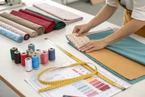
Three years ago, a women's wear brand owner I work with made a $35,000 mistake on color. She had a gut feeling that mustard yellow would be the color of the autumn season. She ordered 2,000 units across three styles in mustard yellow. Her gut was wrong. The color of that season turned out to be sage green. Her mustard yellow inventory sat on the wholesale racks. Retail buyers walked past it. She eventually liquidated the stock at 65% below wholesale cost. The loss was painful. The following season, she abandoned gut feeling entirely. She built a systematic color forecasting process using data from runway analysis, street-style photography, social media sentiment, and color forecasting platforms. Her next season's color selections sold through at 87% full price. The difference was not luck. It was methodology.
You accurately predict the absolute next big color trends for wholesale women's wear in 2026 by triangulating data from three independent sources: the seasonal color forecasts published by professional trend agencies like WGSN, Pantone, and Coloro, which analyze runway, street style, and cultural signals 18 to 24 months in advance; the real-time consumer behavior data from social media platforms, search engines, and e-commerce marketplaces, which reveal which colors are gaining traction right now; and the historical sales data from your own wholesale accounts, which shows which colors have consistently performed well in your specific product category and price point. The most accurate prediction is not a single color. It is a color palette of five to seven shades that includes two core neutrals that anchor the collection, two fashion colors that align with the emerging trend data, and one or two accent colors that differentiate your brand from competitors. The brands that predict color correctly sell at full price. The brands that guess sell at markdown.
Color prediction is not clairvoyance. It is data analysis applied to aesthetics. The data exists. The trend agencies publish it. The social media platforms generate it. The sales records contain it. The brands that collect this data, analyze it systematically, and apply it to their product development process will be right more often than they are wrong. The brands that rely on intuition will eventually guess wrong, and wrong color guesses are among the most expensive mistakes in apparel. I want to share the exact forecasting system our most successful brand partners use to choose colors that sell.
What Primary Data Sources Do Professional Color Forecasters Trust for 2026 Trend Predictions?
A brand owner once asked me where color trends actually come from. She assumed they were decided by a secret committee of designers in Paris. The reality is both more complex and more accessible. Color trends emerge from a convergence of signals: a specific shade appears on a major designer's runway; simultaneously, a similar shade appears in street-style photography from Tokyo or Copenhagen; at the same time, a related shade starts trending on Pinterest and TikTok; and underlying all of this, a broader cultural mood, a desire for calm after a period of chaos, a craving for optimism after a period of uncertainty, drives consumers toward certain color families. The professional color forecaster's job is to detect these signals early, before they become obvious to the mass market.
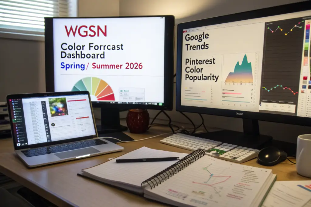
The primary data sources professional color forecasters trust for 2026 trend predictions are the macro trend reports from WGSN and Coloro, which publish seasonal color forecasts 18 to 24 months in advance based on runway analysis, cultural trend research, and consumer sentiment tracking; the Pantone Fashion Color Trend Reports, which capture the colors shown by designers at major fashion weeks; the real-time consumer data from Pinterest Trends, Google Trends, and TikTok Creative Center, which show which colors consumers are searching for and engaging with right now; and the trade show color direction presentations from Première Vision and Texworld, which reflect the consensus of the textile supply chain. No single source is definitive. The forecaster looks for confirmation across multiple sources. A color that appears in a WGSN forecast, is visible on runways, is trending on Pinterest, and is being sampled by textile mills is a high-confidence prediction.
The forecast is not a single answer. It is a probability assessment. The forecaster identifies which colors have the strongest signal across the most sources. Those colors go into the collection palette. The colors with mixed signals go into the watch list for future seasons.
How Should a Wholesale Brand Use WGSN and Coloro Trend Reports Without Blindly Copying Their Palettes?
WGSN and Coloro publish comprehensive color forecasts that are used by major global brands. The risk for a smaller wholesale brand is that blindly copying the forecast palette results in a collection that looks identical to every other brand that also copied the forecast. The trend report should be used as a directional guide, not a paint-by-numbers kit. The brand should read the cultural narrative behind the forecast. WGSN does not just name colors. It explains the cultural mood that is driving the shift: a desire for stability, a craving for joy, a need for comfort, a search for authenticity. The brand should identify which of the forecast colors align with their specific brand identity and customer base. A brand that serves professional women in their 40s should select the sophisticated neutrals and muted fashion colors from the forecast, not the neon brights aimed at Gen Z. The WGSN color forecast methodology provides the strategic framework. The brand's own identity provides the filter. The result is a palette that is on-trend and distinctively the brand's own.
What Real-Time Social Media Listening Tools Catch Emerging Color Micro-Trends Before They Hit the Mainstream?
Social media platforms generate color trend data in real time. Pinterest Trends shows which color search terms are rising week over week. TikTok Creative Center shows which color-related hashtags are gaining views. Instagram hashtag tracking tools like Later or Sprout Social show which color terms are appearing more frequently in fashion posts. A brand can set up a simple monitoring system: track ten color-related search terms on Pinterest, follow five color-forecasting accounts on TikTok, and set up Google Alerts for "color trend 2026 fashion." The goal is to detect acceleration. A color that is growing at 30% month over month on Pinterest and appearing in multiple TikTok fashion videos is a micro-trend that may become a macro trend. The social media trend detection tools for fashion allow a brand to spot these signals before they appear in the traditional trend reports. The early mover advantage in color is significant. The brand that identifies a rising color and gets it into production six months before competitors captures the initial demand wave at full margin.
How Do You Translate Global Runway Color Themes into Commercially Viable Wholesale Palettes?
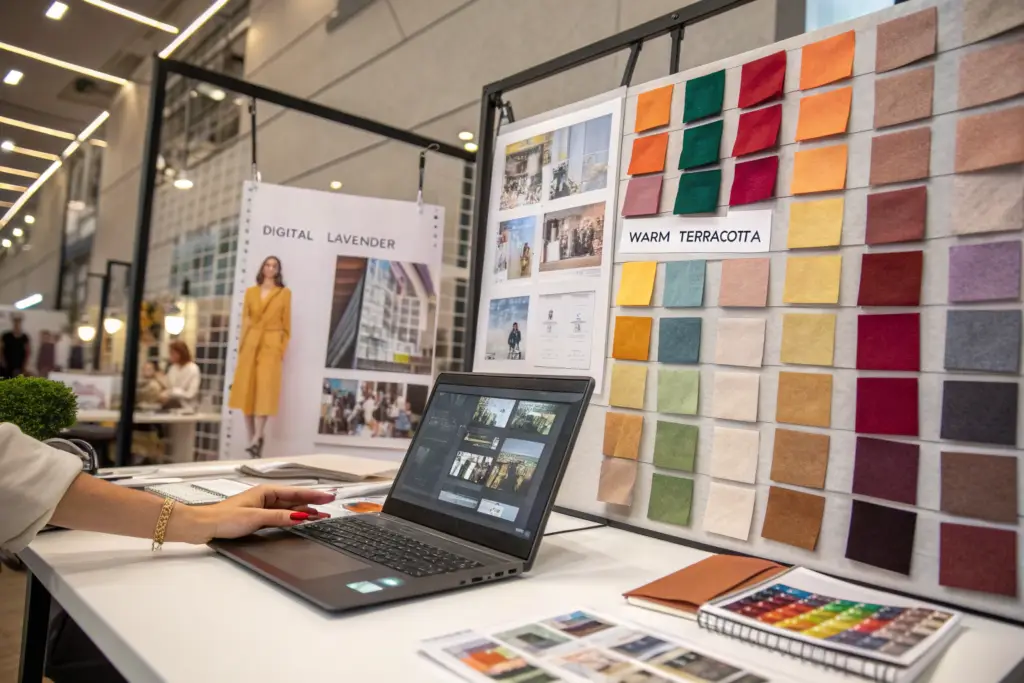
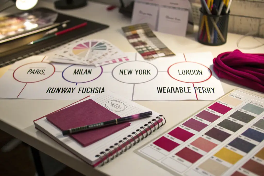
A brand owner I work with attends fashion week every season. For years, she would return inspired and order samples in the exact shades she saw on the runway. The samples were beautiful. The wholesale buyers rejected them. The colors were too extreme, too bright, too fashion-forward for her mid-market boutique customers. She learned to translate rather than copy. A neon lime green on a runway couture gown becomes a muted sage green accent on a commercial blouse. A shocking pink on a runway statement coat becomes a dusty rose lining in a commercial jacket. The runway sets the direction. The brand adapts the intensity for the customer.
You translate global runway color themes into commercially viable wholesale palettes by adjusting three variables: saturation, proportion, and placement. Saturation is the intensity of the color. A runway color at 100% saturation becomes a commercial color at 60% to 80% saturation, softer, more wearable, less intimidating. Proportion is the amount of the garment covered by the fashion color. A runway dress that is entirely electric blue becomes a commercial garment where electric blue is used as a trim, a lining, or an accent panel. Placement is the location of the fashion color on the garment. A runway color that covers the entire silhouette becomes a commercial color that appears on a collar, a cuff, a pocket flap, or a printed scarf. The translation process preserves the trend direction while making the color accessible to a broader customer base. The brands that translate successfully sell fashion to customers who do not think of themselves as fashionable.
The translation process requires understanding the customer. A brand selling to coastal boutique customers can use higher saturation and more aggressive color placement than a brand selling to Midwestern department stores. The translation is not one-size-fits-all. It is specific to the brand's distribution channel and end consumer.
What Is the "Rule of 60-30-10" in Applying a 2026 Trend Color to a Wholesale Collection?
The Rule of 60-30-10 is a classic interior design principle that applies powerfully to fashion collection color allocation. In a wholesale collection, 60% of the units should be in core neutral colors: black, white, navy, beige, gray. These are the colors that wholesale buyers order with confidence because they know they will sell. 30% of the units should be in the season's key fashion colors, selected from the trend forecast data. These are the colors that make the collection look current and exciting. 10% of the units should be in bold accent or novelty colors that differentiate the brand and attract attention at trade shows. The 60-30-10 rule ensures the collection is commercially grounded while still being trend-relevant. A brand that allocates 50% of units to an untested trend color is taking a significant inventory risk. The color allocation strategy for fashion collections is a proven framework for balancing creativity and commercial reality.
How Can You Use "Color Blocking" with Neutrals to Satisfy Both Cautious Wholesale Buyers and Fashion-Forward Consumers?
Color blocking with neutrals satisfies both audiences by placing the trend color in a contained area of the garment surrounded by safe neutral colors. A dress with a navy body and a small coral color block at the waist satisfies the cautious buyer who sees predominantly navy and the fashion-forward consumer who notices the coral accent. A jacket with a beige shell and a turquoise lining satisfies the buyer who orders for the beige and the consumer who falls in love with the turquoise surprise. The color blocking techniques for commercial fashion allow the brand to introduce trend colors at low risk. If the trend color is a hit, the brand increases the proportion in the next season. If it underperforms, the brand's exposure was limited to a small accent area. The technique is a risk management tool disguised as a design choice.
What Role Do Cultural and Socio-Economic Shifts Play in Determining the Dominant Colors of 2026?
In 2020, when the world was in lockdown and consumers were seeking comfort and security, the dominant colors were soothing neutrals, soft blues, and muted greens. In 2022, as the world reopened and consumers craved joy and self-expression, the dominant colors shifted to vibrant pinks, electric greens, and dopamine brights. The connection between cultural mood and color preference is not a theory. It is a documented pattern in consumer behavior. The brands that understand this connection can anticipate color shifts before they appear in trend reports.
Cultural and socio-economic shifts determine the dominant colors of 2026 by shaping the emotional needs that consumers seek to fulfill through their clothing choices. Periods of economic uncertainty drive consumers toward practical, enduring neutrals that feel like a safe investment. Periods of optimism and recovery drive consumers toward warm, uplifting tones that express confidence and hope. Periods of technological anxiety drive consumers toward nature-inspired, grounding colors that provide a sense of calm. The forecaster monitors the cultural conversation, the political climate, the economic indicators, the dominant themes in film, music, and art, and identifies the emotional need that is rising. The colors that satisfy that emotional need will be the colors consumers gravitate toward. The cultural analysis provides the why behind the what. It transforms color prediction from a guessing game into a structured analysis of human behavior.
The cultural analysis is not abstract. It produces specific color direction. If the cultural mood in 2026 is one of "cautious optimism," the dominant palette will include warm neutrals like terracotta and sand, with accents of hopeful pastels like lilac and butter yellow. If the mood is "digital fatigue," the palette will include grounding earth tones and biophilic greens. The cultural signal points to the color families. The trend data identifies the specific shades.
How Will the "Post-Digital Fatigue" Movement Influence the Demand for Earth Tones and Biophilic Greens in 2026?
Consumers are spending increasing amounts of time in digital environments: screens, virtual meetings, social media, artificial intelligence interfaces. This digital saturation creates a counter-desire for tactile, natural, grounding experiences. In color terms, this translates to a demand for colors that evoke the natural world: moss greens, clay browns, stone grays, sky blues, and ocean teals. These biophilic colors provide a psychological antidote to the cold, blue-light spectrum of digital devices. The post-digital fatigue and biophilic design trends are expected to intensify through 2026. Brands that incorporate these grounding, nature-derived colors into their collections will satisfy a deep consumer need for connection to the physical world.
Why Do Economic Recovery Cycles Historically Boost Demand for Optimistic Warm Tones?
Economic recovery cycles boost consumer confidence. Confident consumers are more willing to spend on non-essential items and are more drawn to colors that express optimism, energy, and forward momentum. Warm tones, yellows, oranges, corals, warm pinks, and golds, are psychologically associated with positivity and energy. During the post-2008 recovery, warm coral and tangerine tones dominated fashion palettes. During the post-pandemic recovery, warm, dopamine brights surged. If global economic conditions continue to stabilize through 2026, the demand for optimistic warm tones will likely increase. The economic cycles and color trend correlation is a well-established pattern in fashion forecasting. Brands that monitor leading economic indicators can position their color palettes ahead of the consumer confidence curve.
Conclusion
Accurately predicting the next big color trends for wholesale women's wear in 2026 is a systematic process of data triangulation, trend translation, and cultural analysis. The brands that do this well do not guess. They gather data from professional forecasters, social media platforms, and their own sales history. They translate runway extremes into wearable commercial shades using saturation adjustment and the 60-30-10 allocation rule. They monitor the cultural conversation to understand the emotional needs that will drive color preference. The result is a color palette that is commercially grounded, trend-relevant, and distinctively the brand's own.
The $35,000 mustard yellow mistake taught the brand owner I work with a lesson she now shares with every new designer she mentors. "Your favorite color is not a business strategy. Color is data. Treat it like inventory. Forecast it carefully. Test it in small quantities. Scale only what sells." She has not made a major color mistake in three years.
At Shanghai Fumao, we support our brand partners' color decisions with practical manufacturing capabilities. We provide fabric lab dip development that matches Pantone TCX references with precision. We offer low minimum order quantities on fashion colors so brands can test new shades without committing to large production runs. We provide colorfastness and shrinkage testing to ensure the beautiful fashion color on the sample rack holds up through washing and wear.
If you are building your 2026 color palette and want a manufacturing partner who understands the importance of color accuracy and testing flexibility, reach out to us. At Shanghai Fumao, we will work with you to develop lab dips for your trend colors, produce small test runs to validate market demand, and scale production as your color choices prove successful. Contact our Business Director, Elaine, at elaine@fumaoclothing.com. She can share our color development timeline and a sample lab dip approval form. Color is the first thing your wholesale buyer sees. Make sure it is the right one.