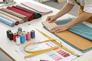
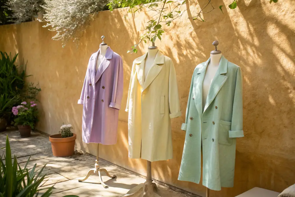
I was walking the aisles of a trade show in New York last September, and something remarkable caught my eye. It was not a new silhouette or a clever construction detail. It was a color. Almost every forward-thinking brand's booth had a rack of outerwear in shades that would have been unthinkable for coats five years ago. Soft lavender. Butter yellow. Pale mint. Bubblegum pink. I stopped at one booth and asked the brand owner about it. She laughed and said, "My buyer from Toronto told me she used to buy black, navy, and beige. Now her pastel coats are outselling her neutrals three to one. I do not pretend to understand it, but I am following the money." Her honest answer perfectly captured the moment.
Pastel-colored summer coats are dominating the North American market because they perfectly capture the cultural mood of optimism and self-expression, perform exceptionally well on social media, and offer the customer a joyful, emotional purchase that neutrals cannot match.
This is not just a color trend. It is a fundamental shift in how the consumer views outerwear. The coat is no longer just a practical layer of protection against the elements. It has become a vehicle for personal expression and a powerful mood-enhancer. At Shanghai Fumao, our pastel coat orders have nearly tripled in two years. I want to explain the cultural, psychological, and commercial forces behind this pastel revolution.
What Cultural and Psychological Forces Are Driving the Pastel Trend?
Color trends are never random. They are a direct reflection of the collective mood. After periods of uncertainty and darkness, there is a powerful human pull towards lightness, softness, and joy. The pastel coat is the ultimate expression of this emotional need. It is armor against the grey. It is a deliberate, visible choice to embrace optimism. The consumer is not just buying a coat. She is buying a feeling.
The pastel coat trend is driven by a cultural desire for dopamine dressing, the visual demands of social media platforms, and a broader generational rejection of restrictive, somber dress codes.
This is a trend with deep psychological roots. It will not disappear next season. It represents a fundamental change in how women want to feel in their clothes. At Shanghai Fumao, we analyze these cultural currents to help our partners make smart, forward-looking buying decisions.
How Does "Dopamine Dressing" Translate to Outerwear Sales?
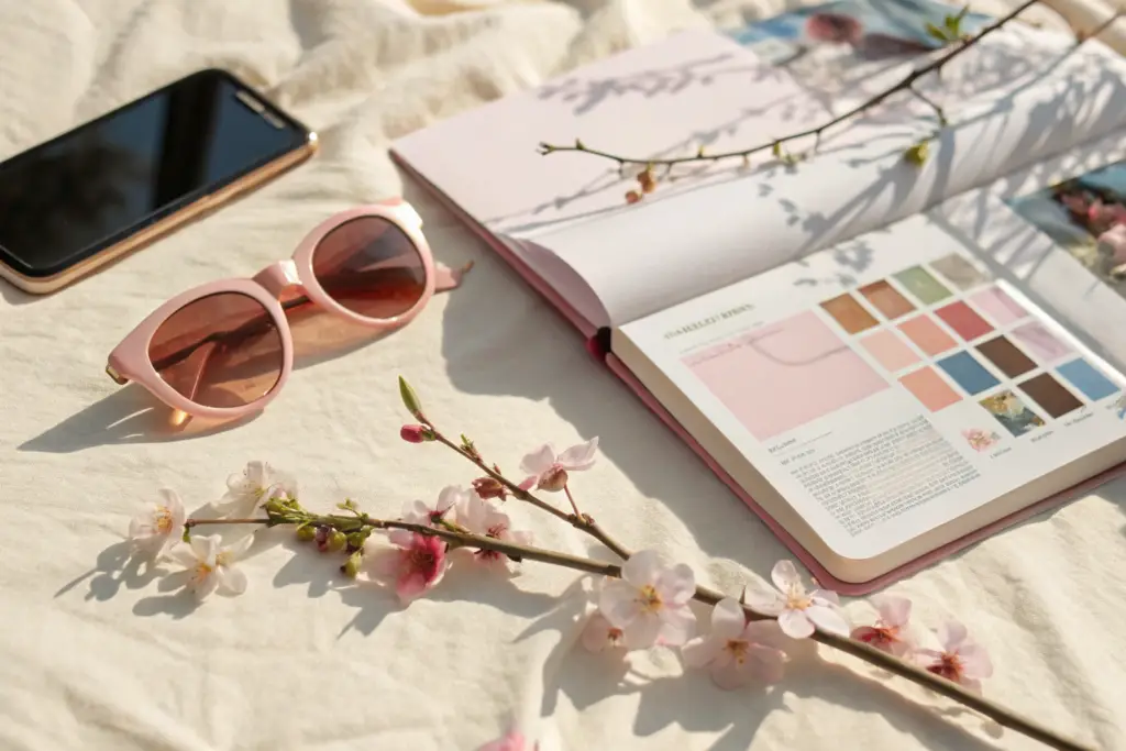
Dopamine dressing is the concept of wearing clothes that actively make you feel happier. Bright, joyful colors trigger a positive neurological response. This is not just a whimsical idea. It is backed by color psychology. Yellow is associated with optimism. Pink is associated with warmth and compassion. Green is associated with calm and renewal. A woman puts on a butter-yellow trench coat, and she feels a genuine lift in her mood. She smiles when she catches her reflection in a store window.
This emotional response is commercially powerful. It transforms a coat from a considered, practical purchase into an impulse-driven, feel-good buy. A customer might agonize over a $200 beige coat, comparing it to ten other beige coats. A $200 lavender coat makes her feel something unique. The decision is emotional and fast. One of our boutique partners in Austin told me a story. A customer walked in, saw a pale pink linen blazer, and literally gasped. She said, "This makes me so happy." She bought it without even trying it on. That is the dopamine effect in action. It short-circuits the rational brain and creates an immediate, emotional sale.
Why Do Pastels Outperform Neutrals on Instagram and TikTok?
Social media is the most powerful fashion marketing engine in the world. The visual algorithms of Instagram and TikTok reward content that is eye-catching, beautiful, and shareable. A sea of beige and black outerwear scrolls past the user's eye without stopping the thumb. A pastel coat pops off the screen. It is visually arresting. It makes the user pause, look, and engage.
Pastel coats also photograph beautifully in a wide range of settings. A lavender coat against a city street creates a beautiful, editorial contrast. A mint green coat on a beach looks fresh and modern. The colors are flattering in natural light. This visual appeal makes pastel coats highly shareable. A customer buys the coat, posts a photo of herself wearing it, and her post performs better than her usual content. She becomes an enthusiastic, unpaid brand ambassador. User-generated content featuring pastel coats consistently outperforms neutral coat content in engagement metrics. A DTC brand we work with launched a baby blue trench coat last spring. Their influencer-gifted campaign generated millions of impressions and a complete sell-out within ten days. The product was beautiful, but the color was the real marketing engine.
Which Pastel Shades Are the Top Performers for Summer 2026?
Not all pastels are created equal. The pastel family is vast, and choosing the wrong shade can mean the difference between a coat that sells out and one that languishes on the sale rack. The North American customer has specific preferences. She wants pastels that are sophisticated, wearable, and flattering against a range of skin tones. The shades that look like baby nursery colors are too sweet and lack the modern edge that the current consumer demands.
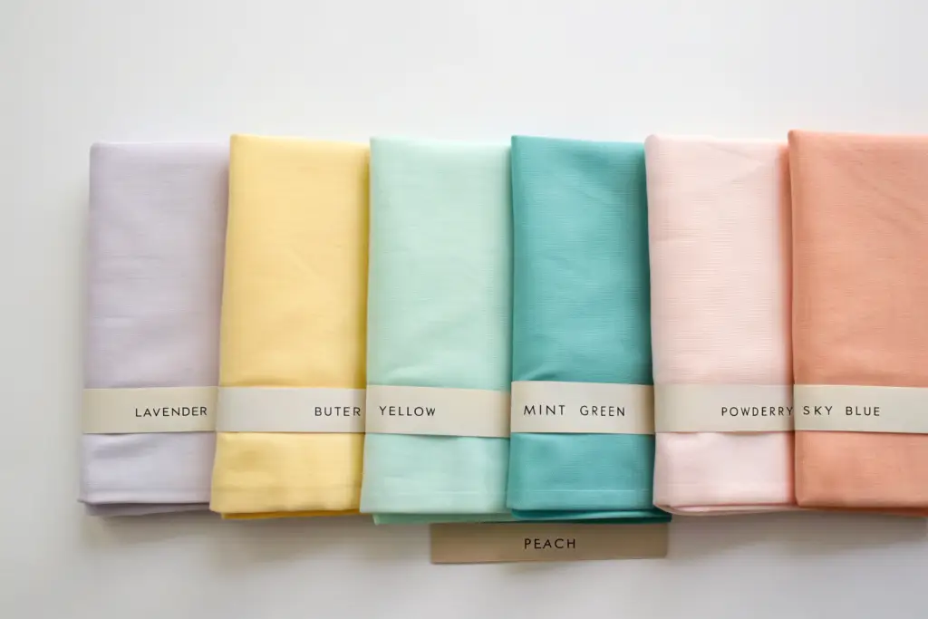
The top-performing pastel shades for Summer 2026 are soft lavender, butter yellow, pale mint green, and powdery sky blue, all with a slightly dusty, sophisticated undertone.
These four shades are the core of a winning pastel coat palette. They are the colors that are appearing again and again in the order books of the most successful North American retailers. At Shanghai Fumao, we have developed our custom pastel palette based on extensive sell-through data from our partners.
Why Are Lavender and Butter Yellow the Two Breakout Stars?
Lavender and butter yellow are the undisputed leaders of the pastel trend for 2026. Lavender has a unique versatility. It can feel cool and sophisticated in a city setting, and soft and romantic in a resort context. It flatters a surprisingly wide range of skin tones. It pairs beautifully with white, grey, denim, and even other pastels. It has a slightly mystical, creative energy that resonates deeply with the current cultural mood.
Butter yellow is pure liquid sunshine. It is the ultimate dopamine-dressing color. It is warmer and easier to wear than a sharp, acidic yellow. It feels nostalgic and optimistic at the same time. It looks incredible with the natural linen and cotton fabrics that dominate summer. A buyer from a major department store told me their butter yellow trench coat was their single best-selling outerwear SKU across all colors last spring. Both lavender and butter yellow have transcended the "trend" label and are becoming core summer fashion colors.
What Is the Appeal of Mint Green and Powdery Blue?
Mint green and powdery sky blue offer a slightly cooler, more tranquil expression of the pastel trend. Mint green has a fresh, clean, and modern feel. It evokes a sense of calm and renewal. It is incredibly popular in activewear and lifestyle brands. A mint green utility jacket or anorak feels sporty, fresh, and perfectly aligned with the gorpcore trend.
Powdery sky blue is the most accessible and universally flattering of the pastels. It is the easiest entry point for a customer who is nervous about wearing color. It is a soft, airy, cloud-like blue that feels classic and timeless. It reads as a neutral to many customers. We produce a sky blue linen blazer for a corporate women's brand, and it sells almost as well as their core navy and beige options. The appeal of these cooler pastels is their serenity. In a chaotic world, a coat in a calming, peaceful color is a small but meaningful comfort.
How Do You Merchandise and Style Pastel Coats to Drive Sales?
The pastel coat is a different kind of product than the neutral coat, and it requires a different approach to merchandising and styling. You cannot treat a lavender trench coat like a beige trench coat. The customer needs more guidance. She might be drawn to the color but uncertain how to wear it without looking like a children's television presenter. The key is to style pastels with sophistication and restraint. The color is the star. Everything else must support it.
Pastel coats sell best when styled with neutral, tonal, or monochromatic looks that allow the coat to be the hero, and when displayed in well-lit areas that make the color glow.
The merchandising must solve the "how do I wear this" question before the customer even has to ask. At Shanghai Fumao, we provide our partners with complete visual merchandising guides for the pastel category.
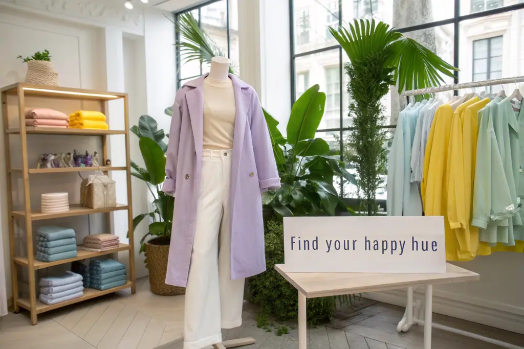
What Are the Winning Styling Formulas for Pastel Outerwear?
The most foolproof and sophisticated formula is tonal dressing. Pair a lavender coat with a top in a slightly lighter or darker shade of purple, and white or cream trousers. This creates a rich, layered, monochromatic look that feels expensive and intentional. The second formula is the pastel-and-neutral pairing. This is the easiest for a customer to adopt. A butter yellow coat thrown over a simple white t-shirt and light-wash, high-waisted jeans. The neutral base allows the coat to pop without any competition.
The most fashion-forward formula is pastel-on-pastel. Pairing a mint green blazer with a lavender top. This is an advanced look, but when merchandised correctly on a mannequin, it is incredibly inspiring. It shows the customer the full creative potential of the trend. One of our boutique partners created a window display with three mannequins, each styled in a different monochromatic pastel look. They sold the complete outfits off the mannequins multiple times over. The customer wanted the entire, joyful vision.
How Should You Display Pastel Coats to Maximize Visual Impact?
A pastel coat must be seen in good light to work its magic. Under harsh fluorescent lighting, a butter yellow can look sickly, and a lavender can look grey. Under warm, natural light or a well-placed spotlight, the colors come alive. They glow. They radiate. Place your pastel coats near the front of the store, close to natural light sources. Use warm-toned spotlights to illuminate them. The light is a critical part of the product presentation.
Color blocking is also highly effective. Create a visual rainbow. Display a lavender coat next to a mint green coat next to a butter yellow coat. The grouping is visually stunning and stops customers in their tracks. It communicates abundance and joy. A retailer in California created a "Pastel Wall" display, a single wall of her store dedicated entirely to pastel outerwear. It became an Instagram destination. Customers came into the store specifically to take photos in front of the wall. They tagged the store. The social media exposure was massive and entirely free.
What Are the Commercial Benefits of Investing in the Pastel Trend?
The fashion case for pastel coats is strong. The business case is even stronger. Investing in this color trend is not just a creative risk. It is a data-driven strategic decision that can improve your inventory turnover, protect your margins, and attract a valuable new customer demographic. The retailers who were early to embrace pastels are now reaping the financial rewards.
The commercial benefits of pastel coats include full-price sell-through, protection from the markdown cycle of neutrals, and the attraction of a younger, social-media-savvy consumer with high lifetime value.
These are the metrics that matter to your bottom line. At Shanghai Fumao, we track this data closely with our partners to continuously refine our color offering.

How Do Pastel Coats Resist the Markdown Cycle?
A black coat is a black coat. The market is flooded with them. When a customer needs a black coat, she can shop around and wait for a sale. She knows there will be plenty of inventory. A pastel coat in a specific, beautiful shade of lavender is a unique find. The customer who falls in love with that specific color knows that if she waits, her size might be gone. She is far more likely to purchase at full price. Scarcity, both real and perceived, drives conversion.
This uniqueness also means the pastel coat does not directly compete with the sea of neutrals on the sale rack. At the end of the season, your beige coats are competing with a hundred other beige coats at 40% off. Your lavender coats are one of a kind. They often sell through at full price before markdowns even need to be considered. This protects your margin and increases your inventory efficiency.
What Customer Demographic Is Driving This Trend?
The pastel trend is being driven by Millennials and Gen Z, but it is also being adopted by older, fashion-forward customers who are tired of dressing in all black and grey. The core customer for this trend is a digitally native woman who sees fashion as a form of joyful self-expression. She is active on social media. She influences her friends. She is looking for pieces that feel special and photograph beautifully.
This customer is incredibly valuable. She has a high lifetime value. She is a repeat shopper. She is an enthusiastic brand advocate who will post about your store for free. By stocking the pastel trend, you are not just selling coats. You are attracting this high-value customer into your brand ecosystem. Once she is in, she will also buy your neutrals, your dresses, and your accessories. The pastel coat is the acquisition tool.
Conclusion
The pastel summer coat is more than a fleeting color trend. It is a cultural phenomenon rooted in a deep human desire for joy, optimism, and self-expression. It is perfectly suited to the visual demands of the social media age. The breakout shades of lavender, butter yellow, mint, and sky blue are delivering exceptional full-price sell-through for retailers across North America. When styled with sophistication and displayed in beautiful light, these coats fly off the rack and attract a loyal, high-value customer.
This is a trend with real staying power and proven commercial results. The time to invest is now, while the colors still feel fresh and exciting to the consumer. At Shanghai Fumao, we have developed a beautiful pastel palette across our entire range of summer coat silhouettes. If you are ready to bring some joy to your outerwear assortment, I invite you to speak with our Business Director, Elaine. She can send you our pastel color card and show you how our coats can brighten your bottom line. You can reach her at elaine@fumaoclothing.com. Let's make summer a little more colorful, together.