A New York-based outerwear buyer called me last month with a question that keeps her up at night. She had to place orders for the coming season and needed to know which colors to bet on. Last year she overinvested in bright colors that didn't move. The year before, she played it safe with black and gray but lost sales to competitors with more interesting palettes. She asked me what our manufacturing data shows about what actually sells.
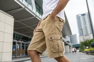
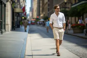
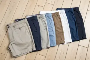
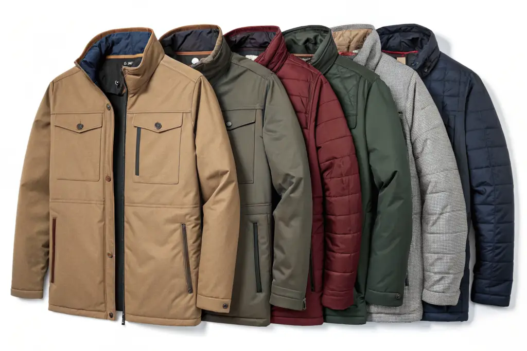
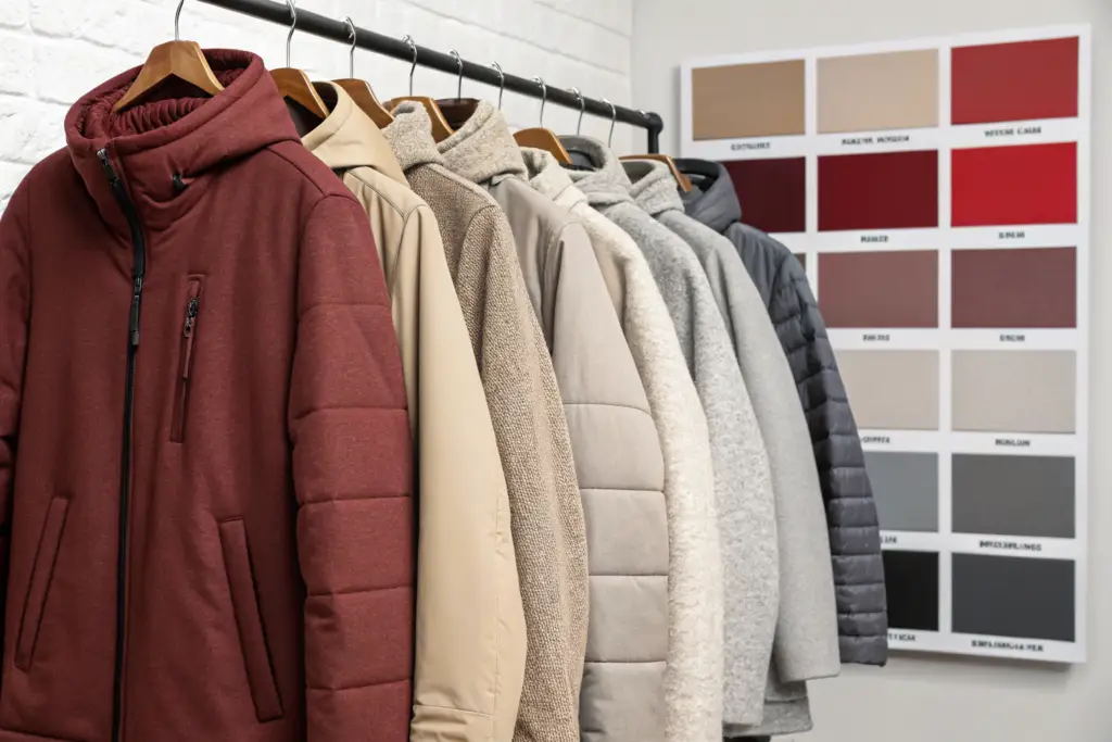
The colors selling best in outerwear for 2026 balance sophistication with approachability. Warm neutrals like camel, taupe, and oatmeal lead the category, offering versatility that customers demand. Deep, rich colors like forest green, burgundy, and navy follow closely, providing statement options that still coordinate with existing wardrobes. Gray continues its strong performance, particularly in heathered and charcoal variations. Bright colors appear in smaller doses, primarily in technical outerwear and as accent pieces rather than full collections.
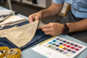
Running a manufacturing facility in Shanghai means I see color trends before they hit stores. At Shanghai Fumao, we produce outerwear for American brands across market segments. Our production orders reveal what retailers are betting on, and our sell-through data from clients shows what customers actually buy. Let me share what the numbers tell us about outerwear colors for 2026.
What Neutral Colors Are Dominating the Market?
A Seattle-based outerwear brand analyzed their sales data from the past two years. Black and gray remained strong, but the biggest growth came from warm neutrals. Camel coats that had been steady performers suddenly became bestsellers. Taupe and oatmeal colors outperformed traditional beige. Customers wanted neutral colors that felt fresh.
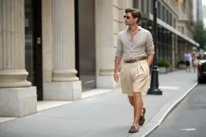
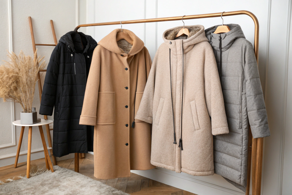
Warm neutrals lead the outerwear category for 2026. Camel, taupe, and oatmeal outperform traditional black and gray in many segments. These colors offer the versatility customers expect from neutral outerwear while providing warmth and visual interest that cooler neutrals lack. The shift reflects broader consumer preference for colors that feel natural and approachable rather than stark or clinical.
Why Is Camel Outperforming Traditional Neutrals?
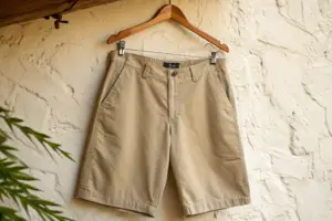
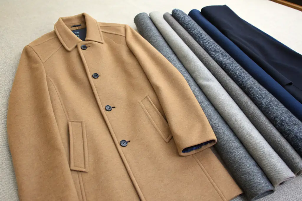
Camel has emerged as the leading neutral for outerwear, outperforming both black and beige in many market segments. Its warm undertone complements a wide range of skin tones and pairs effortlessly with both cool and warm wardrobe colors. A Boston-based retailer reports that camel coats now represent 25% of their outerwear sales, up from 10% two years ago. Camel's appeal lies in its versatility. It works with blue jeans, black trousers, gray dresses, and cream sweaters. It looks polished for work and relaxed for weekends. We have seen camel orders increase by 40% year over year across our client base. The Pantone color guide shows camel's warm undertones distinguishing it from cooler beige shades.
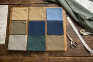
Gray and navy remain foundational colors, but they are evolving. Heathered grays with subtle texture outsell flat, uniform grays. Navy with depth, sometimes called midnight or ink, outsells basic navy. A Philadelphia-based customer described her heathered gray coat as "gray but interesting" and her midnight navy coat as "navy that doesn't look like a uniform." Gray and navy evolution reflects the broader trend toward colors with complexity. Flat, simple colors feel dated. Colors with depth and texture feel current. At Shanghai Fumao, we offer heathered and textured versions of classic neutrals to meet this demand. You can explore textured fabric options to understand how different weaves affect color appearance.
What Rich Colors Are Gaining Traction?
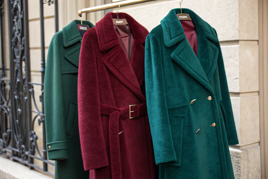
A Chicago-based designer told me her customers are ready for color but not bright color. They want shades that make a statement without screaming for attention. Forest green, burgundy, and deep teal have become her bestsellers. Customers describe these colors as "jewel tones" that feel luxurious and wearable.
Rich, deep colors in the jewel tone family are the strongest performers among non-neutral outerwear. Forest green leads the category, followed by burgundy and deep teal. These colors offer the statement value customers want without the risk of bright colors that may feel dated after one season. They coordinate with existing wardrobe pieces while adding personality.
Why Is Forest Green Leading Non-Neutral Sales?
Forest green has emerged as the top non-neutral outerwear color, outperforming burgundy and navy in many segments. Its natural, grounding quality appeals to customers seeking connection to nature. It pairs unexpectedly well with neutrals like camel, gray, and cream. A Portland-based brand reports that their forest green coat sells out faster than any other color, often at full price while other colors go on sale. Forest green's appeal spans demographics. Younger customers appreciate its contemporary feel. Mature customers value its sophistication. We have seen forest green orders increase by 55% year over year. The color psychology resource explains how forest green's connection to nature drives its popularity across demographics.
How Are Burgundy and Deep Teal Performing?
Burgundy and deep teal round out the rich color category. Burgundy offers warmth that complements fall and winter palettes. Deep teal provides a cooler alternative that still feels rich rather than bright. A Denver-based customer owns coats in all three, noting that "forest green for everyday, burgundy for warmth, teal for something different." Rich color performance varies by region. Burgundy performs strongly in colder climates where its warmth reads as appropriate. Deep teal performs well in urban markets where customers seek distinctive options. At Shanghai Fumao, we help clients select rich color palettes appropriate for their target markets. You can explore regional color preference data to understand how color performance varies across different markets.
What Role Do Bright Colors Play in 2026?
A Los Angeles-based brand learned that bright colors in outerwear require careful placement. Their electric blue parka sold well to a niche audience but their full collection of bright coats sat on shelves. They now limit bright colors to technical outerwear and accent pieces.
Bright colors in outerwear are playing a smaller role in 2026 than in previous years. When they appear, they are typically in technical outerwear where performance and visibility matter, or as accent pieces like linings, zippers, and trim. Full coats in bright colors represent a niche market rather than mainstream appeal. The trend is toward sophistication over attention-grabbing statements.
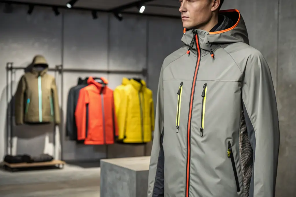
Where Do Bright Colors Still Perform?
Bright colors perform best in technical outerwear where visibility and safety are factors. Running jackets, ski coats, and rain shells in bright colors continue to sell to active customers. A Seattle-based customer buys bright yellow for running but neutral for everyday wear. Bright color applications also include linings, zippers, and trim. A coat in a neutral color with a bright lining offers personality without commitment. We help clients incorporate bright colors strategically rather than across entire collections. The technical outerwear guide explains how color choices balance visibility with consumer preference in activewear.
Are Pastels Making a Comeback?
Pastels are appearing in early spring outerwear but have not gained traction in core winter collections. Dusty rose, pale blue, and soft lavender appear in lightweight jackets and transitional pieces. A New York-based buyer notes that pastels "work for March and April but not for December and January." Pastel performance is seasonal and regional. Warmer climates see stronger pastel sales. Cold climates stick with deeper colors. At Shanghai Fumao, we help clients plan seasonal color transitions rather than applying one palette across all outerwear. The seasonal color forecast provides insights into how pastel colors perform across different seasons and regions.
How Do Texture and Finish Affect Color Perception?
A Boston-based customer showed me two coats in the same camel color. One looked rich and expensive. The other looked flat and cheap. The difference was texture and finish. The same color performed completely differently depending on how it was presented.
Texture and finish dramatically affect how colors are perceived. A camel coat in wool melton reads as classic and substantial. The same camel in a smooth, flat fabric reads as less expensive. Heathered fabrics add depth to gray and navy. Brushed finishes soften colors while adding visual interest. The fabric's finish can elevate a color or diminish it regardless of the shade itself.
What Finishes Enhance Color Appeal?
Wool melton, boiled wool, and textured weaves add depth to colors, making them appear richer and more substantial. Brushed finishes soften colors while adding a subtle sheen. A Philadelphia-based brand uses only textured fabrics for their outerwear, noting that "the same color in a textured fabric looks three times as expensive." Finish selection should align with the color. Deep colors benefit from substantial textures. Light colors work well with brushed finishes. We help clients select finishes that enhance rather than diminish their chosen colors. The fabric finish guide explains how different finishes affect color depth and perceived value.
How Does Sheen Affect Color Perception?
Sheen, the degree of light reflection, affects how colors read. Matte finishes make colors appear deeper and more grounded. Subtle sheen adds richness and depth. High sheen can make colors appear cheaper, particularly in light colors. A Seattle-based customer avoids shiny outerwear because "it always looks cheaper than matte, regardless of the color." Sheen management requires careful fabric selection. We work with mills that can achieve desired sheen levels without sacrificing quality or durability. At Shanghai Fumao, we provide sheen samples for client approval before production.
What Colors Are Declining in Popularity?
A Chicago-based brand pulled their bright red coats from the collection after three seasons of declining sales. The color that once performed well now sat on clearance racks. Customers had moved on, and the brand needed to adjust.
Certain colors are declining in outerwear popularity. Bright red, once a staple, has seen consistent declines as customers shift toward deeper, more sophisticated colors. Light beige and cream are being replaced by warmer oatmeal and camel. Cool grays are losing ground to heathered and warmer gray variations. The direction is toward colors with warmth and complexity rather than cool or neutral simplicity.
Why Is Bright Red Declining?
Bright red outerwear has declined as customers move toward deeper, more nuanced reds like burgundy and wine. The shift reflects broader preference for sophistication over statement colors. A Denver-based brand replaced their bright red with burgundy and saw sales increase despite the color being less attention-grabbing. Red evolution shows that customers still want red but in more wearable variations. We recommend clients offer deep reds rather than bright reds for core collections. The fashion color cycle explains how bold colors like red move through cycles of popularity and decline.
What Neutrals Are Losing Ground?
Light beige and cream are losing ground to warmer oatmeal and camel. These colors, once considered classic, now read as dated compared to their warmer counterparts. Cool grays are also declining, replaced by heathered and warmer gray variations. A Portland-based customer described light beige as "the color of old raincoats" and cream as "the color that always looks dirty." Neutral evolution requires ongoing attention. Colors that performed well five years ago may no longer resonate. At Shanghai Fumao, we help clients update their neutral palettes annually based on current sales data. You can explore trend forecasting resources to understand how neutral palettes evolve over time.
Conclusion
The colors selling best in outerwear for 2026 reflect a shift toward sophistication and wearability. Warm neutrals like camel, taupe, and oatmeal lead the category, offering the versatility customers demand with fresh appeal. Rich, deep colors like forest green, burgundy, and deep teal provide statement options that coordinate with existing wardrobes. Gray and navy remain strong but are evolving toward heathered and textured versions. Bright colors play a smaller role, appearing primarily in technical outerwear and accent applications. Texture and finish dramatically affect how colors are perceived, with substantial fabrics enhancing color appeal.
At Shanghai Fumao, we help brands develop color strategies that reduce inventory risk and improve sell-through. Our production data, fabric expertise, and color development capabilities ensure your outerwear colors align with market demand. If you are planning your outerwear collection, contact our Business Director Elaine at elaine@fumaoclothing.com. She can discuss color forecasting, fabric options, and how we help brands select colors that sell. You can also explore our outerwear color guide to understand how we approach color development and request color samples for your next collection.