
I still remember the phone call that made my heart sink. It was from a long-time client in Seattle. He had just received his shipment of 3,000 custom hoodies for a major university. The university colors were a specific shade of purple and gold. He opened the cartons and his heart stopped. The purple was too red. The gold was too green. They were wrong. He called me, his voice tight with panic, and said, "The university is going to reject the whole order. I'm going to lose the contract." We had approved lab dips. We had approved a sample. But somewhere between the sample and the bulk production, the color drifted. It was a costly lesson for both of us.
Ensuring color accuracy in custom apparel requires a systematic process that starts with physical color standards, continues through lab dip approvals and production monitoring, and ends with final inspection under controlled lighting. You cannot rely on digital images or memory. You must have a physical reference and a factory committed to checking every batch against that reference throughout production.
I have been in this industry for over 20 years. Color is one of the hardest things to get right. It is subjective. It is affected by light, by fabric, by dye lots. I have seen million-dollar orders rejected because of a 2% color variance. I have also seen brands build loyal followings because their colors were always perfect, season after season. The difference is process. At Shanghai Fumao, we have developed a rigorous system for color management. Let me share what I have learned so you can avoid that heart-sinking phone call.
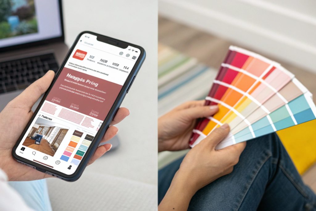
What is the difference between digital color and physical color standards?
I cannot tell you how many times a client has sent me a color and said, "Just match this." And they send a screenshot from their website. Or a photo they took on their phone. Digital color is a trap. It looks different on every screen. My monitor might show it one way. Your monitor might show it another. The factory's monitor in China might show it a third way. None of them are accurate.
Digital color is unreliable for manufacturing because every screen displays color differently. The only reliable standard is a physical color standard, such as a Pantone swatch, a lab dip on the actual fabric, or a physical sample of the target color. This physical reference can be viewed and matched under controlled lighting conditions, removing the guesswork and variability of screens.
I had a client from New York who sent me a color he wanted for a line of t-shirts. He took a photo of a car he liked and emailed it to me. He said, "Match this blue." We did our best. We made a lab dip. He approved it from his screen. When the bulk t-shirts arrived, he was furious. The blue was not the blue of his car. But of course it wasn't. His car was under sunlight when he photographed it. The photo was compressed by email. My screen showed it differently. The dye we used was on cotton, not car paint. It was a recipe for disaster.
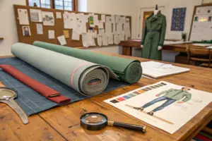
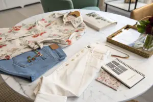
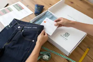
The lesson is simple. Never use a digital image as your only color reference. Always provide a physical standard. The industry standard is a Pantone swatch. You can buy a Pantone swatch book and send us the number. We can then buy the same swatch book and look at the exact same color. If you have a fabric swatch of the target color, even better. Send us a piece. We can match it physically. This is the only way to ensure everyone is literally looking at the same color. For more on Pantone systems, you can visit the Pantone website.
Why do colors look different on cotton, polyester, and blends?
This is a fundamental truth of textile dyeing. The same dye formula will look different on different fibers. Cotton is a natural fiber. It absorbs dye differently than polyester, which is a synthetic fiber. Blends absorb dye in a mix of ways.
Think of it like painting on wood versus painting on metal. The paint is the same, but the final look is different because the surfaces are different. The same is true for fabric. A specific Pantone color might look vibrant and deep on cotton. On polyester, it might look brighter and more flat. On a cotton-poly blend, it might look somewhere in between, but not exactly like either.
This is why we always make lab dips on the actual fabric you will use. We do not use a standard cotton swatch if your garment is a blend. We dye a piece of your specific fabric. Then we compare it to your physical standard under a color-corrected light. Only then do we know if we have a match. A client once asked us to match a color on a recycled polyester fabric. The first lab dip was close, but not perfect. We adjusted the formula and tried again. On the third try, we got it exactly right. If we had used a standard cotton swatch, we would have been wrong and the bulk order would have been a disaster. Understanding fiber-specific dyeing is a technical skill that experienced factories have developed over years.
How do lighting conditions change how we perceive garment color?
Light is everything when it comes to color. A color that looks perfect in your office under fluorescent lights might look completely different in a retail store under halogen lights. It might look different again in sunlight.
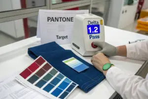
This is why professional color matching is done in a light box. A light box has several different light sources. It has a daylight setting, which simulates noon sun. It has a store lighting setting, which simulates fluorescent light. It has a home lighting setting, which simulates incandescent bulbs. You look at your standard and your lab dip under each light. They should match under all of them. If they match under daylight but not under store light, you will have a problem.
I always advise clients to approve lab dips in a light box. Do not just hold them up to a window. Do not look at them under your desk lamp. Use a proper light box. If you do not have one, ask your factory to send you photos taken in a light box with the different light settings shown. We do this for every client. We send photos of the lab dip next to the standard under D65 daylight, under TL84 store light, and under A incandescent light. This gives you a complete picture. For more on standard lighting for color assessment, you can look at ASTM D1729, the standard practice for visual evaluation of color differences.
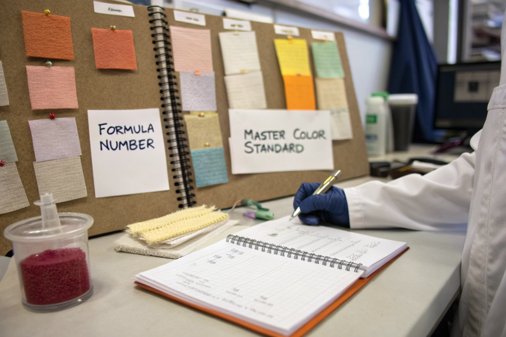
What is the lab dip process and why is it non-negotiable?
I have had new clients ask me, "Can we skip the lab dip? It costs extra and takes time. Can't you just match the color from the sample?" I always say no. Skipping the lab dip is like building a house without a blueprint. You might get lucky, but you are much more likely to end up with a disaster.
A lab dip is a small sample of fabric dyed to match your color standard. It is non-negotiable because it is the only way to verify that the dye formula will produce the correct color on your specific fabric before you commit to dyeing thousands of yards. The cost of a lab dip is tiny compared to the cost of a rejected bulk shipment.
I remember a client who was in a huge rush. He needed his order for a trade show. He asked us to skip the lab dip and just go straight to bulk dyeing based on a previous order. The previous order was on cotton. This order was on a cotton-poly blend. We tried to explain the risk, but he insisted. We dyed the bulk fabric. It came out wrong. The color was off. We had to re-dye it, which cost us time and money, and cost him his trade show deadline. He learned the hard way that the lab dip is not a formality. It is a necessity.
The lab dip process is simple. We take your physical color standard and your fabric. Our dye house creates a formula and dyes a small swatch. We send it to you. You compare it to your standard under proper lighting. If it is correct, you approve it. If it is close but not perfect, we adjust the formula and make another lab dip. We keep going until it is exactly right. Then, and only then, do we dye the bulk fabric. This process protects everyone.
How many lab dip rounds should you budget for?
This depends on the color and the fabric. Some colors are easy. A basic black on cotton might be perfect on the first try. Other colors are hard. A specific shade of red on a synthetic blend might take three or four tries.
I always advise clients to budget for at least two rounds of lab dips in their timeline and budget. The first round gets you close. The second round fine-tunes it. Sometimes you get it on the first round, and that is great. You saved time. But if it takes three rounds, you are prepared. You are not stressed.
I had a client who wanted a very specific shade of teal on a linen fabric. Linen is a challenging fabric for dyeing. It took us four rounds of lab dips to get it exactly right. The client was patient because we had warned them it might take time. They had built that time into their schedule. When the bulk fabric was dyed, it was perfect. The color was exactly what they wanted. That patience paid off in a beautiful final product. If you are working with challenging colors or fabrics, be prepared for multiple rounds. It is part of the process of getting it right. For a deeper look at the dyeing process, resources from the Society of Dyers and Colourists are excellent.
What should you look for when approving a lab dip?
Approving a lab dip is not just about saying "yes, that looks good." You need to be systematic. You need to look at several things.
First, look at the color itself under multiple light sources. As I said earlier, use a light box or at least look at it in different lights. Does it match your standard under daylight? Under store light? Under home light?
Second, look at the depth of color. Is it the same saturation as your standard? Sometimes a lab dip might be the right hue but too light or too dark. Compare them carefully.
Third, look at the evenness of the dye. Is the color consistent across the whole swatch? Are there any streaks or patches?
Fourth, look at the back of the fabric. Is the color penetration the same as your standard? For some garments, the back matters. For others, it doesn't. Know your requirements.
Finally, sign and date the approved lab dip. Send it back to the factory. This physical, signed swatch becomes the master standard for the entire bulk production. It is what we will compare the bulk fabric to. It is your proof later if there is a dispute. We keep these approved lab dips in our files for every order. They are our bible for color. For more on color evaluation, this guide to visual color assessment from X-Rite is very helpful.
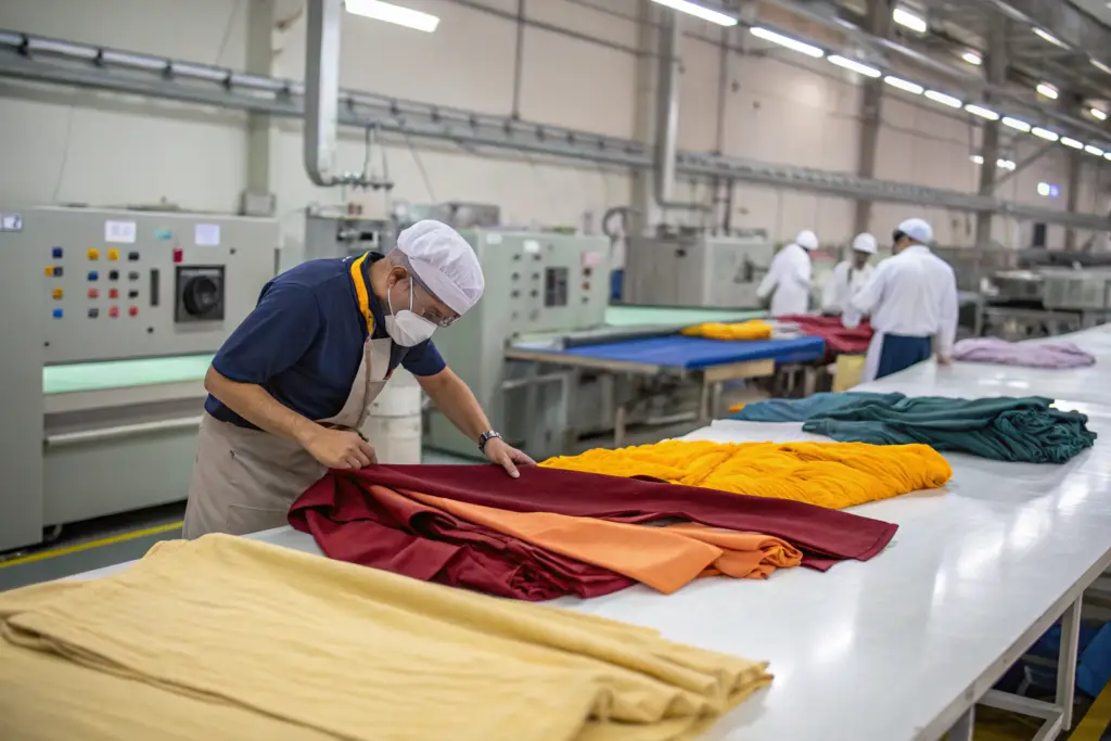
How do you maintain color consistency from sample to bulk production?
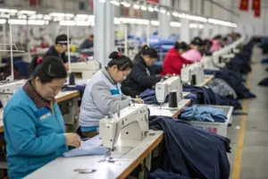
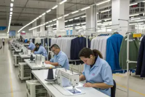
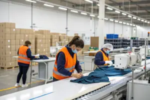
Getting the lab dip right is a huge step. But it is not the end. The real challenge is maintaining that color when you scale up from a tiny swatch to hundreds or thousands of yards of fabric. Bulk dyeing is a different process. It is harder to control. This is where many factories fail.
Maintaining color consistency from sample to bulk production requires rigorous process control, including precise measurement of dyes and chemicals, strict monitoring of dye bath temperature and time, and continuous sampling during the bulk run. The bulk fabric must be compared to the approved lab dip throughout the dyeing process, not just at the end.
I remember a client who had a beautiful lab dip approved. It was a perfect match. We dyed the bulk fabric. The first few yards were perfect. Then, halfway through the run, something happened. A valve malfunctioned and the temperature drifted. The next batch of fabric came out slightly darker. Our dye house manager caught it immediately. He stopped the run. He separated the darker fabric. He fixed the valve and restarted. We then had to decide what to do with the darker fabric. We ended up using it for a different style where the color variation was less critical. But if we had not been monitoring continuously, the whole run could have been ruined.
This is why continuous monitoring is essential. The dye house should be pulling samples throughout the run and comparing them to the approved lab dip. They should be checking for consistency from batch to batch and from roll to roll. A reputable factory will have this process built in.
What causes color variation within the same production run?
Color variation within a single production run is surprisingly common. It can happen for several reasons. Understanding them helps you know what to look for.
The first cause is temperature variation. Dyeing is a chemical reaction. Temperature affects how the dye reacts with the fabric. If the temperature is not perfectly consistent throughout the dye bath, some parts of the fabric will be a different color. This is called "side-to-side" or "end-to-end" variation.
The second cause is dye concentration. If the dye is not mixed perfectly, or if it settles during the process, the concentration can vary. This leads to color differences.
The third cause is fabric variation. Even within the same roll, fabric can vary slightly in how it absorbs dye. This is more common with natural fibers like cotton, which can have natural variations.
The fourth cause is water quality. The mineral content of the water can affect dye uptake. This is why consistent water treatment is important.
A good factory controls all these variables. They have calibrated equipment. They have trained operators. They have standard operating procedures. They test the water. They test the dye solutions. They do everything they can to ensure consistency. When something does go wrong, they catch it early. For more on quality control in dyeing, the AATCC test methods are the industry standard.
How do you handle a shipment with acceptable but not perfect color?
Sometimes, despite everyone's best efforts, color variation happens. The question is, how much variation is acceptable? This is where a "color tolerance" or a "shade band" comes in.
Before production starts, you and the factory should agree on an acceptable tolerance. This is often expressed in terms of a "grey scale" rating. The grey scale is a standard used in the industry to rate color difference. A rating of 4 or higher usually means the color difference is acceptable to most buyers. A rating of 3.5 or lower means it is noticeable and likely unacceptable.
If the bulk fabric falls within the agreed tolerance, you accept it. If it falls outside, you have options. You can reject the fabric and have the factory re-dye it, but this is expensive and time-consuming. You can accept it at a discounted price, if the color difference is minor and you think you can sell it. Or you can use it for a different purpose, like samples or a lower-priced line.
I had a client who received a shipment where the color was slightly off, but within our agreed tolerance. It was a 4 on the grey scale. Most customers would not notice. But this client was a luxury brand with very high standards. They rejected it. We had to re-dye the entire order. It cost us both time and money, but it protected their brand. The lesson is to set your tolerance before you start, and then stick to it. If you want a very tight tolerance, be prepared to pay more and wait longer, because it is harder to achieve. For more on grey scale ratings, you can look at ISO 105-A03, the standard for grey scale for assessing change in color.
Conclusion
Color accuracy is not a mystery. It is a process. It starts with a physical color standard, not a digital image. It continues through careful lab dip approvals on your actual fabric. It requires rigorous monitoring during bulk production. And it ends with final inspection under controlled lighting. When you follow this process, you eliminate guesswork. You protect your brand from costly rejects. You deliver products that look exactly the way you intended.
At Shanghai Fumao, we have built our reputation on color accuracy. We have a dedicated color laboratory. We have trained technicians. We have calibrated light boxes. We have relationships with dye houses that understand the importance of consistency. We know that for many of our clients, color is their brand. We treat it with the respect it deserves.
If you are planning a custom apparel order and color accuracy is critical to your success, I invite you to reach out. Let us talk about your color standards, your fabric, and your timeline. Let us show you how our process ensures that what you design is exactly what you get. Please contact our Business Director, Elaine, at elaine@fumaoclothing.com. We are ready to help you get the perfect color, every time.