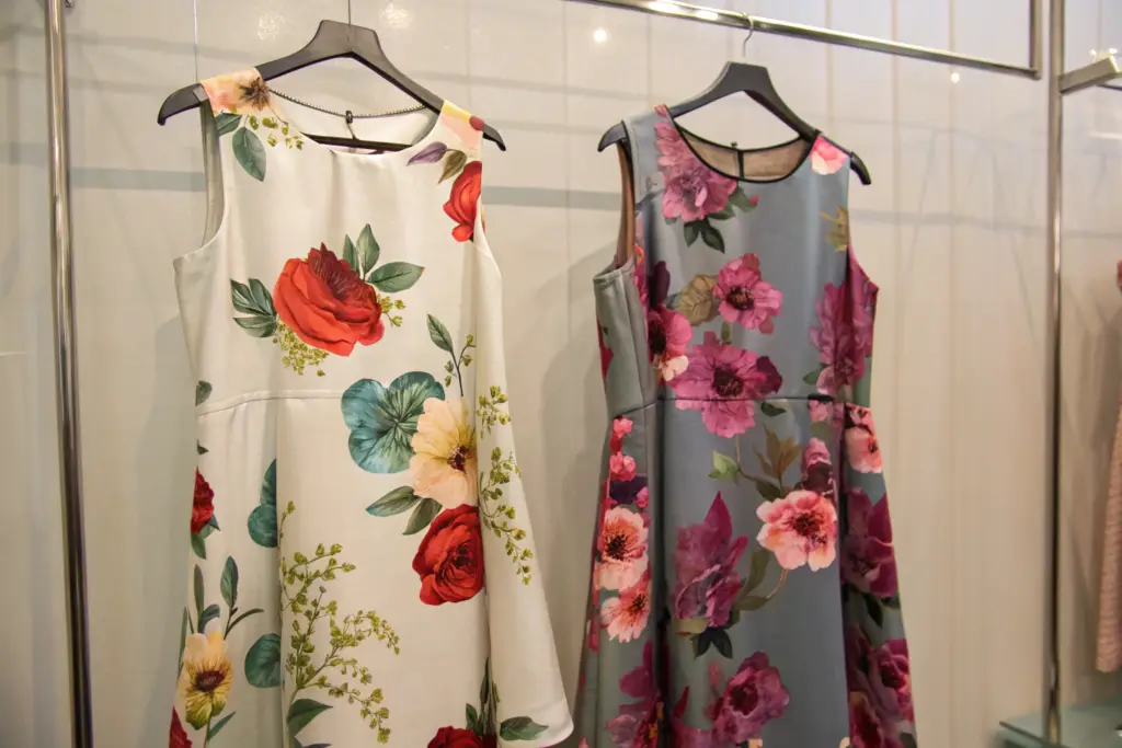
You have seen it. Two dresses hang side by side on a rack. Both are A-line. Both are floral. One looks like a designer piece. The other looks like a discount store knockoff. The difference is not the silhouette. It is not the stitching. It is something about the print itself. The colors on the first dress glow from within the fabric. The petals have depth and shadow. The print feels like it belongs to the cloth, not like it was stamped on top. The second dress has colors that sit flat and dull on the surface. The flowers look like a photocopy. You cannot always articulate why one print looks expensive and another looks cheap, but you know it the moment you see it. Your customer knows it too. She may not understand print technology, but she understands desire, and desire is triggered by the premium print before she even touches the fabric.
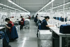
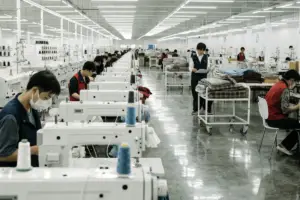
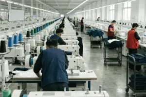
Shanghai Fumao Clothing’s floral prints achieve a premium look through the combination of four specific technical choices that most manufacturers are unwilling to invest in: high-resolution digital printing on natural fiber bases that allow the ink to penetrate the yarn rather than sit on the surface, an expanded color gamut using extended ink sets that reproduce subtle tonal transitions and deep, complex hues, rigorous color management through spectrophotometer-calibrated workflow from design file to fabric strike-off, and fabric-specific print optimization where the print file is adjusted for the absorption characteristics of linen, cotton voile, and cotton poplin individually. The result is a print that looks like it grew from the fabric, not one that was applied to it. This is not a secret technique. It is a deliberate investment in technology, time, and skill that commodity manufacturers decline to make.
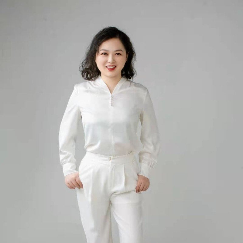
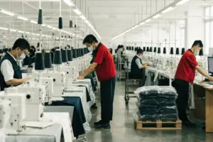
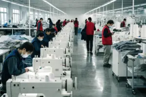
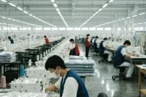
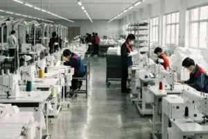
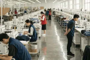
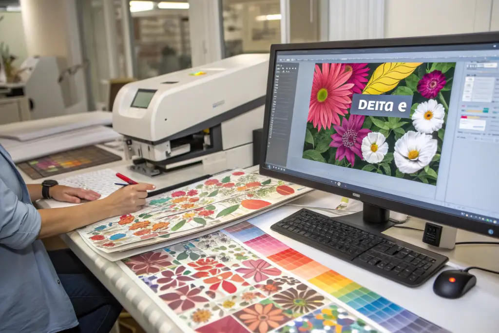
My name is Elaine. At Shanghai Fumao, I oversee the print development process for our woven dresses and linen collections. I have spent years working with print partners, testing fabric-ink combinations, and refining the workflow that turns a designer’s floral vision into a production-ready print that retains its vibrancy wash after wash. In this article, I will deconstruct exactly how we achieve premium print quality, from the initial color calibration to the final fabric strike-off. I will also show you how to evaluate print quality yourself, so you can distinguish a premium print from a cheap one regardless of which supplier you are evaluating.
How Does Digital Printing on Natural Fibers Create a More Luxurious Look Than Traditional Methods?
The first decision that determines print quality is the printing method. Traditional screen printing pushes thick inks through mesh screens onto the fabric surface. It is economical for large, simple designs in limited colors. It is not capable of reproducing the subtle color gradients, fine details, and photorealistic effects that make a floral print feel luxurious. Digital printing, in contrast, sprays microscopic droplets of ink directly into the fabric. On natural fibers like linen and cotton, the ink penetrates the yarn rather than sitting on the surface. This creates a print that is integrated into the fabric, not applied on top of it. When you touch a digitally printed linen floral, you feel the texture of the linen, not the texture of dried ink. The print and the fabric are one.
We use high-resolution digital printing for all our floral dress fabrics, with a resolution of 600 to 1200 DPI depending on the fabric type. This resolution captures the fine veins in a petal, the subtle transition from a deep rose center to a pale petal edge, and the watercolor wash effects that define premium contemporary florals. Screen printing, even at its best, cannot achieve this level of detail or this degree of integration with the fabric. The digital process also eliminates the color registration errors that occur in screen printing when the fabric shifts slightly between color stations, producing that telltale blurry or misaligned look that screams “cheap.”
What Is the Difference Between Pigment, Reactive, and Acid Digital Inks?
Not all digital printing is the same. The ink chemistry determines how the color bonds to the fiber, how vibrant it remains after washing, and how the fabric feels to the touch. The choice of ink is a technical decision that has significant aesthetic and durability consequences.
Pigment inks sit on the surface of the fiber and are bonded with a heat treatment. They work on most fabric types, which is why they are common in entry-level digital printing. But the hand feel is often slightly stiff, and the colors can fade more quickly with washing. Reactive inks chemically bond with natural cellulose fibers like linen, cotton, and viscose. The ink molecule forms a covalent bond with the fiber molecule. The color becomes part of the fiber itself. The result is a print that is wash-fast, light-fast, and completely soft to the touch because there is no surface residue. The fabric drapes exactly as it did before printing. Acid inks are used for protein fibers like silk and wool. They produce brilliant, vibrant colors on those specific substrates.
At Shanghai Fumao, we specify reactive inks for all our linen and cotton floral prints. This is the most expensive ink chemistry, and it requires a steaming and washing post-treatment that adds time and cost. The result is a print that survives fifty washes without significant fading and feels indistinguishable from unprinted fabric to the touch. A customer who buys a floral linen dress from one of our brand partners can wash that dress repeatedly, and the flowers will remain as vibrant as the day she bought it. The digital textile printing ink types and applications article explains the chemistry and the performance characteristics of each ink type. A premium print requires reactive inks on natural fibers. A cheap print uses pigment inks on polyester. The difference is visible, tactile, and durable.
Why Does the Resolution and Color Gamut of Digital Printing Matter for Florals?
Floral prints demand more from a printing system than geometric or abstract prints. A floral has fine lines in the petal veins. It has subtle tonal transitions from the shadowed center of the flower to the sunlit edge of the petal. It has a depth and dimensionality that requires a wide color gamut and high resolution to reproduce accurately.
Resolution in digital textile printing is measured in DPI, dots per inch. A minimum of 600 DPI is required for a print that looks sharp to the naked eye. For highly detailed florals with fine botanical illustrations, 1200 DPI produces a visibly superior result. The higher resolution captures the micro-details that make a floral print feel rich and realistic rather than flat and cartoonish. Color gamut refers to the range of colors the printer can reproduce. Standard digital printers use four ink colors: cyan, magenta, yellow, and black (CMYK). Extended gamut printers add additional ink colors—orange, violet, green, or specialized red and blue—to reproduce a wider spectrum. Florals with complex, saturated hues—a deep burgundy peony, a coral ranunculus with pink undertones, a dusty lavender with grey overtones—require an extended gamut to reproduce accurately. A CMYK-only printer will approximate these complex colors. The result will be close, but slightly flat, slightly off. The customer may not know why the dress doesn’t look as beautiful as the photo, but she will feel the difference. Our print partners use extended gamut digital printers with eight to twelve ink colors. The digital print resolution and color gamut for fashion textiles article explains the technical requirements for photographic-quality fabric printing. This is not marketing language. It is measurable color science.
How Does Color Management Ensure Your Floral Print Matches Your Vision Exactly?
You approve a print design on your computer screen. The pinks are perfect. The greens are exactly the sage tone you wanted. Three weeks later, the fabric strike-off arrives. The pinks are orangey. The greens are muddy. You send it back. The supplier adjusts. The second strike-off is closer but still not right. You settle, because the production deadline is looming. The bulk order arrives. The colors are close to the second strike-off but noticeably different from what you originally approved. This is the most common and most frustrating failure in print development. It is not caused by a bad printer. It is caused by absent or broken color management.
Our color-managed workflow ensures that the colors you approve on your screen, on the paper proof, and on the final fabric strike-off are objectively the same colors. The process uses spectrophotometer measurements at every stage, calibrated monitors and lightboxes, and a shared digital color standard that eliminates subjective “looks good to me” judgments. When we send you a fabric strike-off for approval, we also send a color measurement report showing the Delta E values of the printed colors against the digital standard. A Delta E below 2.0 is imperceptible to the human eye. We target a Delta E below 1.5 for all critical colors. This is a quantitative, verifiable standard, not a subjective opinion.
What Is a Spectrophotometer-Calibrated Workflow and Why Does It Eliminate Color Surprises?
A spectrophotometer is a device that measures the exact wavelength of light reflected from a surface. It produces a numerical description of a color that is independent of the lighting conditions, the observer’s mood, or the screen’s brightness setting. Two colors that look identical under one light but different under another will have different spectrophotometer readings. The device catches metamerism, the phenomenon where colors match under one light source but not another, before it becomes a costly production problem.
Our color workflow operates as follows. You provide a print design file. We open it on a calibrated monitor—a screen that has been adjusted to a known color standard using a hardware calibration device. We measure the critical colors in your design with a spectrophotometer and establish the digital color standard. When our print partner produces the paper proof, they measure the proof against the digital standard and provide a Delta E report. If the Delta E is below our threshold, the proof is approved for fabric strike-off. When the fabric strike-off is produced, it is measured again against the same digital standard. This closed-loop process ensures that the color you approved on the screen is the color on the paper proof and is the color on the fabric. There are no surprises. If a color is out of tolerance, we know before we send you the strike-off, and we fix it before you see it. The spectrophotometer color measurement in textile printing guide explains the technology and the workflow. It is the standard for premium print production. Factories that skip this step are relying on a human eye adjusting printer settings by trial and error. That is not quality control. That is gambling.
Why Do We Adjust Print Files Specifically for Linen Versus Cotton?
Linen and cotton absorb ink differently. Linen fibers are thicker, more absorbent, and have a natural irregularity that scatters light. Cotton fibers are finer, more uniform, and reflect light more evenly. The exact same print file, printed on linen and on cotton with the same ink and the same printer settings, will produce noticeably different results. The linen print will look softer, more muted, with a slight vintage quality. The cotton print will look crisper, brighter, and more saturated.
Neither result is wrong, but one may be wrong for your specific design. A delicate watercolor floral designed for a soft, romantic aesthetic may look perfect on linen but washed-out on cotton. A bold, graphic tropical floral may look spectacular on cotton but muddy on linen. We adjust the print file—the saturation levels, the contrast curve, the black point—for the specific fabric substrate to achieve the intended aesthetic result. This adjustment is done by our print partner’s color technician, based on years of experience with specific fabric-ink combinations and verified with spectrophotometer measurements. A factory that does not perform fabric-specific adjustments is treating all fabrics as interchangeable. They are not. The fabric-specific color adjustment for digital textile printing article explains how fiber characteristics affect print appearance. A premium print is optimized for its substrate. A generic print is not.
What Fabric Base Choices Elevate a Floral Print From Ordinary to Extraordinary?
The printing technology and the color management are invisible to the end customer. The fabric base is the first thing she touches. It is the physical experience of the dress. A premium print on a cheap fabric is a contradiction. The print may be beautiful, but if the fabric feels like sandpaper or looks like plastic, the dress is a disappointment. The fabric and the print are partners. A great print on a great fabric is greater than the sum of its parts. A great print on a poor fabric is a waste of a great print.
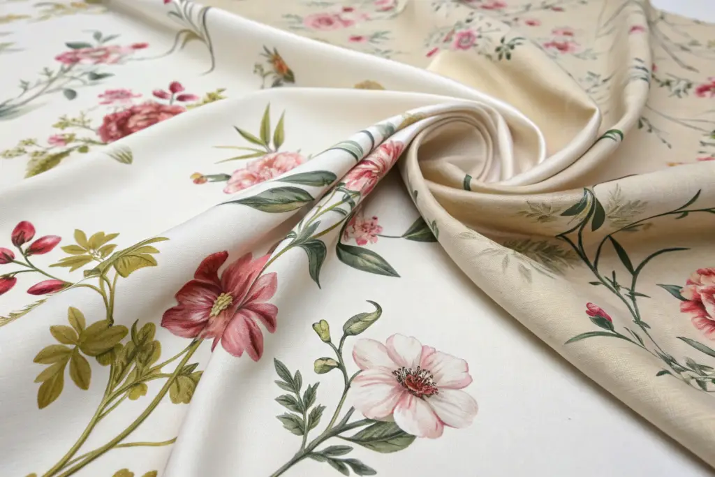
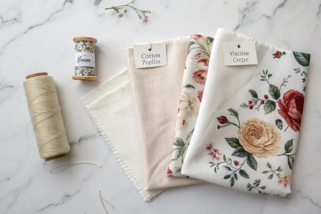
We print our florals on a curated selection of premium natural fiber fabrics, each chosen for its specific aesthetic and performance characteristics. Our standard linen is a 200 GSM pre-washed pure European flax with a soft hand and a characteristic slub texture that adds depth to floral prints. Our cotton voile is a 100% long-staple cotton, lightweight and semi-sheer, with a fluid drape ideal for tiered dresses. Our cotton poplin is a tightly woven, crisp fabric that holds structural A-line shapes beautifully. We do not print on polyester satin, polyester crepe, or poly-blend bases because the synthetic sheen undermines the natural, authentic aesthetic that our brand partners’ customers seek. The fabric base is a quality decision, not a cost decision.
Why Does Linen’s Natural Slub Texture Enhance Floral Prints in a Way That Smooth Fabrics Cannot?
Linen’s slub texture—the small, irregular thickenings in the yarn—is sometimes seen as a defect in mass-market fabrics that prize uniformity. In a premium context, the slub is a feature. It creates a subtle, organic surface texture that catches light unevenly, giving the printed floral a depth and a handcrafted quality that a perfectly smooth fabric cannot replicate.
When a floral print is applied to smooth cotton poplin, the print looks crisp, clean, and modern. This is beautiful in its own way and appropriate for certain aesthetic directions. When the same floral print is applied to textured linen, the print takes on a different character. The ink settles into the slubs slightly differently than it settles into the smooth areas. The result is a print that has a subtle, built-in patina, as if the dress has been loved for years and the print has softened with age. This quality is highly valued by the contemporary and artisanal brand segment. It communicates authenticity, craft, and a connection to natural materials. The customer who buys a linen floral dress is often buying that authenticity as much as she is buying the floral pattern itself. The linen fabric characteristics and aesthetic properties article describes the unique visual and tactile qualities of linen. The slub is not a flaw. It is the texture of luxury, and our printing process is calibrated to work with it, not against it.
How Do We Ensure the Fabric Hand Feel Remains Soft After Printing?
A common complaint with printed fabrics, especially those printed with pigment inks, is that the printed area feels stiff, rough, or plasticky. The ink sits on the surface and changes the tactile quality of the fabric. A floral dress that feels soft on the unprinted areas but stiff on the printed flowers is a quality failure. The customer feels the inconsistency every time she touches the dress.
Because we use reactive inks that bond chemically with the fiber rather than sitting on the surface, the printed fabric retains its original hand feel. The ink is inside the yarn, not on top of it. After printing, the fabric undergoes a washing and softening post-treatment that removes any residual chemistry and restores the fabric’s natural softness. The result is a fabric that feels uniformly soft across both printed and unprinted areas. The customer cannot feel where the print begins and ends. This is particularly important for A-line dresses with large, all-over floral prints, where the print coverage is extensive. A dress with 80% print coverage that feels soft and breathable everywhere is a premium garment. A dress with 80% print coverage that feels like a plastic sheet on the printed areas is a return. The fabric hand feel after digital printing article explains the impact of different ink chemistries on fabric softness. Reactive inks are the premium choice specifically because they preserve hand feel.
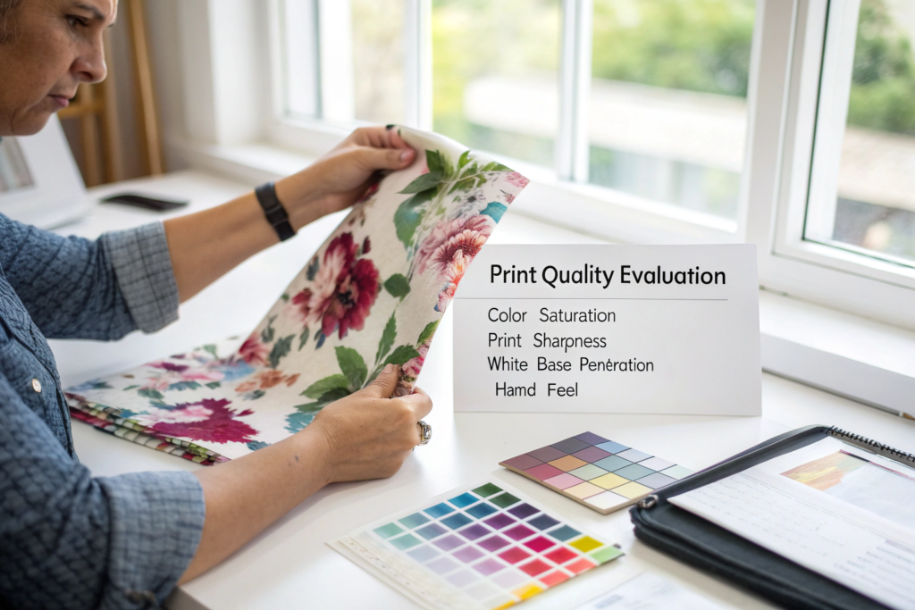
How Do You Evaluate Print Quality Yourself When Comparing Suppliers?
You have read about our process. But you should not take any supplier’s word for their print quality. You should test it. Print quality is objectively evaluable with a few simple tools and a systematic approach. When you receive a fabric strike-off or a sample dress from any supplier, including us, you can perform a five-minute evaluation that reveals the truth about their print technology, their color management, and their attention to detail.
To evaluate a floral print’s quality, perform these five checks in order. First, the back-of-fabric check. Turn the fabric over. A premium reactive-ink print on natural fibers shows the print visible on the back side because the ink has penetrated through the yarn. A cheap pigment print shows a pale, ghostly version or nothing on the back because the ink sits on the surface. Second, the stretch-and-recovery check. Gently stretch the printed area. The print should not crack, whiten, or show stress marks. Third, the wash-fastness check. Wash the fabric sample once according to the care label. Compare it to an unwashed reference. A premium print shows no visible fading. Fourth, the hand-feel check. The printed area should feel as soft as the unprinted area. Fifth, the print-alignment and resolution check. Inspect the print with a magnifying loupe. The edges should be sharp, the colors should be in perfect registration, and there should be no visible dot matrix or pixelation.
Why Is the “Back of the Fabric” Test the Quickest Way to Identify Reactive Versus Pigment Printing?
The back-of-fabric test takes two seconds. Turn the fabric over. If the print is clearly visible on the back, with colors that are muted but recognizable, you are looking at a print that was produced with reactive inks that penetrated the fiber. If the back is blank, or shows only a faint, ghostly impression of the print, you are looking at a pigment print where the ink sits on the surface.
This test is a reliable proxy for overall print quality because reactive printing is the more expensive, higher-quality process, and a factory that invests in reactive printing is more likely to invest in other quality measures. The pigment-printed fabric will also feel stiffer in the printed areas, fade faster with washing, and lack the integrated, “part of the fabric” look of a reactive print. The how to identify digital print quality on fabric guide provides additional visual and tactile tests for print evaluation. The back-of-fabric test is the fastest and most revealing. Use it first, and let the result guide your deeper investigation.
Conclusion
A premium floral print is not an accident of good taste. It is the product of specific, deliberate technical choices. The choice of digital printing over screen printing, for its resolution and its tonal subtlety. The choice of reactive inks over pigment inks, for their color penetration, wash-fastness, and hand feel. The choice of a spectrophotometer-calibrated color workflow, for its objective, measurable color accuracy. The choice of fabric-specific file optimization, to ensure the print looks intended on linen versus cotton. And the choice of premium natural fiber bases—European flax linen, long-staple cotton voile and poplin—that provide the tactile and visual foundation that elevates a print from applied decoration to integrated luxury.
At Shanghai Fumao, we make these choices not because they are cheap or easy, but because they are the only way to produce a floral print that meets the standards of the contemporary, premium brands we serve. We invite you to test our prints against these criteria. Request a fabric strike-off of any floral from our print library, or send us your design for a custom print development. Wash it, stretch it, turn it over, inspect it with a loupe. Let the print prove itself.
My name is Elaine. My email is elaine@fumaoclothing.com. Contact me to request print samples, to discuss a custom floral development, or to ask technical questions about how we would approach your specific fabric and design requirements. Your floral print should be the reason a customer picks up your dress. Let’s make sure it is.