Last season, a brand owner from Portland sent me a photo of her newly arrived summer trench coats. The coats were beautiful. The fabric was a crisp, water-repellent cotton-nylon blend. The construction was flawless. The color was a perfect sand-beige. But the logo on the back neck label was crooked. The embroidery thread tension had been set too high, and the lettering was puckered. The customer-facing brand mark, the single most visible element of her brand identity, looked like an afterthought. She had spent months perfecting the fit and the fabric, and she had spent zero time thinking about how the logo would be applied to the garment. The crooked logo was the only thing her wholesale buyer noticed during the receiving inspection. The buyer accepted the shipment with a warning, and the brand owner spent $2,800 having a local contractor unpick and re-embroider 1,400 neck labels. The lesson was expensive but clear. Logo customization is not a finishing detail. It is a production process that requires the same level of specification and quality control as the coat itself.
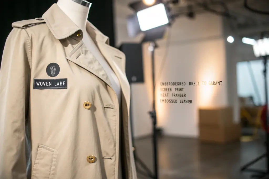
You can customize the logo on a lightweight summer trench coat using one of five primary application methods: woven label, embroidered direct-to-garment, screen print, heat transfer, or embossed leather patch. The method you choose depends on the coat's fabric weight, the desired aesthetic, the production volume, and the cost per unit. Woven labels and embroidered logos are the most common for summer trench coats because they communicate quality and withstand the care cycles of a lightweight outerwear garment. At Shanghai Fumao, we produce logo customization for our clients using all five methods. We guide the client through the method selection, the artwork preparation, the strike-off approval process, and the quality control checks that ensure every logo on every coat is perfectly placed, perfectly aligned, and perfectly executed.
The logo is the brand's signature on the garment. It is the element that transforms a generic factory-produced coat into a branded product that commands a premium price and builds customer recognition. The logo customization process is not complicated, but it requires specific technical knowledge about fabric compatibility, application methods, and quality standards. Let me walk through every method, every consideration, and every step of the process so your logo arrives exactly as you envisioned it.
What Are The Best Logo Application Methods For Lightweight Summer Fabrics?
The fabric of a summer trench coat is the constraint that determines which logo application methods will work and which will fail. A lightweight cotton-nylon blend at 120 GSM is a different substrate than a heavyweight wool melton at 400 GSM. The lightweight fabric is delicate. It can be damaged by excessive heat, punctured by thick embroidery needles, or distorted by heavy screen print ink. The logo application method must be chosen for compatibility with the specific fabric, not just for the aesthetic effect.
The best logo application methods for lightweight summer trench coat fabrics are woven labels for the back neck branding, high-density embroidery with a water-soluble stabilizer for chest or sleeve logos, and soft-hand screen print or heat transfer for large back graphics or interior branding. Woven labels are the safest and most versatile method. They are produced separately, inspected for quality before attachment, and sewn into the garment with a simple straight stitch that does not damage the fabric. Embroidery on lightweight fabrics requires a fine needle, a low stitch density, and a water-soluble backing that dissolves after the embroidery is complete, leaving the fabric soft and unpuckered. Screen print and heat transfer require low-cure-temperature inks and adhesives that bond to the fabric without scorching or stiffening the hand feel. At Shanghai Fumao, we test the logo application method on the actual bulk fabric before production begins. We produce a strike-off sample for the client's approval, and we check the adhesion, the colorfastness, and the fabric integrity after five wash cycles.
The wrong application method can ruin a production run. A thick embroidery on a lightweight cupro fabric creates a puckered, distorted surface that cannot be repaired. A high-temperature heat transfer on a polyester-nylon blend can scorch the fabric, leaving a permanent yellow mark around the logo. The method selection is a technical decision that should be made with the factory's guidance.
When Should You Choose A Woven Label Over A Printed Label For Your Brand Mark?
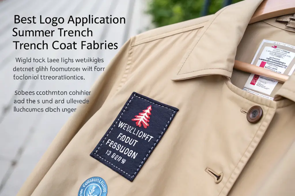
The woven label and the printed label are the two most common methods for the back neck brand mark, the label that carries the brand name or logo at the inside center back of the coat. The choice between them is a decision about perceived quality, durability, and cost.
A woven label is made by weaving polyester or cotton threads together to form the design. The weaving process creates a label with a distinct texture, a subtle three-dimensionality, and a durability that survives hundreds of wash cycles without fading or fraying. The woven label communicates quality. The customer sees a woven label and associates it with premium, established brands. The woven label is more expensive than a printed label, typically $0.08 to $0.25 per unit depending on the size, the complexity, and the order quantity. A printed label is made by printing the design onto a satin or cotton substrate. The printing process can reproduce fine detail, gradients, and photographic images that are not possible with weaving. The printed label is smooth and flat, without the texture of a woven label. It is less durable. The ink can crack or fade after repeated washing. The printed label communicates a more accessible, contemporary brand positioning. It is less expensive, typically $0.04 to $0.10 per unit. For a summer trench coat positioned at a $98 to $148 retail price, the woven label is the appropriate choice. The incremental cost of $0.10 per unit is insignificant relative to the premium signal the woven label sends to the customer. For a coat positioned below $68, the printed label is acceptable and the cost savings are meaningful at volume. The woven label vs printed label for clothing brands is a decision that should be aligned with the brand's overall positioning strategy.
How Does Direct Embroidery Perform On Thin Cotton And Linen Coats?
Direct embroidery is the process of stitching the logo design directly onto the garment fabric using a computerized embroidery machine. It is the method used for chest logos, sleeve logos, and exterior brand marks. On a heavy denim jacket, direct embroidery is straightforward. On a lightweight cotton or linen summer trench coat, it is technically demanding.
The challenge is puckering. The embroidery needle pushes through the fabric, and the thread tension pulls the fabric slightly inward. On a thick, stable fabric, the tension is absorbed. On a thin, unstable fabric, the tension creates visible puckering, a wavy distortion around the embroidered area. The puckering is permanent and cannot be pressed out. The solution is a combination of the correct stabilizer, the correct needle, and the correct stitch density. A water-soluble stabilizer is placed behind the fabric during embroidery. The stabilizer provides temporary support, absorbing the thread tension and preventing the fabric from distorting. After the embroidery is complete, the garment is washed, and the stabilizer dissolves completely, leaving only the soft fabric and the embroidery. A sharp, fine needle, typically a size 65/9 or 70/10, is used instead of the standard 75/11 embroidery needle. The finer needle creates a smaller puncture hole, reducing the stress on the fabric. The stitch density is reduced. A standard embroidery design might have a density of 0.4mm between stitches. For lightweight fabric, the density is opened to 0.5mm or 0.6mm, reducing the total thread volume and the associated tension. The result is a clean, flat embroidery with no puckering and a soft hand feel on the inside of the garment. The direct embroidery techniques for lightweight fabrics require an experienced embroidery operator and a willingness to test and adjust the settings on the specific fabric.
How Do You Prepare And Submit Logo Artwork For Factory Production?
The logo artwork is the digital file that the factory uses to produce the physical logo. A logo that looks crisp on a computer screen may not translate to a woven label or an embroidery file. The file format, the resolution, the color specification, and the size specification all determine whether the physical logo matches the brand owner's vision. Submitting the wrong file format is the single most common cause of logo production delays.
You prepare and submit logo artwork for factory production by providing a vector file, preferably in Adobe Illustrator .ai or .eps format, with all text converted to outlines and all colors specified as Pantone TPX or TCX textile color codes. The vector file can be scaled to any size without losing resolution, which allows the factory to adjust the design for different label sizes or embroidery hoop dimensions. If a vector file is not available, a high-resolution raster file, a .png or .tiff at 300 DPI at the actual print size, is acceptable for printed labels and heat transfers, but it is not suitable for woven labels or embroidery digitizing. Along with the artwork file, you should provide a technical specification sheet that states the exact dimensions of the logo, in millimeters or inches, the intended placement on the garment, and the approved Pantone color references. At Shanghai Fumao, we provide our clients with an artwork preparation guide that specifies the file formats, the color systems, and the dimension requirements for each logo application method. We review every artwork submission before production and we flag any issues that will affect the quality of the finished logo.
The artwork preparation is the brand owner's responsibility. The factory can produce the logo, but the factory cannot design the logo. A brand that submits a low-resolution JPEG pulled from a website will receive a blurry, pixelated logo. A brand that submits a clean vector file with specified Pantone colors will receive a sharp, accurate logo.
What Is The Difference Between Pantone TPX And CMYK Color Matching For Labels?
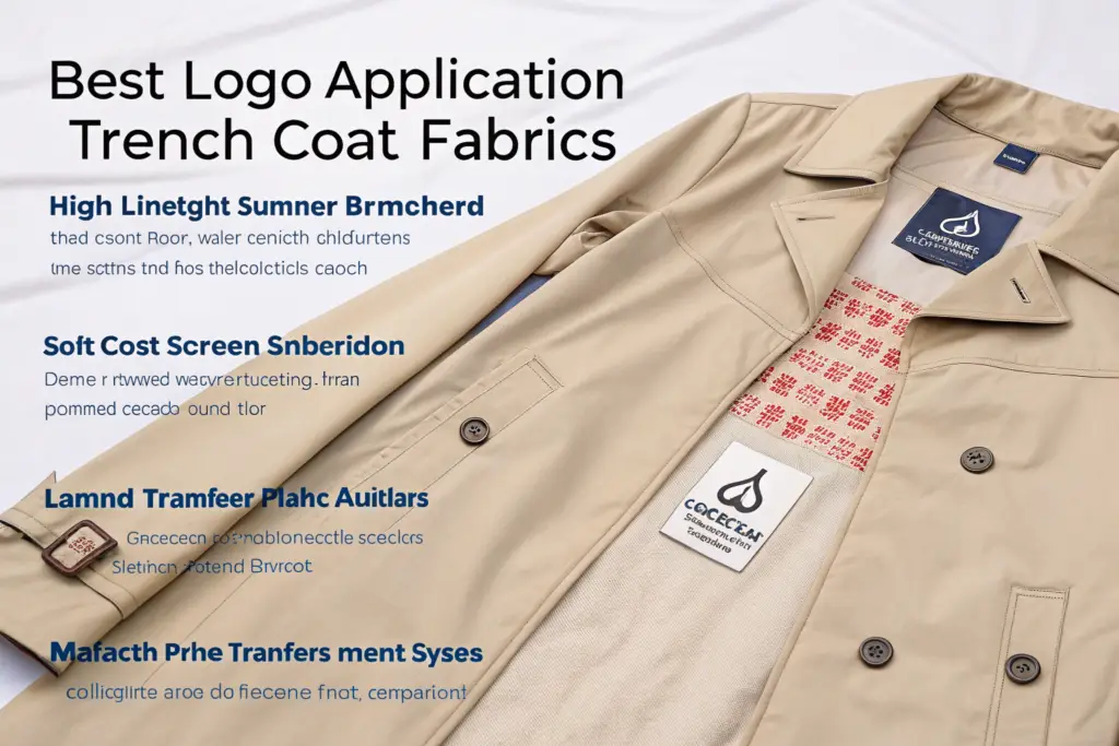
The color matching system is the language that ensures the logo color on the physical label matches the logo color on the brand's website and marketing materials. The most common color systems are Pantone and CMYK, and they work in fundamentally different ways.
Pantone is a proprietary, standardized color matching system. Each color in the Pantone formula guide is a specific ink formulation that a printer or a thread dyer can mix and reproduce exactly. When the brand specifies Pantone 19-4052 Classic Blue, the label factory and the embroidery thread supplier both know exactly what color is required. The Pantone TPX and TCX suffix refers to the substrate. TPX is for paper, used for printed hang tags and packaging. TCX is for textiles, used for dyed fabric labels and embroidery thread. Specifying the wrong suffix can result in a color that looks correct on paper but wrong on fabric. CMYK is the four-color process printing system used for digital and offset printing. It mixes cyan, magenta, yellow, and black inks to create a wide range of colors. CMYK is used for printed labels and heat transfers that are produced on a digital printer. The CMYK color gamut is smaller than the Pantone gamut, meaning some Pantone colors cannot be accurately reproduced in CMYK. A bright orange or a deep purple in Pantone may appear dull or shifted in CMYK. For woven labels and embroidered logos, Pantone is the standard. The thread is dyed to a specific Pantone color. For printed labels, both Pantone and CMYK are used, with Pantone providing better accuracy at a higher cost. The Pantone color matching for textile labels is the professional standard for fashion branding. A brand that specifies Pantone colors communicates professionalism to the factory and receives a more accurate color match.
What Size And Placement Specifications Should You Provide For A Trench Coat Logo?
The size and placement of the logo determine whether it looks intentional and balanced on the garment. A logo that is too large overwhelms the coat. A logo that is too small is illegible. A logo that is placed too high on the back neck is covered by the collar. A logo that is placed off-center on the chest looks like a manufacturing defect.
The standard size and placement specifications for a summer trench coat logo are as follows. For a back neck brand label, the standard size is 30mm to 50mm wide by 10mm to 20mm high, depending on the logo's aspect ratio. The label is sewn centered on the back neck seam, with the top edge of the label 10mm to 15mm below the collar seam. This placement ensures the label is visible when the collar is folded down but not so low that it peeks out above the collar. For a chest embroidery, the standard size is 40mm to 70mm wide, placed on the left chest, centered between the armhole seam and the center front placket, with the top of the logo aligned with the second buttonhole from the top. For a sleeve embroidery or label, the standard size is 25mm to 40mm wide, placed on the left sleeve, 40mm to 60mm up from the sleeve hem, centered on the outer sleeve panel. For an interior brand label on the side seam, the standard size is the same as the back neck label, sewn into the left side seam, approximately 150mm above the hem. These are starting points. The brand should review the placement on a physical sample and adjust based on the specific coat's proportions and design. The logo placement guide for garment manufacturing should be documented in the tech pack with a diagram that shows the exact measurement reference points.
What Is The Strike-Off Approval Process And Why Is It Critical?
The strike-off is a physical sample of the logo, produced on the actual fabric or label material, using the actual production method, before the bulk production begins. The strike-off is the brand owner's opportunity to see exactly how the logo will look, feel, and perform on the garment. Approving the strike-off is the point of no return. Once the strike-off is approved, the factory produces the bulk logos to match the approved sample. Any deviation from the approved strike-off is a quality defect.
The strike-off approval process is critical because the digital artwork on a screen does not accurately represent the physical logo on the fabric. The thread colors appear different on a monitor than they do on a textured woven label. The embroidery density feels different on the hand than it looks in a digital rendering. The size that looked appropriate in the design software may feel too large or too small when placed on the actual garment. The strike-off eliminates these discrepancies by providing a physical reference standard. At Shanghai Fumao, we produce a strike-off for every logo on every new order. We ship the strike-off to the client along with a placement photo showing the logo attached to the actual coat sample. The client reviews the strike-off, approves it in writing, or provides specific revision requests. We do not begin bulk logo production until the strike-off is approved.
Skipping the strike-off process to save a week in the production timeline is a gamble that almost always results in a quality problem. The strike-off is the quality control gate for the brand's visual identity. The time invested in the strike-off process is a fraction of the time required to rework or replace defective logos in bulk production.
How Do You Evaluate An Embroidery Strike-Off For A Lightweight Shell Fabric?
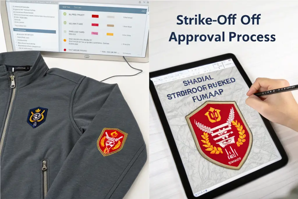
Evaluating an embroidery strike-off requires examining the sample under good lighting, on the actual garment fabric, with attention to five specific quality criteria. A strike-off that looks acceptable in a quick glance may have subtle defects that will be magnified across 3,000 units.
The five evaluation criteria for an embroidery strike-off on lightweight fabric are as follows. First, the flatness. Lay the strike-off on a flat surface. Look for any puckering, waving, or distortion of the fabric around the embroidery. The fabric should lie completely flat, with no visible tension lines radiating from the embroidery. Second, the stitch coverage. The embroidery should have full coverage of the design area, with no gaps where the fabric shows through between the stitches. The stitches should be dense enough to create a solid, legible logo, but not so dense that they create stiffness. Third, the back side appearance. Turn the fabric over and examine the back of the embroidery. The back should be clean, with no loose thread tails, no knots, and no adhesive residue from the stabilizer. If a water-soluble stabilizer was used, no stabilizer residue should remain. Fourth, the color accuracy. Compare the thread colors to the approved Pantone references under a daylight lamp. The colors should match the references closely, with no visible shade deviation. Fifth, the size and placement. Measure the embroidery dimensions with a ruler and compare to the specification. The dimensions should be within a tolerance of +/- 1mm. The placement on the garment should be within a tolerance of +/- 3mm. The embroidery quality evaluation criteria are objective and measurable. The brand owner should evaluate the strike-off systematically, not just by feel.
What Should You Check On A Woven Label Strike-Off Before Giving Bulk Approval?
The woven label strike-off is a sample of the actual woven label that will be sewn into the coat. It is typically produced on the same loom, with the same threads, at the same density as the bulk production. The strike-off should be evaluated for both the label itself and the attachment to the garment.
The evaluation criteria for a woven label strike-off are as follows. First, the weaving quality. Examine the label under magnification. The yarns should be densely packed, with no visible gaps, no broken threads, and no color bleeding between adjacent areas of different colors. The edges of the design should be sharp and clean. Second, the color accuracy. Compare the thread colors to the approved Pantone references. The colors on a woven label are produced by the thread color, not by printing, so the match should be precise. Third, the hand feel. The label should be soft and flexible, not stiff or scratchy. The customer's neck will be in contact with the back neck label. A stiff, scratchy label creates a negative sensory experience that the customer associates with the entire coat. Fourth, the dimensions. Measure the label width, height, and thickness with a ruler. The dimensions should match the specification within a tolerance of +/- 1mm. Fifth, the fold and sew. The strike-off should be folded and sewn into a fabric swatch that represents the actual garment neck seam. Check that the label is sewn straight, with even stitch margins on both sides, and that the label lies flat against the fabric without curling at the corners. The woven label quality standards are the same standards that a wholesale compliance auditor will apply during a receiving inspection.
How Do You Ensure Logo Consistency Across A Full Production Run Of 3,000 Coats?
Consistency is the hardest dimension of quality. A single strike-off can be perfect. The challenge is reproducing that perfection across 3,000 units, sewn by different operators, on different machines, over multiple days of production. The brand that does not specify a consistency standard will receive a range of logo quality, from excellent to barely acceptable, within the same shipment.
You ensure logo consistency across a full production run by establishing a sealed reference standard from the approved strike-off, defining objective quality criteria with measurable tolerances, and implementing an inline inspection process that checks the logo on every unit or on a statistically valid sample. The reference standard is the approved strike-off, sealed in a clear polybag and signed by the brand owner and the factory production manager. It is the physical standard against which all bulk logos are compared. The quality criteria include the placement accuracy, the color match, the stitch density or print opacity, and the attachment security. The inline inspection is conducted by a QC inspector who checks the logo on the first units off the line and then checks a random sample of units every hour of production. At Shanghai Fumao, we implement this three-part consistency system for every branded order. Our QC team is trained to identify logo defects and to stop the production line if a consistent defect pattern emerges.
Logo consistency is a process, not an outcome. The brand that relies on the final inspection to catch logo defects will ship defective logos because the final inspection is too late to correct a systematic problem on the production line.
What Quality Control Checks Should The Factory Perform On Logo Application?
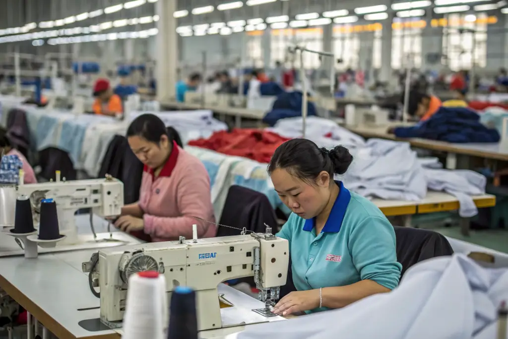
The factory's QC team should perform a series of specific checks on the logo application at three stages of production: the incoming materials check, the inline production check, and the final audit check. Each stage catches different types of defects.
The incoming materials check inspects the labels, the embroidery thread, the screen print ink, or the heat transfer films before they are used in production. The QC inspector verifies that the material matches the approved strike-off in color, size, and quality. A batch of woven labels that is printed with the wrong Pantone color is caught at this stage, before 3,000 labels are sewn into 3,000 coats. The inline production check inspects the logo application as the coats are being produced. The QC inspector checks the first five units off the line for placement accuracy, alignment, and attachment quality. If the logo placement is off by 3mm on the first five units, the line supervisor adjusts the jig or the operator's technique immediately. The inspector then checks a random sample of 10 units every hour. If a defect pattern emerges, the line is stopped and the cause is corrected. The final audit check inspects a statistically valid random sample of the finished coats before packing. The inspector checks the logo on every coat in the sample and records any defects. If the defect rate exceeds the agreed AQL, Acceptable Quality Limit, the entire lot is re-inspected and defective units are repaired or replaced. The garment quality control inspection checklist should include the logo as a specific inspection point with defined accept and reject criteria.
How Do You Specify Logo Placement Tolerances In Your Tech Pack?
The placement tolerance is the acceptable range of variation from the specified placement. A placement specification of "left chest, centered" is not measurable and cannot be inspected. A placement specification of "left chest, center of logo aligned with center of chest panel, top edge of logo 180mm below shoulder seam, tolerance +/- 5mm" is measurable and inspectable. The tech pack must provide the measurable specification and the tolerance.
The placement tolerance for a logo on a summer trench coat is typically +/- 5mm for the chest and sleeve placements, and +/- 3mm for the back neck label placement. The tighter tolerance for the back neck label reflects its smaller size and its highly visible location. The tolerance should be specified for both the horizontal and vertical axes. The logo must be within tolerance on both axes to pass inspection. The measurement reference point must also be specified unambiguously. The back neck label placement is measured from the center of the label to the center of the back neck seam. The chest logo placement is measured from the center of the logo to the center front placket and from the top of the logo to the shoulder seam. The tech pack should include a diagram that shows the measurement reference points, the specified distances, and the tolerance ranges. The tech pack placement specifications for garment labels are the contract between the brand and the factory. A brand that provides a clear, measurable placement specification with defined tolerances has a basis for rejecting non-conforming units. A brand that provides a vague placement description has no basis for rejection.
Conclusion
Customizing the logo on a lightweight summer trench coat is a technical process that requires the same level of attention as the fit and the fabric. The logo is the brand's identity on the garment. It is the element the customer sees every time they put the coat on and every time they hang it in their closet. A professionally executed logo communicates quality, builds brand recognition, and supports the premium pricing that makes the private label business model profitable. A poorly executed logo, crooked, puckered, faded, or peeling, communicates amateurism and erodes the customer's trust in the brand.
The logo customization process has five decision points. Choose the application method that is compatible with the lightweight fabric and the brand's positioning. Prepare the artwork in the correct file format with specified Pantone colors. Specify the size and placement with measurable dimensions and defined tolerances. Approve a physical strike-off before bulk production begins. And implement a quality control process that ensures consistency across every unit in the production run. Each decision point is a quality gate. Skipping a gate increases the risk of a logo defect that damages the brand's reputation and costs money to correct.
At Shanghai Fumao, we guide our clients through every step of the logo customization process. We advise on the best application method for the specific fabric and design. We provide an artwork preparation guide and we review every file submission. We produce strike-offs and ship them for approval. We maintain the approved reference standard on our production floor. We conduct the incoming, inline, and final QC checks that ensure logo consistency. We do this because we know the logo is not just a decoration. It is the brand's signature, and we treat it with the care it deserves.
If you are developing a summer trench coat collection and you want to ensure your logo is executed to the standard your brand requires, contact our Business Director, Elaine, at elaine@fumaoclothing.com. Send her your logo artwork and tell her about your brand positioning. She will advise on the application method, provide a strike-off timeline, and quote the customization cost for your order volume. Because your logo is the first thing your customer sees, and it should look exactly the way you intended.