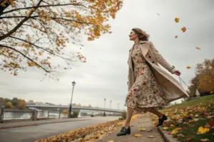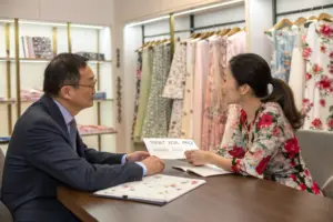

You have spent months perfecting your brand’s color palette. Your mood board is flawless. Then, you receive the pre-production sample from a new factory, and the floral print looks nothing like your design file. The coral is too orange, the navy looks black, and the soft lavender is a muddy grey. Your stomach drops. This color mismatch isn't just a small error; it threatens your entire collection's cohesion and your brand's reputation. I've sat across the table from countless frustrated U.S. brand owners who have lost thousands of dollars and precious weeks to this exact problem, feeling betrayed by a supply chain they couldn't control.
Yes, an expert garment factory can match the exact Pantone of your brand's floral print with a high degree of accuracy, but it requires a scientific, lab-driven process called digital spectrophotometer color matching, not a visual approximation. This precision depends entirely on the factory's upfront investment in color calibration technology, their mastery of dye chemistry for specific fabric bases, and a structured, multi-stage approval system that you and the factory must follow together.
This isn't just about having a good eye for color. It's a technical manufacturing discipline. Over my years running Shanghai Fumao's production floor, I've learned that achieving a 1.0 Delta E tolerance on a cotton poplin versus a polyester sports mesh are two completely different scientific challenges. The conversation around Pantone matching needs to shift from a hopeful "can you?" to a verifiable "how do you prove it?". Most communication breakdowns happen because the brand thinks in terms of creative vision, and the factory thinks in terms of dye recipes. Bridging that gap with data, not just a reference JPEG, is the only way to protect your brand's visual identity at scale. This process is exactly what turns a one-time buyer into a decade-long sourcing partner.
Why Visually Matching a Pantone Chip Destroys Color Accuracy
Early in my career, I watched a factory manager hold a Pantone cotton swatch up to a dye bath and squint. He nodded, and production started. The 3,000 floral dresses that arrived in the client’s Los Angeles warehouse two months later were a sickly, yellow-tinged version of the intended buttercream. That visual guesswork cost us the client, and rightly so. It was a hard lesson that transformed how we now operate at Shanghai Fumao. We banned visual approvals and mandated digital readings for every single color in a floral print. Your brand's identity cannot rest on someone's mood, the factory's fluorescent lighting, or a tired pair of eyes.
Visually matching a Pantone chip destroys color accuracy because the human eye's color perception is subjective and highly susceptible to metamerism, a phenomenon where two colors appear identical under one light source but drastically different under another, making lab-grade spectrophotometer readings the only reliable standard.
The science here is brutal and non-negotiable. I often have to explain to new brand partners that the physical Pantone book they mailed us is already out of date. The paper swatches fade over time with exposure to light and skin oils. A book older than 12 months is no longer a master standard; it's a rough suggestion. Beyond the faded reference, the real enemy is the light source in the room where the approval happens. A standard retail store uses warm, yellow-tinged lighting to make colors pop, while a factory's inspection room might use harsh, cool fluorescent tubes at a high color temperature. A floral print's burgundy background might look perfectly rich in a New York showroom but reveal a distracting purple undertone under a Chicago boutique's track lights. This is metamerism in action, and it's the silent killer of brand consistency. Our job is to remove this variable completely, creating a color match that holds true under D65 daylight, TL84 store light, and incandescent home light simultaneously.
How Does Metamerism Ruin a Floral Print Across Different Stores?
Let me break down exactly how this technical failure impacts your sales. You, as a brand owner, approve a floral sample in your office, which likely has large windows and a mix of natural and artificial light. You sign off, and the bulk production ships to three different retail environments.
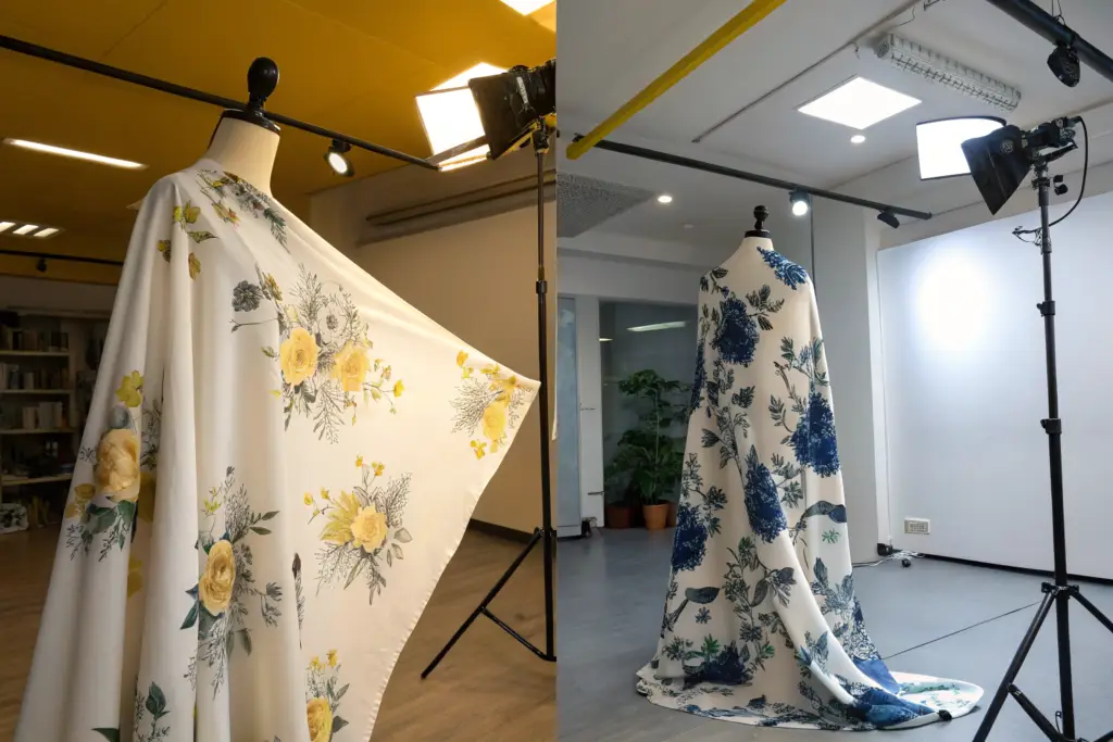
A customer then sees your dress in a department store with bright, direct overhead lighting. She sees the true, rich olive green leaf you intended. She loves it. She buys it. She then tries it on at home under warm, dimmable LED bulbs, and the leaf now looks a sickly brownish-green. She feels tricked. The dress is returned, and your brand's quality perception takes a hit that costs far more than the return shipping. This mismatch happens because the dye combination used to formulate that olive green reacts to different wavelengths of light differently than the original Pantone ink did. The only way to prevent this is to demand a spectral reflectance curve analysis from your factory. This curve graph plots how the color reflects light across the entire visible spectrum. Two colors that have identical spectral curves will always match, under any light. At Shanghai Fumao, this report, generated by our spectrophotometer, is the only document our color lab technicians sign off on before a single yard of fabric enters our five production lines.
Can a Factory's Lighting Setup Fool My Eyes?
Yes, and it happens more often than you'd think. A factory that still relies on visual inspection will consciously or unconsciously manipulate the environment to get a "pass." A viewing booth is a standard piece of equipment, but it's only as honest as its maintenance log. The lamps inside these booths have a rated lifespan. An old, burnt-out D65 daylight bulb shifts its color temperature without the user even noticing. The grey, neutral-colored interior walls of the booth can also fade from a perfect Munsell N7 grey to a warmer, yellowish tint over years, biasing every judgment made inside.
This is why I tell my clients to become process auditors, not just product inspectors. Ask your potential partner a direct question: "When was the last time your light booth lamps were replaced and calibrated, and can I see the log?" A serious facility will have a strict schedule, usually replacing tubes every 2,000 hours of use and recalibrating the booth against a master standard annually. If you get a vague answer, you are dealing with a factory that is still running on guesswork. This is a massive risk for a floral print, where multiple colors must harmonize. You can't just match a single solid color; you must ensure the crimson rose, the blush pink background, and the sage green stem all coexist correctly under the same lighting condition. A compromised visual environment guarantees that the final dress will have a garish, slightly "off" feeling that customers detect instantly, even if they can't explain why.
The Scientific Process of Lab Dip Development
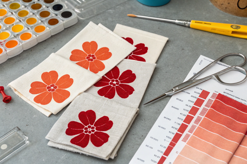
When you send a floral design to a factory, you trigger a complex chemical process, not a simple inkjet job. The heart of this process is the lab dip. This is a small-scale dye test of your specific color onto your specific fabric, done in a controlled laboratory setting. I remember a project with a startup brand in Austin, Texas, who had a 7-color floral with a very tricky dusty rose as the hero tone. The first five lab dips we submitted looked right in the lab but wrong on the full fabric width. It took our head chemist dyeing tiny swatches, adjusting the recipe by 0.01% of a red dye, to finally unlock the exact match. That level of granularity is what true color matching looks like.
The scientific process of lab dip development is a methodical cycle of dye recipe formulation, fabric-specific application, and multi-light source verification, designed to lock in a color formula that will reproduce consistently from a small swatch to a bulk production run of thousands of yards.
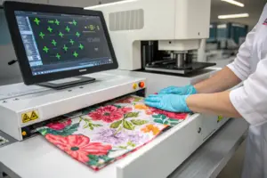
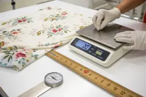
Many first-time buyers misunderstand the timeline here. A proper lab dip for a multi-color floral design cannot be rushed. It's not a 24-hour service if you want accuracy. The process begins with the colorist analyzing your target Pantone codes against the fabric's fiber composition. A reactive dye behaves one way on 100% cotton and completely differently on a rayon-polyester blend. The chemist, often with decades of hands-on experience, writes a preliminary recipe—a precise digital "cookbook" detailing which dyes to mix and in what percentages by weight. This tiny batch is then applied to a swatch of your actual production fabric in a special pressurized beaker. The fabric is then steamed to fix the dye, washed to remove unfixed color, and dried. Only then is the resulting lab dip swatch placed into the spectrophotometer for a numerical comparison against your target. This cycle repeats, with tweaks to the recipe, until a Delta E reading of 1.0 or less is achieved.
What Is a Delta E CMC Tolerance in Textile Printing?
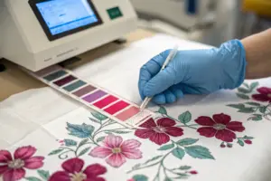
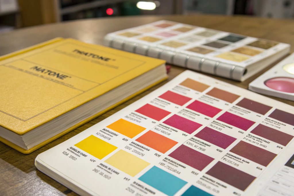
When a factory sends you a color lab dip, they shouldn't just send the swatch. They must send a data sheet with a specific number: the Delta E CMC. This isn't jargon; it's your contract's most critical number. Delta E, or dE, is a single number that represents the mathematical distance between two colors in a three-dimensional color sphere. The smaller the number, the closer the match.
The CMC, or Color Measurement Committee, formula is important because it's weighted to account for human visual perception. Our eyes are much more sensitive to slight shifts in hue (is it too green?) and chroma (is it too dull?) than they are to shifts in lightness (is it too dark?). The CMC formula factors this in, making it a more commercially realistic standard than a raw, unweighted Delta E 76 reading.
Here is the tolerance table I make every brand owner sign off on before we start a floral project at Shanghai Fumao:
| Delta E CMC Value | Visual Perception | Commercial Acceptability for a Floral Print |
|---|---|---|
| Below 0.5 | Invisible difference. A perfect match even to a trained colorist. | Ideal, but often requires excessive lab time for every color in a 7-color print, adding cost and delay. |
| 0.5 - 1.0 | Barely perceptible difference under close side-by-side examination. | The Gold Standard. This is the bullseye we aim for on all hero colors and brand-critical logo tones. Commercially perfect. |
| 1.0 - 2.0 | A noticeable but acceptable difference, often passing a customer's eye test. | Acceptable for background blenders or secondary motifs that don't anchor the visual brand identity. |
| Over 2.0 | A clear, unmissable mismatch. The two colors do not look the same. | Reject immediately. This production batch should never be cut and sewn without a formal concession. |
This table is your objective power tool. It removes the subjectivity from the conversation. If a factory sends a dip with a dE CMC of 1.5 on your primary background cream, you can point to the table and say, "This doesn't meet our agreed 1.0 standard for a background color. Please resubmit." The conversation is over, and it didn't rely on anyone's opinion or a compressed iPhone photo sent via WhatsApp.
Why Does the Fabric Base Chemically Change My Pantone Match?
This is the single biggest source of client education that we do at Shanghai Fumao. You cannot pick a Pantone from a cotton book and demand an exact match on nylon, silk, or recycled polyester without understanding that the dye chemistry is fundamentally different. The Pantone you selected was printed with a specific ink on a specific, bright-white paper base. Your dress fabric is not ink, and it is not paper.
Different fibers drink dye differently. Cotton, a cellulose fiber, is dyed using reactive dyes that form a covalent bond with the fiber, becoming part of the fabric's molecular structure. Polyester, a synthetic fiber, is dyed using disperse dyes in a high-heat, high-pressure process akin to deep-frying the color into the hollow molecular chains. The same visual "Crimson Red" requires a completely different chemical recipe for each fiber. Furthermore, the base color and texture of your fabric massively impact the final visual result. A bright, optically whitened cotton will make a floral print look vibrant and sharp. A natural, unbleached organic cotton with a creamy, yellow-tinged base will mute all the colors applied to it, making the print look vintage and soft without a single change to the dye recipe. Then, there's surface reflectance. A shiny satin weave reflects light directionally, making a color look deep and saturated at one angle and washed out at another, while a matte jersey knit diffuses the light for a constant, flatter color appearance. You are never just matching a Pantone. You are matching a specific color, on a specific substrate, with a specific surface texture, to be viewed under specific lighting.
Building a Bulletproof Color Quality Control System for Your Brand
Securing a perfect lab dip is a victory, but it's not the end. The real danger lies in the bulk yardage. I recall a crisis we averted for a client with a luxury resort wear line in Miami. Their collection was built around a specific turquoise Pantone in a large-scale floral. The lab dip was flawless. However, during the bulk fabric dyeing, our in-line quality control spectrophotometer detected a slow, creeping drift in the hue, caused by a slight steam pressure fluctuation in the fixation unit. We stopped the dyeing of 500 meters of fabric, corrected the machine's calibration, and re-dyed the batch. Without that mid-process digital check, the entire production would have been a disastrous mismatch. That's the difference between checking color at the end and controlling color in real-time.
Building a bulletproof color quality control system for your brand requires a shift from a final inspection mindset to an active process control model, using continuous spectrophotometer readings at every stage from bulk dyeing to cutting, ensuring that what gets sewn into a garment is statistically identical to your signed-off standard.
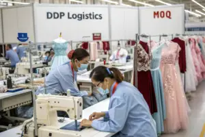
A bulletproof system doesn't just catch errors; it prevents them. For a B2B buyer, this translates directly into reduced chargebacks, zero lost selling seasons, and a brand image that commands premium retail pricing. The system works on a principle of statistical sampling. You cannot check every inch of 3,000 yards of printed floral fabric. Instead, you create a rationalized sampling plan—for instance, taking a spectral reading from the left, center, and right selvage of the fabric roll every 50 yards. This data is plotted on a control chart in real-time. If the process is stable, the readings will cluster tightly around the target dE 1.0 line. If the trend line starts creeping upwards, even if it hasn't hit the 2.0 rejection limit yet, the machine operator gets an alert to adjust the dye bath concentration or the printing press's pressure. This turns color management from a reactive guessing game after the fact into a live, proactive manufacturing control.
How Should a Factory Use a Lightbox in Final Garment Inspection?
The lightbox is the ultimate court of appeal, but its use must be perfectly ritualized to have any legal or commercial standing. A chaotic, informal glance under a random bulb is worse than useless; it creates false confidence. The proper method is a structured multi-source assessment that immediately flags metameric failure.
The correct inspection protocol for a final floral print dress in a certified lightbox has three stages. First, the inspector places your signed-off master gold-seal sample next to the bulk production garment on the floor of the booth. Second, they view the pair under the primary agreed light source, typically D65 artificial daylight, which simulates the noon sun and is the global standard for color communication. They assess hue, chroma, and lightness. Third, and most critically, they do not just pass the garment. They manually switch the light source to a secondary illuminant like TL84, which simulates typical retail store fluorescent lighting. The inspector runs their eyes over the whole floral pattern again. A true, high-quality match stays visually consistent under both light sources. If the colors "snap" and shift dramatically between D65 and TL84, the batch fails, even if the match under D65 alone was perfect. I require our final QC teams at Shanghai Fumao to record the specific spectral readings under both light sources on the inspection report, photographing the readout on the spectrophotometer's screen for undeniable traceability.
Are On-Site Spectrophotometers a Non-Negotiable Asset for a Reliable Factory?
In my direct, daily operational experience, the answer is a flat yes. A garment factory without a calibrated, high-end spectrophotometer is not a serious partner for a brand that cares about its visual identity. It’s like a hospital running without an X-ray machine. You can guess at the problem, but you cannot see inside it.
The spectrophotometer is the source of objective truth. It works by flashing a controlled beam of light onto the dyed fabric and measuring the exact percentage of light reflected back at every wavelength across the visible spectrum. This generates a spectral fingerprint that is unique to that precise color on that exact fabric. This fingerprint is then compared to the digital master data of your Pantone target stored in the device's library. It eliminates all human bias. The machine is never tired, never hungry, and never under pressure from the production manager to "just pass it."
Here are the four non-negotiable questions you must ask a potential sourcing partner about their color control hardware:
- What is the brand and model of your spectrophotometer? A professional-grade instrument from X-Rite or Datacolor is what you need to hear. A cheap, off-brand portable gadget is not acceptable for production-level consistency.
- Can you show me the certificate of annual factory calibration? Every precision instrument drifts. A valid, traceable calibration certificate from the original manufacturer is proof of maintenance and care.
- Does your color software log all readings with date and time stamps? This audit trail is your insurance policy. If a color dispute arises six months later, you can pull the exact spectral data from that specific production batch and compare it to the standard.
- How do you profile a new fabric substrate? The machine must be told what fabric it's reading. A measurement on a napped, fuzzy fleece requires a different aperture and averaging method than a measurement on a smooth, reflective satin. A competent operator must know how to make this adjustment.
A factory that can confidently and instantly answer these questions is a factory that has made a serious capital investment in protecting your brand's core asset: its color. At Shanghai Fumao, this hardware and the trained chemist behind it are the first things I show a visiting client, because I know that color confidence is the foundation of trust in our industry.
Conclusion
The question is not whether a factory can match the exact Pantone of your floral print. The real question is whether that factory has built a scientific fortress around its color operations to guarantee that match, roll after roll, season after season. We've traced the path from the fatal unreliability of the human eye and the trap of metamerism, through the meticulous chemical ballet of the lab dip development and the objective law of the Delta E CMC tolerance, to the concrete requirements of a modern, digitized color quality control system. This process—and it is a process, not an art—is what separates a vendor who "gets close" from a manufacturing partner who hits the bullseye.
Your brand's color is your silent ambassador. In a retail environment saturated with choice, a perfectly executed, universally consistent floral print signals luxury, reliability, and an obsessive attention to detail that your customers will pay a premium for. A color that drifts by even a few percentage points of Delta E signals carelessness and cheapness, devaluing every other ounce of design work you poured into the garment. This is a level of risk that no successful brand should accept. The days of visual color approval, of squinting at chips under unknown factory lights, must be left in the past. The present is digital, data-driven, and verifiable.
If you are sourcing a floral collection and the accuracy of your brand’s palette is a critical concern, I encourage you to bring that exacting standard to us. At Shanghai Fumao, we have invested heavily in the spectrophotometry hardware, the calibrated light booths, and the experienced color chemists required to speak the language of 1.0 Delta E CMC tolerances fluently. We understand that for a growing brand, a color failure isn't just a single bad batch; it’s a lost relationship with a retail buyer or a poor review that lives online forever. Don't leave the face of your brand to guesswork. To discuss your specific fabric and print challenges, please contact our Business Director, Elaine. She can arrange a technical deep-dive walkthrough of our color lab process over a video call. Reach her directly at elaine@fumaoclothing.com. Let’s build a production line that protects your palette perfectly.