A brand owner I deeply respect once told me a story that changed how I think about summer clothing. She had designed a beautiful collection of pure Italian linen dresses. They sold out instantly online. But the return rate was nearly 30%. The customers complained that the dresses were "too sheer" and "looked cheap." The problem was not the fabric. It was the matching. The brand had shown the dresses on a model wearing nude, seamless undergarments. The customers were wearing them with dark, visible underwear. The transparent nature of high-quality linen clashed with the wrong base layer. She relaunched the collection with a matching line of slip dresses in the exact same neutral tones. The return rate dropped to 4%. The fabric hadn’t changed. The understanding of how to match and layer it had.
The clothing matching standards for high-quality summer clothes are governed by four uncompromising rules: the Transparent Layer Rule, the Texture Contrast Rule, the Tone-on-Tone Luxury Rule, and the High-Quality Anchor Rule. First, any sheer, lightweight, or open-weave fabric—such as linen, voile, or fine silk—must be matched with a high-quality base layer in the exact same neutral tone; visible contrast stitching or dark underwear instantly destroys the illusion of luxury. Second, summer looks must balance one open, textured fabric with one dense, smooth fabric to avoid looking messy. Third, luxury summer dressing relies not on loud prints but on "tone-on-tone" depth, where you mix ivories, ecrus, and sands in different tactile qualities. Finally, every outfit needs a single heavy anchor—such as a structured leather belt, a thick resin bracelet, or full-grain leather sandals—to ground the lightweight fabrics and prevent the look from floating away. Mastering these standards allows brands to sell not just clothes, but a complete, foolproof aesthetic.
Summer is the cruelest season for clothing. In winter, you can hide cheap fabric under layers of wool. In summer, the fabric is exposed. The construction is exposed. The fit is exposed. Every detail matters. I want to share exactly how our most successful brand partners at Shanghai Fumao design and style their summer collections to meet these standards, and how you can apply these rules to elevate your own brand’s offerings.
How Can You Master the Art of Matching Transparent, Lightweight Fabrics Without Sacrificing Modesty?
I was walking through a trade show in Paris when I saw a mannequin that stopped me in my tracks. It was wearing a crisp, white, oversized poplin shirt. Underneath, you could barely see the outline of a tank top. But the tank top was not white. It was a dull, grayish cotton. In the bright halogen lights of the convention center, the gray underlayer glowed like a neon sign, completely ruining the expensive look of the poplin. That one mismatched base layer made a $90 shirt look like a $15 street market find.
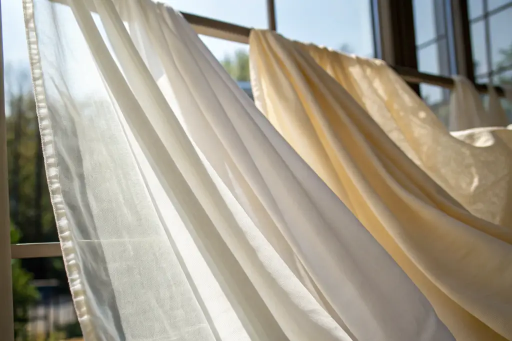
The absolute standard for transparent summer fabrics is the "shadowless layer." You must wear a base layer, such as a slip, camisole, or bralette, that matches your skin tone exactly if the outer layer is white or light-toned. For darker sheers, the base layer must be an exact tonal match. The fabric of this base layer is just as critical. It must be a microfiber or pure silk with a completely smooth, flat surface. Textured lace or ribbed cotton underneath a sheer voile creates visual noise and friction. The goal is to create a visual illusion where the eye cannot tell where the base layer ends and the outer layer begins. This is achieved through tone matching, not contrast. For garment manufacturers, this means the hem of the sheer outer garment must be finished with a microscopic rolled hem, not a thick overlock stitch, to avoid a bulky shadow line.
When designing a collection, a brand should never sell a sheer white linen shirt without offering the matching camisole. It is not an accessory. It is a structural requirement of the outfit. Brands that bundle these pieces see higher average order values and dramatically lower return rates.
Why Should Base Layers Be Tone-Matched to the Sheer Fabric Instead of Contrasted?
Contrast creates a harsh, abrupt visual stop. If you wear a black bra under a white linen shirt, the eye goes directly to the black lines. The expensive drape of the linen becomes invisible. Tone-matching works with the fabric’s natural transparency. It lets the light pass through and reflect off the similar tone underneath, creating a soft, ethereal glow. This is how luxury brands achieve that "floating" look. The base layer becomes part of the fabric’s depth. For fabric layering techniques in high-end design, the key is integrating, not separating.
What Are the Best Seam Finishes to Prevent a Bulky Underlayer Shadow?
French seams and microscopic rolled hems are non-negotiable. A standard overlock stitch creates a ridge of thread that catches the light and casts a dark shadow through the fabric. A French seam encloses the raw edge completely within a tiny, flat fold. A microscopic rolled hem, often done on a specialized 1/16-inch hemmer foot, creates a barely-there edge. These finishes are more expensive because they require slower machine speeds and skilled operators. But they are the difference between a garment that looks exquisite in sunlight and one that looks homemade.
How Do You Build a “Texture-Rich” Summer Outfit Without Overheating or Adding Bulk?
A client once complained that her summer collection looked "flat" in photos. The designs were beautiful: a linen tunic and linen trousers. But the fabric was the same. The texture was the same. The weight was the same. The outfit had no friction. It looked like a pair of pajamas. We solved the problem by introducing a single high-sheen accessory and restructuring the trouser fabric to a smoother, high-twist yarn. The difference was night and day. The roughness of the tunic made the smoothness of the trousers pop.
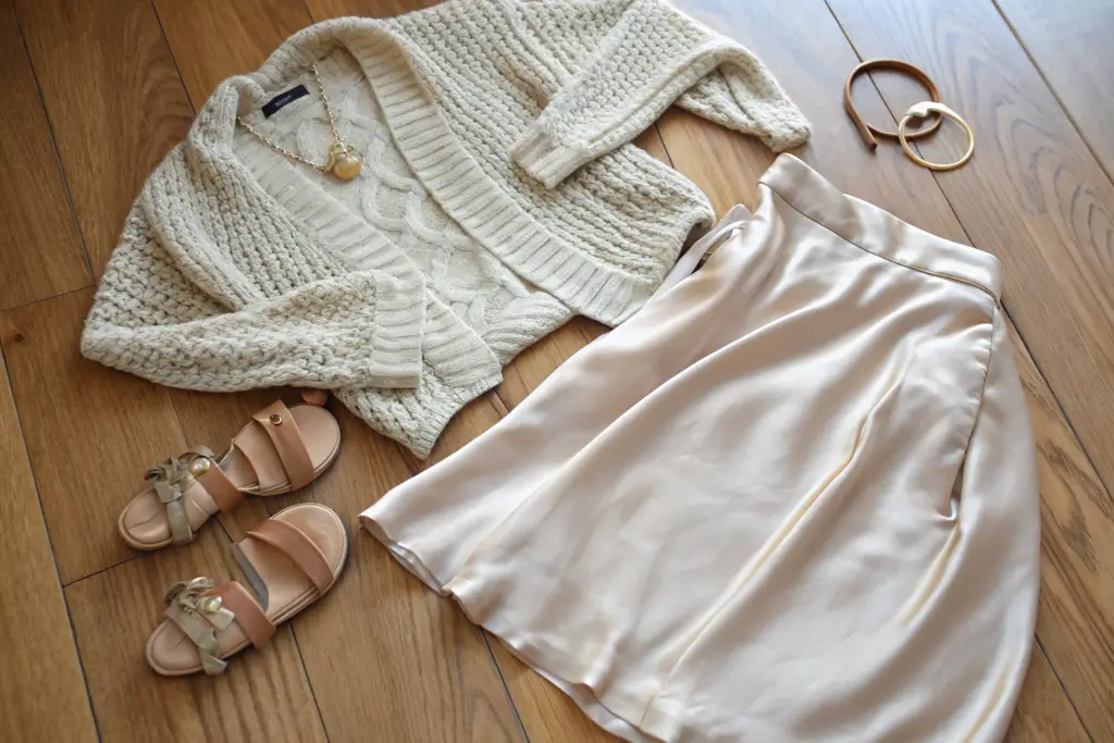
A texture-rich summer outfit relies on the physics of contrast. You must pair one "open" or "dry" texture with one "closed" or "fluid" texture. For example, a dry, slubby linen gauze top must be matched with a compact, liquid-hand silk or high-gauge cotton sateen bottom. This creates a visual push-and-pull. The open texture allows air to circulate and looks casual. The closed texture reflects light and looks polished. You should never match two open-weave fabrics or two high-sheen fabrics together. Two open weaves look messy and unkempt. Two shiny fabrics look sweaty and cheap. The contrast is what signals to the eye that the outfit was intentionally designed, not randomly thrown on. This also impacts the technical specs: a high-twist yarn for the smooth fabric prevents it from clinging to the open weave during static buildup.
For a brand, this means thinking about your collection as a matrix, not just a line of isolated pieces. Every top in your catalog should have a designated bottom from a different texture family. Wholesale buyers appreciate this because it makes their job of visual merchandising much easier.
Why Should “Open-Weave” Fabrics Never Be Mixed Together in a Single Outfit?
Open-weave fabrics, like linen gauze, crochet knits, and loosely spun cotton slubs, have a high friction coefficient. When they rub together, they catch, bunch, and create static. Visually, the eye cannot find a resting point; the textures blur together into a fuzzy, indistinct mess. An outfit of a linen gauze shirt and linen gauze pants lacks hierarchy. By swapping the bottom to a dense, smooth weave, the eye registers a clear foreground and background. The outfit looks cleaner.
What Is the Ideal Pairing Ratio of “Matte” to “Lustre” for a Professional Summer Look?
The ideal ratio for professional daytime summer looks is 80% matte to 20% lustre. A matte, tailored cotton-linen jacket and trousers (80%) paired with a lustrous silk shell top (20%) exudes quiet authority. The lustre draws the eye to the face. A 50/50 ratio risks looking like evening wear or a disco. For fabric selection for professional apparel, the grounding power of matte textures is a fundamental principle.
How Can You Create a Luxury “Tone-on-Tone” Summer Look Using Different Fabric Qualities?
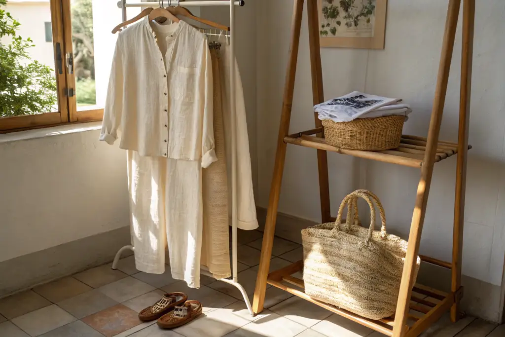
I once asked a brand owner why her summer collection felt so expensive despite using the same base fabrics as her competitors. She pointed to her dye lot cards. "We don’t do ‘white’ and ‘navy,’" she said. "We do ‘chalk,’ ‘ivory,’ and ‘ecru.’" By working within a narrow band of neutrals but across radically different fabric types, she created a depth that eye-catching prints could never achieve. A customer could buy a chalk linen blazer, an ivory silk shell, and ecru cotton trousers, and wear them together in any combination. Every outfit worked perfectly. The tone-on-tone standard requires a deep understanding of color theory and fabric finishing.
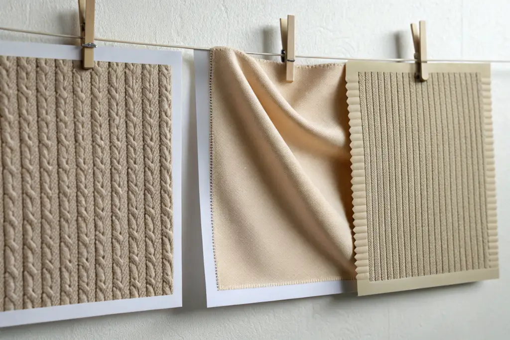
Tone-on-tone dressing is the hallmark of quiet luxury. It requires matching the exact temperature of the color across different materials. An ecru linen has a slightly cool, raw undertone. An ivory silk has a warm, milky undertone. If you pair a cool ecru with a warm ivory, the outfit looks "off" and discordant. You must source fabrics where the Pantone undertones align. The luxury comes from the subtle play of light: the matte linen absorbs light, the shimmering silk reflects it, and the textured knit diffuses it. This creates a monochromatic look that has incredible depth without a single logo or loud print. For manufacturers, this requires a precise lab dip matching process across different fiber types, which is technically challenging but commercially priceless.
For your wholesale line sheet, consider presenting these as "pre-styled capsules." If you show a buyer an ecru lookbook where every piece is interchangeable, you significantly increase the order size. You are not selling a shirt; you are selling a mini-wardrobe.
What Is the Difference Between a “Cool” Ecru and a “Warm” Ivory in Textile Pigmentation?
Cool ecru has a hint of gray or green in the base dye. It looks best on fabrics with a dry, matte finish. Warm ivory has a hint of yellow or pink. It looks best on smooth, lustrous fabrics. The mistake brands make is using the same "natural" dye lot for both their cotton canvas and their silk satin. When placed together, the temperature clash is jarring. The solution is to create a unified palette where the dye recipe is adjusted for each fiber type to achieve the same visual temperature. This is what separates true luxury from fast fashion.
How Do You Select Accessories That Complement, Rather Than Compete with, a Tone-on-Tone Outfit?
In a tone-on-tone look, the accessory should match the deepest shade in the outfit or provide the only pop of texture. A mother-of-pearl pendant, a woven raffia bag, or a wooden watch are ideal. Shiny gold metal can work but must be kept very minimal. The goal is to let the skin and the fabric quality be the focal points. If you are selling a tone-on-tone collection, providing these accessories as part of your wholesale catalog adds a powerful revenue stream.
What Is the “Heavy Anchor Rule” and How Does It Ground an Entire Lightweight Outfit?
I have seen beautiful chiffon dresses look like shapeless nightgowns because they lacked an anchor. Lightweight fabrics follow the laws of gravity and static electricity; they float and cling unpredictably. Without a heavy element to pull the eye down and provide a visual "period" at the end of the sentence, the outfit lacks authority.
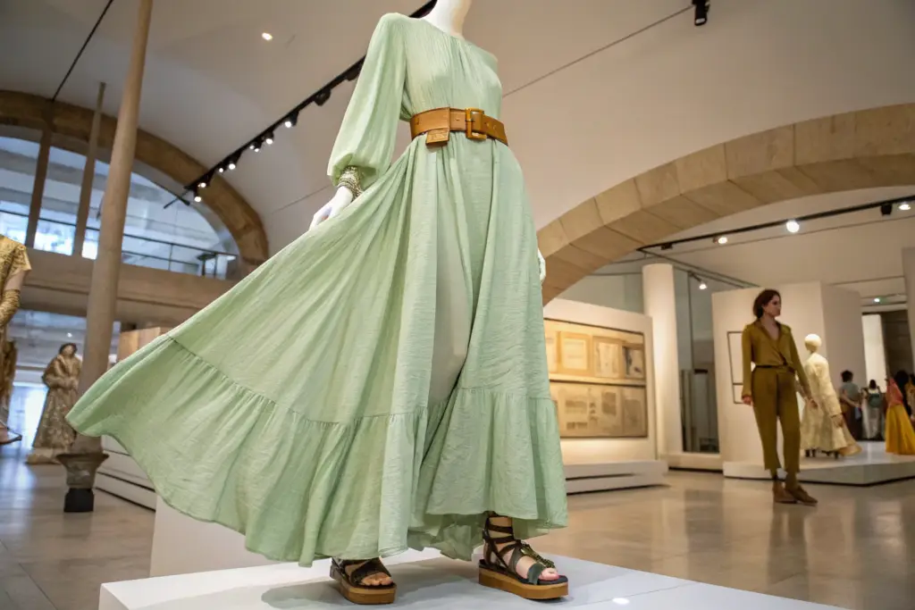
The Heavy Anchor Rule states that every summer outfit based on fabrics under 150 GSM must include one element with significant physical or visual weight. The anchor can be a thick, full-grain leather belt, a pair of heavy-soled sandals, a dense, chunky metal necklace, or a structured bag. This anchor does three things. Physically, it weighs down the fabric, controlling the drape and preventing the garment from billowing in the wind. Visually, it stops the eye from sliding off the bottom of the outfit. Tactically, it signals durability and quality, reassuring the customer that the look is intentional. For a brand, this is a high-margin add-on sale. The belt or the sandal becomes an essential part of the seasonal buy. You should never sell a chiffon dress without showing it cinched with the exact belt you want to sell.
This rule directly impacts the tech pack. If a lightweight dress is designed to be worn with a belt, the side seams must include a thread chain belt loop, and the seam must be reinforced to handle the weight of the leather without puckering. These are the tiny details that prove a brand understands construction.
Why Do Full-Grain Leather Accessories Visually “Stabilize” Fabrics Like Chiffon or Modal?
Chiffon and modal have a low visual density. They reflect light in a scattered, diffuse way. Full-grain leather has a high visual density and a directional, structured grain. The human eye perceives weight and stability through this density. A thick leather strap provides a solid, unchanging horizon line that contrasts with the moving, flowing fabric. Without it, the outfit looks temporary and fragile. With it, the contrast creates a dynamic tension that is deeply satisfying to the eye.
What Are the Best Low-Profile Reinforcement Techniques for Belt Loops on Thin Summer Dresses?
Standard belt loops on thin fabric tend to tear or pucker. The best technique is a thread chain loop, hand-formed from the buttonhole thread, which is flexible, soft against the skin, and incredibly strong. Another option is a Rouleau loop, a thin tube of self-fabric turned inside out and stitched into the waist seam. This integrates seamlessly into the design and distributes the belt’s weight along the entire waistband seam, preventing stress points.
Conclusion
The matching standards for high-quality summer clothes are not about fleeting trends. They are about engineering solutions to the inherent challenges of lightweight fabrics. Sheerness is solved with tone-matched, flat-surface base layers. Texture is managed through strict contrast pairing of open and closed weaves. Color depth is achieved through disciplined tone-on-tone palettes calibrated across different fibers. And the ethereal nature of summer fabrics is grounded by the strategic use of heavy, high-quality anchors.
The brand that understands these rules sells a complete, resolved look. They don’t just ship a linen shirt; they ship the perfect slip to go under it. They don’t just offer a dress; they offer the belt that gives it structure. This approach drives higher transaction values and, more importantly, it creates an emotional response in the customer. They feel that the brand has anticipated their needs and solved their problems before they even had to ask.
At Shanghai Fumao, we specialize in the precision manufacturing required to execute these standards. We offer French seam finishing, thread chain loop attachments, and intricate tone-on-tone lab dip matching across multiple fabric bases. We understand that a summer garment is an exposed canvas, and every stitch tells a story of quality.
If you are developing a premium summer collection and want to ensure your pieces match perfectly in both color and texture, we are here to help. At Shanghai Fumao, we can provide a "Texture Contrast Matrix" for your line plan. Contact our Business Director, Elaine, at elaine@fumaoclothing.com. She can send you a sample pack of our best-selling summer fabric pairings. Let’s work together to create a collection where every piece feels like it was made for each other.