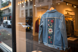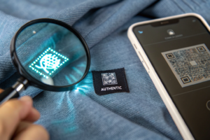

A brand owner from Nashville called me in a state of frustration last year. He had spent weeks designing a complex embroidered back panel for a denim jacket. The design was a detailed floral and bird motif, inspired by vintage Western wear. He sent the factory a JPEG of his artwork and a brief description: "Please embroider this design on the back of the jacket. Use matching thread colors." Three weeks later, he received the sample. The bird looked like a bloated pigeon. The floral petals were dense, stiff blocks of stitching that made the jacket back as rigid as cardboard. The colors were close, but not quite right. He had to reject the sample and start over, losing a month from his development timeline. He asked me, "What did I do wrong?"
The most effective way to brief a factory on a complex embroidery design is to provide a complete embroidery-specific design package, not just a graphic file. This package includes a digitized stitch file in the factory's machine format, a high-resolution reference image with a calibrated color swatch, a stitch-out sample on the actual production fabric, and a detailed specification sheet defining the placement coordinates, stitch density preferences, and underlay requirements. A JPEG and a wish are not a brief. They are the beginning of a long, expensive revision cycle.
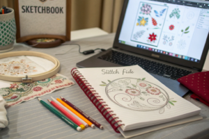
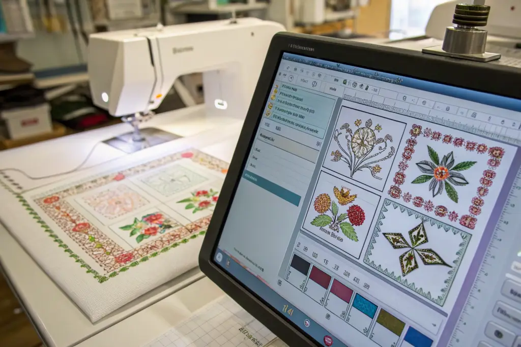
Embroidery is not printing. A graphic design that looks beautiful on a screen must be translated, stitch by stitch, into a physical textile process. The thread has thickness. The fabric has stretch and texture. The machine has physical limitations. The digitization process, converting art into stitches, is where most complex embroidery projects succeed or fail. The brand owner who understands this process and briefs it correctly saves weeks of sampling time and thousands of dollars in revision costs. At Shanghai Fumao, our embroidery digitizing team works directly with brand owners to translate their creative vision into production-ready stitch files. Let me walk you through the exact process.
Why Is a Digitized Stitch File More Critical Than a JPEG Artwork?
The single biggest misconception about embroidery is that an embroidery machine can read a JPEG or a PNG file. It cannot. An embroidery machine is a CNC machine. It reads a stitch file, a set of coordinate instructions that tell the needle where to move, when to change thread colors, and when to trim the thread. The stitch file contains no image. It contains vectors, stitch types, and machine commands. A JPEG is a grid of colored pixels. The translation from pixels to stitches is a specialized technical process called digitization.
A digitized stitch file is more critical than the JPEG artwork because it contains the specific instructions the embroidery machine requires to physically create the design. The digitizer makes hundreds of micro-decisions that determine the final appearance: the stitch type for each element, satin stitch for lettering, tatami fill for large areas, the stitch angle that affects light reflection, the pull compensation that counteracts the fabric's tendency to pucker under dense stitching, and the color sequence that minimizes thread changes and maximizes efficiency. A JPEG provides none of this information. An experienced digitizer provides all of it.
A brand owner who sends only a JPEG is asking the factory's digitizer to make all these decisions without guidance. The digitizer is a technician, not the brand's designer. They will make pragmatic, generic choices that may not align with the brand's aesthetic intent. The result is a sample that looks "off" in ways the brand owner struggles to articulate. The solution is to hire a skilled digitizer to create the stitch file before sending the brief to the factory.
How Do You Brief a Digitizer to Translate Your Artwork into Embroidery-Ready Paths?
The digitizer is the translator between the designer's visual language and the machine's physical language. Briefing the digitizer effectively requires the brand owner to communicate the design intent, not just the design file.
The brief should specify the final size of the embroidery in millimeters or inches. A design digitized for a 100mm width will not scale perfectly to a 150mm width without stitch density adjustments. The size must be fixed at the digitizing stage.
The brief should specify the fabric the embroidery will be stitched on. A heavy denim requires different underlay and pull compensation than a lightweight jersey knit. The digitizer must know the fabric to set the correct parameters.
The brief should indicate the desired texture and dimensionality. Does the brand want a flat, smooth embroidery, or a raised, three-dimensional effect? Should certain elements, like a flower petal or a letter, have a slightly padded, domed surface? The digitizer can achieve these effects through stitch type selection and underlay layering.
The brief should reference specific elements of the design that are priority. "The eagle's eye must be sharp and detailed. The feathers should have a sense of movement. The lettering must be crisp and legible at a distance." The digitizer will allocate more stitches and more attention to the priority elements.
The brief should also specify what to simplify. A complex illustration with hundreds of tiny color variations must be reduced to a manageable number of thread colors, typically 6 to 12 for a production-viable design. The brand owner should indicate which colors are essential and which can be merged.
A brand owner producing an embroidered logo for men's polo shirts briefed his digitizer with a detailed document. It included the exact logo dimensions, the pique fabric specification, a note that the logo should have a subtle 3D puff effect on the brand name, and a color reduction from the 15-color original illustration to an 8-color embroidery palette. The digitizer delivered a stitch file that produced a perfect sample on the first attempt.
What Are "Stitch Types" and How Do They Affect the Final Texture of Your Design?
The three fundamental stitch types in embroidery are the satin stitch, the tatami stitch, and the run stitch. Each produces a distinct visual texture and has specific applications. Understanding these types allows the brand owner to brief the desired texture with precision.
The satin stitch is a series of parallel stitches laid closely together to form a smooth, shiny, ribbon-like surface. It is used for lettering, borders, and narrow elements. The satin stitch reflects light and creates a premium, polished look. A satin stitch that is too wide, over approximately 8mm, can snag and is prone to abrasion. The digitizer will use a split satin or a tatami fill for wider areas.
The tatami stitch, also called a fill stitch or a ceding stitch, is a series of running stitches laid in rows to fill a large area. The stitch pattern can be programmed to create different textures, a woven effect, a cross-hatch, a curved contour fill that follows the shape of the element. The tatami stitch is less shiny than the satin stitch and is more durable on large areas. The stitch density, the spacing between the rows, determines the coverage and the stiffness of the filled area.
The run stitch is a single line of stitching used for fine details, outlines, and underlay. A triple run stitch, three parallel lines stitched simultaneously, creates a bolder outline. Run stitches are also used for decorative effects like a hand-stitched look or a delicate filigree detail.
A brand owner describing the desired texture in the brief should use these terms. "The brand name should be in a dense satin stitch for a premium sheen. The background shield should be in a lighter-density tatami fill with a subtle woven texture, to avoid making the garment back too stiff. The fine outline around the crest should be a single run stitch for delicate definition." The digitizer understands this language and will execute the design accordingly.
How Do You Specify Placement Coordinates to Avoid Misaligned Logos?
An embroidery design that is perfectly digitized and beautifully stitched can be ruined by incorrect placement. A logo placed one centimeter too high or too low on the chest looks awkward and unprofessional. The consumer may not consciously measure the placement, but they will feel that something is wrong. Placement errors are one of the most common causes of sample rejection in embroidered garments.
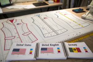
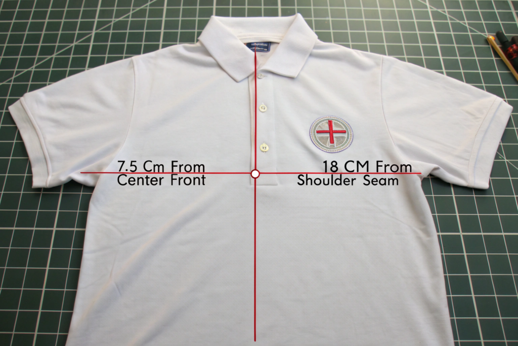
Specifying placement coordinates for embroidery requires defining the exact reference point on the garment from which the measurement is taken, and the exact location on the embroidery design that is placed at that measurement. The reference point must be a fixed garment feature, the center front line, the shoulder seam, the collar band edge, the hem. Vague instructions like "center chest" or "upper left" are ambiguous. A precise instruction is "The center of the embroidery design is placed 7.5 cm from the center front line and 16 cm down from the shoulder seam intersection at the neck." The coordinate system is absolute, repeatable, and verifiable.
The placement specification should be provided in both written and visual form. A technical diagram of the garment with the placement coordinates marked is far more effective than a written description alone. The diagram should show the garment in its flat, pre-assembly state, with the reference points and the target placement point clearly dimensioned.
What Is a "Placement Jig" and How Does It Guarantee Consistency Across a Bulk Run?
A placement jig is a physical template, typically made of clear acrylic or heavy cardstock, that is placed on the garment to mark the exact embroidery location. The jig has alignment edges that register against the garment's reference points, the shoulder seam, the center front, the neckline, and a cutout or a marked point indicating the precise center of the embroidery area.
The embroidery machine operator places the jig on each garment, aligns it to the reference points, and marks the embroidery center through the cutout with a fabric marker or a small sticker. The garment is then hooped, the needle is aligned to the mark, and the embroidery is stitched. The jig ensures that every garment in a run of 500 units has the logo in the exact same location.
The jig is particularly valuable for asymmetrical placements, such as a logo on the left chest only, or a design that wraps around a side seam. The jig removes the operator's judgment from the placement decision. The operator follows the jig, not their eye. The placement consistency across the bulk run is guaranteed.
We create placement jigs for every embroidered style we produce. The jig is designed from the brand's placement specification. A sample jig is sent to the brand for approval before bulk production begins. The approved jig is used for every unit in the order. The placement variation across the order is less than 2mm, imperceptible to the consumer.
How Should You Measure Embroidery Position from a Garment's Center Front Line?
The center front line is the most reliable vertical reference point on a garment. It is the line that divides the left and right sides of the body. On a button-front shirt, it is the line of the button placket. On a t-shirt, it is the imaginary line running down the center of the chest.
The embroidery position is measured horizontally from the center front line to the center of the embroidery design. A measurement of "7.5 cm from CF" means the center of the logo is 7.5 centimeters to the left or right of the center front line. The measurement must be taken with the garment laid flat and the center front line straight.
The vertical reference point varies by garment type and placement location. For a left chest logo, the vertical reference is typically the intersection of the shoulder seam and the neckband, or the collar band edge. The measurement is taken down from this point to the center of the embroidery. For a full-front design, the vertical reference might be the center front neck point, and the measurement is taken down to the top of the design.
The placement specification must define both the horizontal and vertical measurement, the garment reference points for each, and the exact point on the embroidery design that aligns to the coordinate. The center of the design is the most common alignment point, but for asymmetrical designs, a specific corner or feature point may be specified.
A brand owner specifying an embroidered crest for a blazer pocket provided this placement instruction: "The center of the crest is placed on the left chest, 4 cm to the left of the center front button line, and 22 cm down from the shoulder seam intersection at the neck. The crest is oriented with its vertical axis parallel to the center front line." The instruction is complete, unambiguous, and executable.
What Thread Specifications Prevent Fading, Bleeding, and Breakage?
The thread is the paint of embroidery. The quality of the thread determines the vibrancy of the color, the durability of the stitching, and the garment's ability to withstand washing and wear. A cheap, unbranded thread will fade in sunlight, bleed color in the wash, and break under the high-speed tension of an embroidery machine, causing thread breaks that leave gaps in the design. The thread specification is not a minor detail. It is a primary determinant of the embroidery's long-term quality.
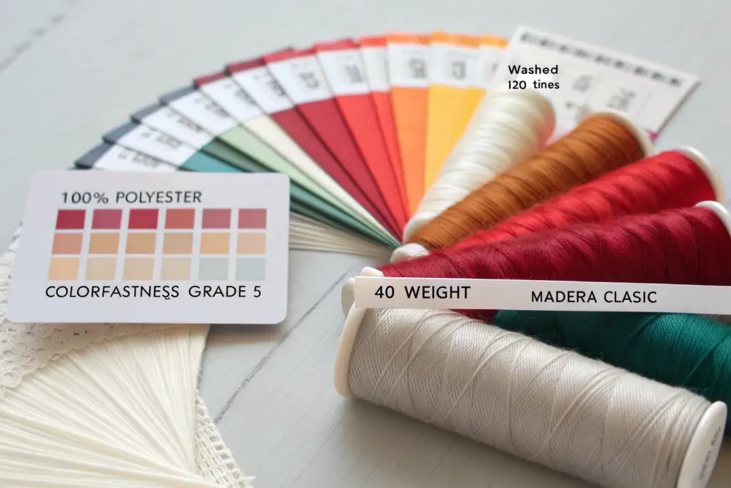
The thread specification for complex embroidery should name the specific brand, fiber type, and weight. The industry standard for premium embroidery is a 100% polyester trilobal filament thread, such as Madeira Polyneon or Gunold Poly, in a 40-weight thickness for most designs. Polyester is preferred over rayon for its superior colorfastness, bleach resistance, and tensile strength. The thread brand should be specified because generic "polyester thread" varies enormously in quality. A named brand ensures a consistent, tested product. The thread color should be specified using the thread manufacturer's color code, not a generic color name. "Madeira Polyneon #1982 Deep Navy" is precise. "Dark blue thread" is ambiguous.
The thread specification should also address the bobbin thread. The bobbin thread is the thread on the underside of the embroidery. It is typically a finer, white or black polyester thread. The bobbin thread specification matters for the tension balance and the appearance of the embroidery reverse side, which is visible on unlined garments.
Why Is a Physical Thread Color Chart Superior to a Digital Screen Swatch?
Digital screens are not color accurate. A navy blue on a designer's calibrated monitor in New York will look different on an uncalibrated monitor in Shanghai. A CMYK or RGB color code sent to a factory does not correspond directly to a physical thread color. The thread is a physical object with its own color properties.
A physical thread color chart is a book or a card produced by the thread manufacturer that contains actual samples of every thread color in their range, identified by a unique color code. The brand owner selects the thread color from the physical chart, notes the manufacturer's color code, and sends that code to the factory. The factory orders the exact thread by that code. The color match is guaranteed.
If the brand owner does not have a physical thread chart, the next best method is to send a physical color reference, a fabric swatch, a Pantone chip, a printed color target, to the factory. The factory's digitizer or thread specialist will match the physical reference to the closest thread color and send a stitch-out on the actual fabric for the brand owner's approval. This method is slower than using a physical thread chart directly but is far more accurate than relying on digital color communication.
A brand owner with a specific shade of burnt orange for his brand logo invested in a Madeira thread color chart. He identified the exact thread code, Madeira Polyneon #1742 Burnt Orange, and included it in his embroidery brief. The factory ordered the thread. The sample was stitched. The color was a perfect match. There were zero color revision cycles. The $30 thread chart saved weeks of sampling time.
How Do You Test Embroidery for Colorfastness to Light and Multiple Washes?
The brand owner should request colorfastness testing for the embroidered sample, particularly if the garment is positioned as a premium product expected to last for years. The testing verifies that the thread will not fade in sunlight or bleed in the wash.
Colorfastness to light is tested according to ISO 105-B02 or AATCC 16. The embroidered fabric is exposed to a high-intensity xenon arc lamp that simulates sunlight. The color change is assessed against a grey scale and given a grade from 1, severe fading, to 5, no fading. For premium garments, a grade of 4 or higher is expected.
Colorfastness to washing is tested according to ISO 105-C06 or AATCC 61. The embroidered fabric is subjected to accelerated washing cycles with detergent, temperature, and mechanical action. The color change of the embroidery and the staining of an adjacent white fabric are assessed. A grade of 4 or higher is expected.
These tests can be performed by the thread manufacturer, who provides technical data sheets for their products, or by an independent testing laboratory. The brand owner should request the test reports as part of the embroidery approval process. A reputable thread manufacturer like Madeira or Gunold publishes colorfastness data for their entire product range.
A brand owner producing men's swim shorts with an embroidered logo required colorfastness to chlorinated water and sea water, in addition to light and washing. We used a Madeira Polyneon thread with documented resistance to chlorine and salt water. We sent the embroidered fabric sample to an independent lab for the full suite of tests. The results exceeded the brand's standards. The logo embroidery on the swim shorts remains vibrant after multiple seasons of pool and ocean use.
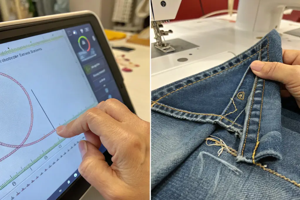
What Can a "Stitch-Out" Approval Sample Reveal That a Digital Proof Cannot?
A digital proof of an embroidery design, a simulation generated by the digitizing software, is a useful preview tool. It shows the stitch directions, the color separations, and the overall layout. But it has fundamental limitations. It cannot show how the thread will interact with the specific fabric. It cannot show how the light will reflect off the satin stitches. It cannot show how the fabric will drape after the embroidery is applied. It cannot be touched.
A stitch-out approval sample, a physical embroidery of the design on the actual production fabric, is the only reliable basis for final approval. The stitch-out reveals fabric puckering around dense stitch areas, the true color of the thread against the fabric ground, the tactile stiffness of the embroidery, the clarity of small text and fine details at the actual size, and the overall aesthetic balance of the design on the garment. A digital proof is a preview. A stitch-out is reality. No complex embroidery design should go into bulk production without an approved physical stitch-out on the correct fabric.
The stitch-out should be produced on the exact fabric that will be used in bulk production, not on a similar fabric or a standard backing material. A design that stitches beautifully on a stable woven canvas may pucker and distort on a stretchy jersey knit. The fabric matters.
How Do You Assess "Pull Compensation" and "Underlay" on a Physical Stitch-Out?
Pull compensation is the digitizer's adjustment for the fact that the embroidery thread pulls the fabric inward as it is stitched. A circle stitched without pull compensation will emerge as a slight oval, narrower in the direction of the stitch angle. The digitizer compensates by slightly widening the design in the stitch direction. The stitch-out reveals whether the pull compensation is correct.
On the stitch-out, measure the critical dimensions of the embroidered design. If the design is specified as 50mm wide, it should measure 50mm wide on the stitch-out, within a tolerance of 1mm. If it measures 48mm, the pull compensation was insufficient. The digitizer must adjust the file.
Underlay is the foundation stitching laid down before the top stitches. It stabilizes the fabric, creates a platform for the top stitches, and affects the final texture and dimensionality. The stitch-out reveals whether the underlay is appropriate for the fabric. Insufficient underlay on a stretch fabric will result in a distorted, wavy design. Excessive underlay on a light fabric will create a stiff, heavy embroidery that affects the garment drape.
The stitch-out assessment should include a drape test. Hold the embroidered fabric by one corner. Does the fabric drape naturally, or does the embroidered area hang stiffly like a rigid patch? The embroidery should be flexible and integrated with the fabric, not a separate, solid object attached to it. If the embroidery is too stiff, the stitch density or the underlay is excessive.
What Should You Check on the Reverse Side of the Embroidery?
The reverse side, the back, of the embroidery reveals the quality of the digitizing and the machine setup. A clean, well-organized reverse side has no loose threads, no thread nests, and a consistent bobbin thread appearance. A messy reverse side is a sign of tension problems, poor digitizing, or inadequate machine maintenance.
Check for thread breaks. A thread break during stitching leaves a small gap in the design on the front side and a loose thread tail on the back side. The stitch-out should be examined carefully for any gaps or missing stitches.
Check the bobbin thread visibility. The bobbin thread should be primarily on the back side. If the bobbin thread is pulling through to the front side, the top thread tension is too tight, or the bobbin tension is too loose. The tension adjustment is a machine setting that the factory must correct before bulk production.
For garments worn against the skin, such as t-shirts and baby clothing, the reverse side of the embroidery must be smooth and non-irritating. A rough, scratchy reverse side will cause consumer complaints and returns. A backing material, a soft, lightweight interfacing, can be applied to cover the embroidery reverse and protect the skin. The brand owner should specify this requirement if the garment is worn directly against the body.
A brand owner approving a stitch-out for a children's t-shirt ran his finger over the reverse side. He felt a slight scratchiness from the dense tatami fill area. We added a soft, fusible backing patch over the embroidery reverse. The next stitch-out was smooth and comfortable against the skin. The minor adjustment prevented a significant comfort issue that would have generated returns from parents.
Conclusion
Complex embroidery is a collaboration between the designer's vision and the digitizer's technical expertise, executed by the factory's embroidery team. The quality of the final product depends on the clarity and completeness of the brief that connects these three parties. A vague brief produces a disappointing sample. A precise brief produces a successful product.
We have defined the five essential components of an effective embroidery brief. The digitized stitch file, created by a skilled digitizer briefed on the design intent, is the foundational technical document. The placement specification, with exact coordinates and a placement jig, ensures the design sits perfectly on every garment. The thread specification, with a named brand and a physical color code, guarantees color accuracy and long-term durability. The stitch-out approval sample on the actual production fabric reveals the physical reality of the embroidery that no digital proof can show. And the assessment criteria, pull compensation, underlay, reverse side, drape, provide the objective standards for approving the stitch-out or requesting revisions.
The brand owner who invests time in preparing this brief, and who partners with a factory that has in-house digitizing and embroidery capability, will bring complex embroidery designs to market efficiently and to specification.
At Shanghai Fumao, our embroidery department includes in-house digitizers who work directly with our brand clients to translate their designs into production-ready stitch files. We maintain a full library of Madeira and Gunold thread color charts. We produce stitch-out samples on the actual production fabric for every new design. We create placement jigs for every placement specification. We do this because we understand that embroidery is a precision process that rewards thorough preparation.
If you have a complex embroidery design you want to bring to life, or if you have been frustrated by embroidery sampling delays and quality issues with previous suppliers, I invite you to contact our Business Director, Elaine. She can connect you with our embroidery digitizing team, walk you through our briefing process, and arrange for a stitch-out sample on your fabric. Reach Elaine at elaine@fumaoclothing.com. Let's stitch your vision into reality.