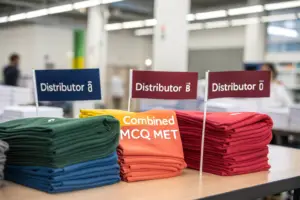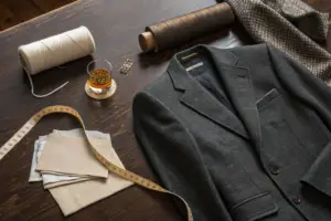
A distributor from Chicago once said to me, "I know what I like. I just don't know how to describe it." He had built a successful business selling men's casual shirts. He understood his customer, the price point, and the sales channel. But when it came to describing a collar shape or a cuff detail, he struggled. He had been relying on his previous supplier to "make it look good," but the results were inconsistent. Some seasons, the shirts looked premium. Other seasons, the same spec produced something that looked cheap. He could not articulate why. He just knew his return rate spiked when the "look" was off. He felt trapped because he knew his limitations but did not know how to assess whether a factory could compensate for them.
You can evaluate a supplier's aesthetic understanding without design expertise by conducting a structured sample interpretation test. Provide the same basic tech pack to multiple suppliers and analyze the submitted samples against specific, observable criteria: proportion interpretation, color and fabric sensibility, and detail refinement. Ask the supplier to explain why they made specific aesthetic choices. Their answers reveal whether they made conscious design decisions or simply copied the spec without understanding the visual intent. A supplier with genuine aesthetic intelligence can articulate the "why" behind the "what."
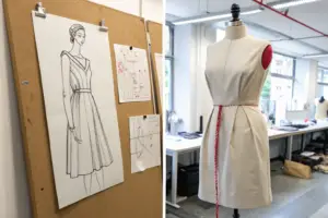
Aesthetic sense in garment manufacturing is not about being an artist. It is about understanding proportion, balance, color harmony, and the subtle details that make a garment look expensive rather than cheap. It is the difference between a collar that frames the face elegantly and one that looks like an afterthought. It is the difference between a print placement that looks intentional and one that looks random. These things can be evaluated systematically, even if you do not have a design background. At Shanghai Fumao, we work with many distributors who are merchants first and designers second, or not at all. Our job is to be their aesthetic partner. Let me show you how to find a factory that can do this for you.
How Do You Test a Factory’s "Design Eye" Before You Commit to a Full Order?
The standard sampling process tests a factory's technical ability. Can they sew a straight seam? Can they match a pattern at the side seam? Can they attach a zipper cleanly? These are important questions, but they do not answer the aesthetic question. A garment can be technically perfect and still look unattractive. The collar shape is slightly off. The sleeve is slightly too wide. The length is slightly awkward. None of these are technical defects, but together they produce a garment that does not sell. Testing a factory's design eye requires a different kind of sample request.
You test a factory's design eye by giving them an intentionally incomplete design brief. Provide a reference image, perhaps a photo of a designer garment you like, and ask the factory to create a similar garment at your target FOB price, with their own interpretation of the key details. Do not provide a full graded spec with every measurement defined. Leave room for the factory to make aesthetic choices. The sample they produce, and the explanation they give for their choices, reveals whether they have genuine aesthetic intelligence or are simply order-takers.
An order-taker will produce a literal copy of the reference image, often poorly proportioned because they scaled it without understanding the original design intent. An aesthetic partner will produce an interpretation. They will say, "We kept the lapel width from your reference, but we narrowed the shoulder slightly because the original shoulder was extended for a runway look and would look disproportionate on a commercial size medium." That explanation demonstrates understanding. That is the factory you want.
What Is an "Incomplete Brief" Test and How Does It Reveal Aesthetic Judgment?
An incomplete brief test works by giving the factory enough information to understand the product category, the target customer, and the price point, but not enough to simply execute a paint-by-numbers spec. The brief leaves deliberate gaps that the factory must fill with their own judgment. How the factory fills those gaps tells you everything about their design intelligence.
A good incomplete brief looks like this. "We want a women's midi dress for a resort collection. Target retail is $120. The customer is 30 to 45, buys from Anthropologie and small boutiques. We like the feeling of this reference image, the relaxed elegance, the sleeve detail. We don't have a specific measurement spec. Please propose a silhouette, a fabric, and a color palette that fits this brief." The factory receives the target customer, the price point, and a mood reference. They must fill in the silhouette, the fabric, and the colors.
A factory with no aesthetic judgment will respond with a generic, safe, boring dress. A simple shift in a solid beige linen. It meets the brief technically but has no point of view. A factory with aesthetic judgment will respond with a considered proposal. "We suggest a bias-cut midi in a sand-washed silk-linen blend for movement. A subtle puff sleeve with a self-fabric tie at the cuff, inspired by your reference but scaled for everyday wear. A color palette of faded terracotta, sea glass green, and warm ivory." This response shows they understood the "relaxed elegance" mood and translated it into specific, coherent design choices.
We participated in an incomplete brief test for a distributor who sold women's workwear. She sent us a photo of a designer blazer and said, "I want this feeling, but for a teacher, not a fashion editor." Our team proposed a softer shoulder construction, a slightly longer body length for coverage, and a machine-washable stretch-cotton twill that looked tailored but felt comfortable. We explained each choice and why it suited the target customer. She told us later that two other factories sent her literal copies of the designer blazer in cheap polyester. Our interpretation won the business because we demonstrated we were thinking about her customer, not just her spec sheet.
How Should You Evaluate the "Why" Behind a Supplier's Sample Choices?
The sample itself is half the test. The supplier's explanation of the sample is the other half. A supplier who cannot explain their choices either made no conscious choices or does not understand their own process. Neither is acceptable.
Ask the supplier to present the sample with a commentary. "Walk us through this sample and tell us why you made each key decision. Why this collar shape? Why this button placement? Why this hem length?" Listen for answers that reference the target customer, the intended use, the fabric behavior, and the overall visual balance. Listen for a design vocabulary.
A weak answer sounds like this. "We just followed the reference." That tells you nothing. They copied. They did not think. A strong answer sounds like this. "We lowered the button stance by two centimeters from the reference because the reference was a size 2 runway sample and a size 8 commercial garment needs a slightly lower break point to maintain the same proportional relationship. We also reinforced the button placket with a slightly heavier interfacing because the linen fabric has a soft drape and needed more structure at the closure to prevent gaping." This answer references proportion, scaling, fabric behavior, and functional wearability. It demonstrates deep understanding.
A distributor client asked us to explain the pocket placement on a utility jacket sample we made for him. We explained that we had moved the chest pockets outward by three centimeters from the standard placement because his brand's customer demographic had broader shoulders, and the outward placement created a more balanced visual frame. He was stunned. He had never thought about pocket placement in relation to shoulder width. He knew his customer's body type but had never connected it to a specific design detail. Our explanation not only justified the sample but also educated him and built his confidence in our partnership.
What Specific Garment Details Reveal a Supplier’s Understanding of Proportion?
Proportion is the invisible language of garment design. It is the relationship between the size of a collar and the width of a shoulder. It is the placement of a waist seam relative to the natural waist. It is the length of a sleeve relative to the length of the body. When proportion is right, the garment looks harmonious. The wearer looks balanced. When proportion is wrong, the garment looks awkward. The wearer looks somehow "off," even if the observer cannot articulate why. A supplier with aesthetic understanding obsesses over proportion.
A supplier's understanding of proportion is revealed in three specific garment details: collar scale and shape relative to the garment size, pocket placement and size on the body, and sleeve-to-body length ratio. A supplier with a trained eye will adjust these proportions for different sizes, ensuring a size XS and a size XL both look aesthetically balanced, not just technically graded. A supplier without this skill will apply a mechanical grade that produces awkward proportions at the size extremes.
Grading is the technical process of scaling a pattern from a base size to a range of sizes. A mechanical grade increases all measurements by a fixed increment. An aesthetic grade adjusts the increments to maintain the visual balance of the original design. A collar that looks perfect on a size medium might look comically small on a size XXL if graded mechanically. A skilled pattern maker will increase the collar size proportionally, even if the strict grade rule does not require it, because they are designing for the body, not just the spreadsheet.
Why Is Collar Scale the Single Most Telling Sign of a Factory's Aesthetic Sense?
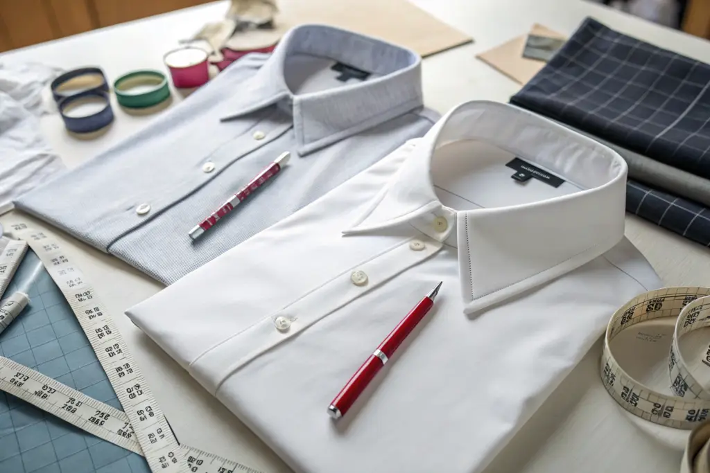
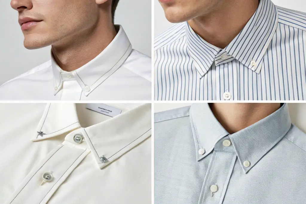
The collar frames the face. It is the most visible detail on a shirt, a blouse, a jacket, or a coat. An aesthetically aware factory treats the collar as a critical design element, not an afterthought. They understand that collar scale must relate to the garment size, the fabric weight, and the intended style.
A collar that is too small for a garment looks stingy and cheap. It suggests the factory used the same collar pattern piece for all sizes to save cutting time. A collar that is too large looks clownish. It overpowers the face and throws the entire garment out of balance. The correct collar scale creates a harmonious frame for the face, regardless of the garment size.
A collar's shape is equally telling. The curve of the collar point, the height of the collar band, the roll line where the collar folds over. These subtle curves are almost impossible to specify in a tech pack. They are the result of skilled pattern cutting and pressing. A factory that consistently produces beautiful collars has a pattern maker with an eye for line and a finishing team that understands pressing as a shaping process, not just a wrinkle-removal step.
A men's shirt distributor I work with told me that his return rate dropped by half when he switched to us from his previous supplier. The only change was the collar. The fabric, the fit, the price, were all the same. The previous supplier's collar was technically correct, the measurements matched the spec, but it lacked life. It sat flat and lifeless. Our collar had a gentle roll, a slight lift at the back, a soft curve at the points. It looked like a collar from a much more expensive shirt. Customers noticed. They could not explain why, but they felt the difference. The collar was the silent signal of quality.
How Do You Assess Pocket Placement and Size on a Sample Garment?
Pockets are a design detail that many non-designers overlook, but an aesthetically aware factory treats them with precision. Pocket placement affects the visual balance of the entire garment. A chest pocket placed too low drags the eye down and makes the torso look short. A pocket placed too high looks crowded and nervous. A pocket placed too far to the side looks like it is trying to escape the body. The correct placement creates a balanced, grounded visual anchor.
Pocket size is equally important. A pocket that is too small for the garment looks like a toy pocket. It is functionally useless and aesthetically jarring. A pocket that is too large overwhelms the garment and dominates the visual field. The pocket should be proportionate to the garment and to the wearer's hand. A functional pocket must accommodate a phone or a hand, not just look decorative.
Ask the supplier to explain their pocket placement. A thoughtful supplier will reference body landmarks. "We placed the chest pocket with its center aligned to the mid-clavicle line, and the pocket opening at the level of the fourth rib, which is the natural break point when the arm is relaxed." This is a supplier who thinks about the body wearing the garment, not just the pattern on the table.
A women's utility jacket sample we made for a client had a patch pocket on the chest. In the sample review, she asked if we could move the pocket "just a little to the left." We asked why. She said it "felt off-center." We measured the pocket placement relative to her body centerline. It was mechanically centered on the pattern, but when the jacket was worn on a female body with curves, the visual center shifted. We adjusted the pocket placement 1.5 centimeters outward to create optical balance, even though the measurement was now technically asymmetrical on the flat pattern. The client was amazed. She had felt the problem but could not diagnose it. We solved it because we understood that visual balance on a three-dimensional body is not the same as mechanical symmetry on a two-dimensional pattern.
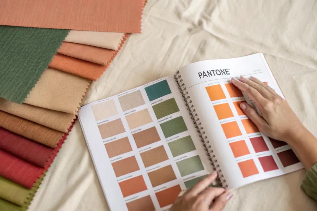
Can a Supplier’s Color and Fabric Recommendations Enhance Your Product Value?
Color and fabric are not purely subjective matters of taste. They are commercial decisions that directly impact sell-through. The right color in the right fabric can sell out at full price. The wrong color, even in a perfectly constructed garment, will sit on the rack until it is marked down to cost. A supplier with aesthetic intelligence understands the commercial weight of color and fabric choices and can guide a non-designer client toward selections that will perform in their specific market.
A supplier's color and fabric recommendations enhance product value when they demonstrate an understanding of the client's target customer demographic, the regional climate, the retail season, and the competitive landscape. A supplier who simply shows you their available fabric swatches and asks you to pick is providing a commodity service. A supplier who curates a selection of fabrics and colors specifically for your brand, with a rationale for each recommendation, is providing a value-added design partnership.
The curated selection is the sign of aesthetic intelligence. It shows the supplier has filtered their fabric library through the lens of your brand identity. They are not just showing you what they have. They are showing you what will work for you. The rationale behind each selection, the weight is right for your summer launch, this shade of blue tests well with your customer demographic, this texture adds the "handmade" feel your brand messaging emphasizes, demonstrates that the supplier is thinking commercially, not just showing inventory.
How Do You Judge a Supplier's Color Palette Proposal for Your Market?
A color palette proposal from a supplier should be more than a list of colors they have in stock. It should be a coherent color story with a clear point of view. The colors should relate to each other in a way that feels intentional, not random. They should reflect an understanding of your market's color preferences.
Evaluate the palette against three questions. First, is the palette coherent? Do the colors work together as a group? A supplier with no aesthetic sense will show you five random colors they happen to have. A supplier with aesthetic sense will show you a palette where each color relates to the others in tone, saturation, or temperature. The palette tells a story.
Second, is the palette appropriate for your target customer and climate? A neon brights palette proposed for a brand selling to conservative, older women in the Northeast is a mismatch. A supplier who understands your market will propose colors that resonate with your customer's taste and lifestyle.
Third, does the palette reflect an awareness of the upcoming season's color direction? A supplier who is plugged into the fashion industry will know that terracotta is trending for Resort 2026 and sage green is replacing mint as the new neutral. They will incorporate this intelligence into their proposal, helping you stay relevant without being trend-chasing.
A distributor selling women's dresses to Southern boutiques asked us to propose a summer color palette. We proposed a palette of sun-bleached coral, sea grass green, and warm sand, with an accent of deep indigo for a pop. We explained that the palette was inspired by the Gulf Coast landscape, resonating with her customer's regional identity, and that the colors were selected to flatter tanned skin tones, which is relevant for her summer customer. She adopted the entire palette without changes. Her sell-through that season was 92% at full price, her best ever. She attributed much of that success to the color story, which her customers responded to emotionally.
What Fabric Weight and Drape Choices Signal Design Intelligence?
Fabric weight and drape are the technical parameters that create aesthetic effect. A skilled supplier understands the relationship between fabric weight, garment silhouette, and body type. They will recommend a heavier fabric for a structured blazer that needs to hold its shape, and a lighter, fluid fabric for a bias-cut dress that needs to move with the body. They will steer a client away from a beautiful fabric that is wrong for the intended design.
A supplier who accepts every fabric choice without comment is not providing aesthetic partnership. They are providing order fulfillment. A supplier who says, "This linen is beautiful, but it is 250 GSM and will be too stiff for the soft drape you want on this maxi dress. We recommend this 180 GSM linen-cotton blend instead. It has a similar texture but will flow much better on the body," is providing design intelligence.
The drape of a fabric can be tested by asking the supplier to provide a drape video. A simple smartphone video of the fabric being held and released, or draped over a mannequin, tells you more about how a garment will look on a body than any spec sheet. A supplier who proactively provides these videos is demonstrating an understanding that fabric is not just a specification. It is a material with behavior, and that behavior determines the aesthetic success of the garment.
A client wanted to produce a women's slip dress in a silk-look fabric but at a lower price point. We recommended a specific Tencel twill with a sand-washed finish that had a similar luster and drape to silk charmeuse, but was machine washable and a third of the cost. We sent her a drape video showing both fabrics on a mannequin, side by side. The visual similarity was striking. The Tencel dress looked like a luxury product. She produced the dress. Her customers could not tell the difference, and the machine-washable care was a huge selling point. The fabric recommendation was based on a deep understanding of fabric aesthetics and commercial pragmatism.
How Do You Use "Visual Benchmarking" to Align Aesthetic Expectations?
The biggest risk in an aesthetic conversation between a non-designer client and a factory is misaligned expectations. The client says, "I want it to look premium." The factory hears "premium" and thinks of a specific level of construction and material. The client's mental image of "premium" might be very different. When the sample arrives, the client is disappointed. The factory is confused. Both parties feel the other did not understand. Visual benchmarking eliminates this risk.
Visual benchmarking is the practice of using specific, commercially available reference garments to define the aesthetic quality level for each element of your product. You provide the factory with a physical or photographic example of a garment that represents your target aesthetic level for collar construction, for fabric hand feel, for button quality, for stitching visibility. The factory matches the benchmark, not an abstract adjective. "Make it look as good as this" is a clear, objective instruction that bypasses the limitations of verbal description.
The key is to use real, purchasable garments as benchmarks, not runway photos or editorial images. A runway garment is often a one-off, constructed with techniques and materials that are not commercially scalable. An editorial photo is styled, lit, and retouched. A real, off-the-rack garment from a brand at your target market level is an achievable, honest benchmark. The factory can examine it, deconstruct it, and match it.
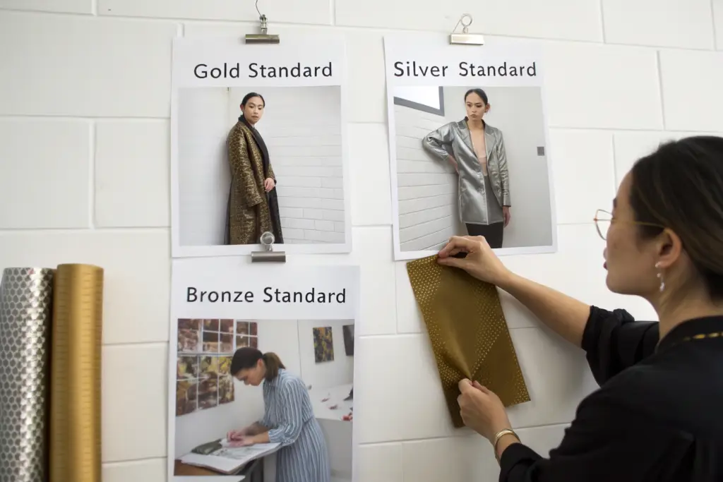
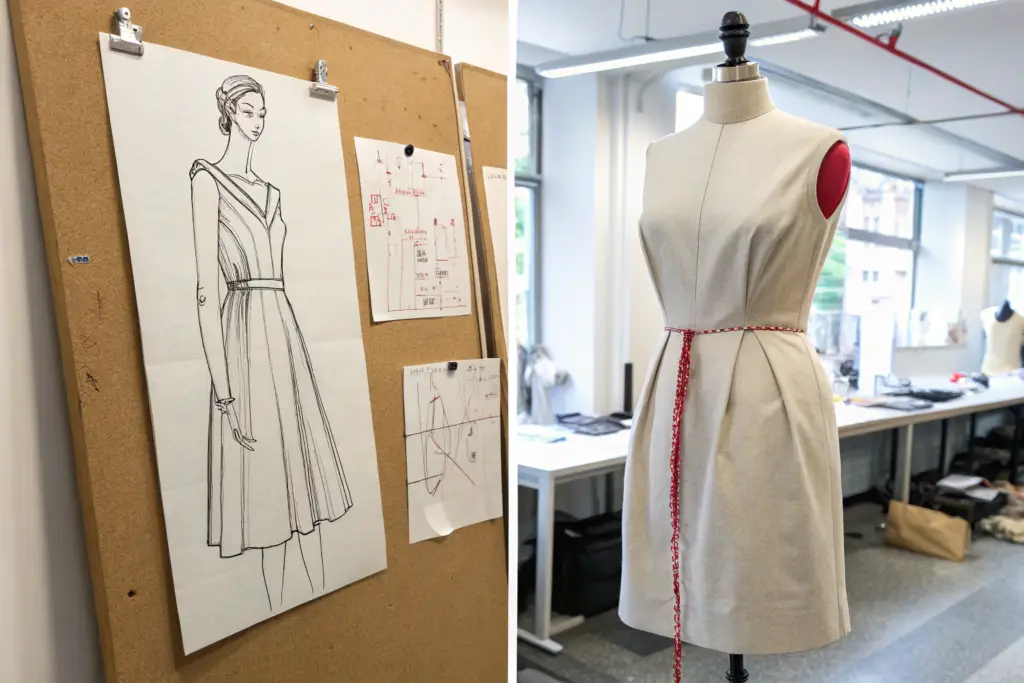
What Is a "Good-Better-Best" Sample Set and How Do You Build One?
A "Good-Better-Best" sample set is a collection of three physical garment samples that represent three distinct quality and price levels for the same product category. The "Good" sample is the entry-level, the minimum quality you would accept. The "Better" sample is your target, the quality you are aiming to produce. The "Best" sample is the aspirational reference, the designer-level garment that inspires your design but is above your price point.
To build the set, go shopping. Buy a shirt from a mass-market brand at your "Good" level. Buy a shirt from a contemporary brand at your "Better" level. Buy a shirt from a designer brand at your "Best" level. Ship these three shirts to your factory. Tell them, "This is the range. We are aiming for the 'Better' level. We like the collar from the 'Best' sample, but simplified. We cannot accept anything below the 'Good' level."
The physical samples communicate more in a single glance than a hundred pages of written specifications. The factory can feel the fabric weight difference between the Good and Better levels. They can see the stitching density difference. They can examine the button quality. They now have a calibrated sensory understanding of your aesthetic expectations.
A distributor client did this with men's casual trousers. He sent us a Good sample from a fast-fashion brand, a Better sample from a mid-tier department store brand, and a Best sample from an Italian luxury brand. He wanted the Better level with a detail from the Best, a specific side adjuster on the waistband. The physical samples made his request instantly clear. We deconstructed the Best side adjuster, simplified the construction to fit his Better-level cost, and produced a trouser that exceeded his expectations. The Good-Better-Best set compressed months of verbal back-and-forth into a single shipment.
How Do You Use Reference Images That Communicate Without Words?
Reference images are a universal language, but they must be selected and annotated with intention. A folder of fifty Pinterest images labeled "inspiration" is not a design brief. It is a mood board without a point of view. The factory cannot know which element of each image you are referencing. The color of image three? The sleeve of image twelve? The overall vibe of image twenty-seven? The ambiguity leads to mismatched expectations.
A effective reference image set is curated and annotated. Each image includes a brief note explaining exactly what you are referencing. "Reference Image A: We like the collar shape, specifically the width of the collar point and the height of the band." "Reference Image B: We do NOT like this pocket. It is too large and placed too low. Avoid this." The annotation removes ambiguity. The factory knows exactly what to take and what to leave.
Also useful are negative references, images of what you specifically do not want. "We want the fabric to feel like this, but NOT look shiny like this." A negative reference paired with a positive reference defines the acceptable range. The factory knows the boundaries. They can make decisions within the defined space without needing to ask for clarification on every detail.
A client once sent us a single photo of a vintage dress she found in a Paris flea market and a note that said, "I want this feeling, but for a modern woman." The photo was beautiful but the instructions were vague. We asked for more direction. She then sent three additional photos: one of a contemporary brand's dress with a sleeve she liked, one of a fabric texture she loved, and one of a dress with a neckline she specifically did not want. With these four annotated images, we had a complete aesthetic brief. The sample we produced captured the romantic, worn-in feeling of the vintage dress while being perfectly wearable for a modern customer. The four images did what a thousand words could not.
Conclusion
Evaluating a supplier's aesthetic understanding is not about having a design degree. It is about having a structured method for observing, questioning, and benchmarking. The method replaces subjective feeling with objective evidence. You do not need to know if a collar is "beautiful." You need to observe if the collar scale is proportionate to the garment size, and if the supplier can articulate the proportional logic behind their choice. You do not need to know if a color is "on trend." You need to observe if the supplier's color palette is coherent and appropriate for your specific customer, and if they can justify each selection with reference to your market.
The incomplete brief test reveals whether the supplier fills design gaps with creative intelligence or generic templates. The proportion details, collar, pocket, sleeve-to-body ratio, reveal whether the supplier's pattern maker has an eye for visual balance or just mechanical grading. The color and fabric recommendations reveal whether the supplier understands the commercial weight of aesthetic choices. And the visual benchmarking process, the Good-Better-Best set and the annotated references, ensures that both parties are aiming for the same target, not two different interpretations of the same words.
A supplier who passes these tests is not just a manufacturer. They are an aesthetic partner. They can compensate for your design limitations. They can elevate your product beyond what you could specify yourself. They can be the silent design intelligence behind your brand.
At Shanghai Fumao, we have built our sample development team to be exactly this kind of partner. Our pattern makers, our fabric specialists, and our sample sewers are trained to think like designers, not just technicians. We ask why. We propose alternatives. We curate palettes. We benchmark to commercial references. We do this because many of our most successful clients are not designers. They are entrepreneurs who know their customer and their market, and who need a manufacturing partner that can translate that business knowledge into beautiful, saleable product.
If you are a distributor or brand owner who knows your numbers but feels insecure about your design eye, I invite you to contact our Business Director, Elaine. She can walk you through a sample aesthetic evaluation exercise using your own product category, share examples of how we have interpreted other non-designer briefs, and discuss how we would approach your specific aesthetic challenges. Reach Elaine at elaine@fumaoclothing.com. You do not need to be a designer to create beautiful clothing. You need a factory that designs with you.