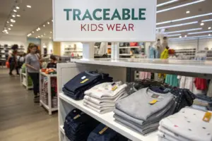
I will never forget a phone call I received in March 2021. A brand owner from Seattle was furious. He had just opened his shipment of 3,000 organic cotton T-shirts, ready for a spring launch. The body panels were a perfect sage green. The sleeves, cut from a different fabric batch, looked almost mint. The garments were unsellable as a matching set. He lost his selling window, and I almost lost a client. That day, I realized that color is not just a design detail. It is a financial risk. If the left sleeve does not match the right, the garment is worth zero dollars. As the owner of Shanghai Fumao, I knew we had to move from trusting the eye of a dye master to trusting hard scientific data and locked-down processes.
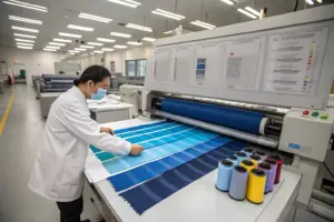
Ensuring color consistency across different fabric batches requires a closed-loop system that combines digital spectrophotometer readings, strict Delta E tolerances under D65 lighting, and physical lab dip retention. At Shanghai Fumao, we do not ship a single cut of fabric unless the numerical color difference from the approved standard falls below Delta E CMC 1.0 for critical solid colors. This removes subjective human judgment from the quality control equation.
But hitting that number on a machine is only one part of the puzzle. The real challenge is maintaining that exact shade when the raw cotton arrives in a different season, the humidity in the dye house changes, or the fabric construction shifts from a jersey to a fleece. You need a system that controls the variables before they become problems. Let me walk you through how we built that system, so you never have to explain to your customers why the "navy" blazer they bought online looks black.
What Is the Delta E Standard in Garment Dyeing?
A lot of people think "matching" means it looks the same. In a professional dye house, "matching" means the machine says it is the same. The difference is measured by a unit called Delta E. If the Delta E is zero, the colors are mathematically identical. If it is above 1.0, a trained eye can see the difference under controlled light. If it is above 2.0, an untrained customer on a Zoom call can spot the shade difference between a collar and a body panel. I had to learn the hard way that "close enough" is an expensive phrase. We once dyed 1,800 yards of a burgundy poly-cotton twill. It looked fine in our warm factory lights. It looked purple in the client’s cool warehouse LEDs. That is a phenomenon called metamerism, and it taught me that the light source matters just as much as the dye formula.
The Delta E CMC standard gives a numerical tolerance for color error, with a pass typically set below 1.0 for garment panels that sit next to each other. Unlike a simple Delta E 1976 measurement, the CMC formula accounts for how human eyes perceive color shifts, weighting lightness and chroma differently. This prevents a situation where a machine gives a "pass" to a color that a human would instantly reject.
When you set up a contract with a factory like Shanghai Fumao, you need to agree on the Delta E standard before the dye beakers come out. Here is how we break it down in our pre-production meetings.
Why Do D65 and TL84 Light Sources Create Different Colors?
Metamerism is the trap. Two fabrics can look perfectly matched in a store window under daylight, but step into a dressing room with fluorescent bulbs, and the jacket suddenly looks like a different shade from the pants. D65 represents natural noon daylight. TL84 represents the typical fluorescent light found in a big-box American retail store. We test every lab dip in a light booth that switches between these two sources. If a fabric matches under D65 but fails under TL84, we reject the dye recipe.
I remember a specific project for a corporate uniform brand in Texas. They had very strict branding guidelines for their "company red." We submitted a lab dip that was a 0.5 Delta E under D65. Perfect. But when we flicked the switch to TL84, the Delta E jumped to 2.8. The red shifted toward orange. We had to adjust the dye concentration by 5% and add a touch of blue to neutralize the shift. Without that light box testing, we would have shipped uniforms that looked mismatched in the office environment where they were worn. My advice to buyers is to always specify which light source is the primary standard and which is the secondary, typically D65 first and TL84 second for the US apparel market.
Can a Spectrophotometer Replace a Human Eye?
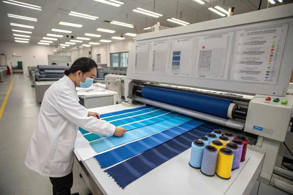
Yes, for consistency, it absolutely must. The human eye gets tired. A master dyer who has been looking at red fabric for six hours will start to see everything as slightly green as the eye's cones fatigue. A spectrophotometer does not get tired. It does not have a bad day. It measures the exact spectral reflectance curve of the fabric and spits out a Lab value.
We invested in a benchtop model five years ago. Every single batch of bulk fabric that enters our cutting room has a printed label with its Lab reading stapled to the roll. If the reading is outside the agreed tolerance, the roll sits in a quarantine zone. It does not get cut. I have found that this single habit—measuring every roll, not just a random sample—reduces our shade variation complaints by over 90%. You cannot average out color. One bad roll cuts into 500 bad garments. The machine catches it before the knife drops.
How Do Lab Dip Processes Prevent Bulk Shade Deviations?
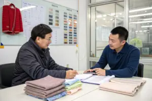
The lab dip is the tiny swatch of fabric that holds the fate of the entire production run. It is a 4-inch square of your color, dyed in a beaker. You sign off on it. I keep one copy. You keep one. It becomes the physical contract for color. But here is what many buyers do not understand: a color that works in a 100-gram beaker will not always work in a 200-kilogram dyeing machine. The physics of heat and liquid flow change the result. The skill of a great dye house is in "scaling up" the recipe accurately from beaker to bulk.
A strict lab dip protocol requires the dyed swatch to be presented in three precise variations—lighter, target, and darker—to account for bulk dyeing tolerances. Before signing off, the buyer must perform a physical evaluation under two light sources and a digital measurement against the Delta E target. This prevents the "chasing the shade" problem where a factory sends ten submissions, slowly creeping away from the original color until the final bulk fabric bears no resemblance to the design intent.
At Shanghai Fumao, we do not send a single lab dip and ask, "Is this good?" We send a story. Here is why.
Why Should Buyers Approve a "Lighter, Target, Darker" Set of Lab Dips?
When we dye bulk fabric, the color flows through a moving rope of fabric. It is not static. Slight temperature gradients in the dyeing machine can cause the end of the roll to be a touch darker than the beginning. If you only approve the perfect target, any tiny deviation inside the machine becomes a "failed" roll. This causes delays, re-dyes, and damage to the fabric hand.
We send three swatches. "A" is 5% lighter. "B" is the target. "C" is 5% darker. If you sign off on all three, you are setting a commercial tolerance range. I know that the bulk can fall anywhere in that window. For a brand like yours, this is a business decision. Is your customer picky enough to notice a 5% shade difference on a heather gray sweatshirt? Probably not. On a crisp white dress shirt? Maybe yes. The AATCC test methods we follow recommend this visual evaluation step before any bulk dyeing begins. It aligns expectations with physical reality.
What Happens When Bulk Fabric Fails the Lab Dip Match?
I will give you a real scenario from last summer. We dyed a coral pink viscose challis for a women's dress program. The lab dip was gorgeous. The first bulk batch came out with a Delta E of 1.8 against the standard. Too much yellow. It failed.
The fabric did not go to waste. We have a "color correction" protocol. We strip the dye with a reducing agent, which is delicate work because viscose loses strength when wet. Then we re-dye with an adjusted formula, adding a tiny amount of blue to neutralize the yellow. The re-dyed batch measured a 0.7 Delta E.
But we documented this failure internally. We traced it back to a faulty steam valve that kept the dye bath 3 degrees cooler than the recipe called for. The dye molecules did not bond at the right rate. We fixed the valve. We did not charge the buyer for the re-dye, because our internal process failed the first time. That level of transparency is what keeps our quality control system honest.
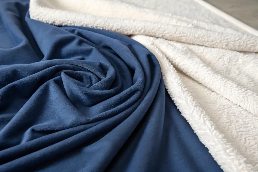
How Does Fabric Construction Affect Color Perception?
This is a lesson I wish every young fashion designer learned in school. A PANTONE 19-4029 Navy Blazer will look like a deep, rich ink on a shiny satin. Take that exact same dye recipe and apply it to a brushed fleece, and it will look like a dusty, faded midnight. The fiber surface changes the physics of light reflection. Satin bounces light back like a mirror, making the color look darker and more saturated. Fleece scatters light, making the color look lighter and duller. I have seen buyers panic, thinking we used the wrong dye, when the only difference was the fabric structure.
The same dye liquor produces visually different results on different fabric constructions due to surface reflectance geometry. A smooth weave creates a specular reflection that deepens the perceived shade, while a textured or brushed surface creates diffuse reflection that lightens it. This means you cannot use the same lab dip approval for a woven label and a knit shell, even if they are both 100% cotton.
Understanding this optical reality saves weeks of back-and-forth. You need to set a separate standard for each material, not a single master color card.
Why Does a Cotton Jersey Look Different from a Cotton Woven in the Same Dye?
The yarn twist and the weave structure matter. A high-twist yarn in a poplin woven fabric is compact. It reflects light uniformly. A low-twist, open-end yarn in a jersey knit is hairy and bulky. The tiny fibers sticking out create a "halo" that traps light.
We did an experiment for a client who wanted a matching tracksuit. The hoodie was a loopback terry. The sweatpants were a brushed fleece. We tried to use the same dye bath. The loopback looked maroon. The fleece looked almost dusty rose. We had to actually darken the dye formula for the fleece by 8% to compensate for the light-scattering effect of the brushed surface. It was an optical compensation, not a chemical mismatch. I always tell brands to trust the textile testing lab that measures color in a closed sphere, not their eyes, when matching across these structures.
How to Approve Color on a Brushed or Sandwashed Surface?
A finished, sandwashed silk charmeuse is beautiful. It has a soft, peachy hand feel. But the mechanical sandwashing process abrades the fiber surface. This creates a micro-fuzz that lightens the color by up to 15% visually.
When you approve a lab dip for a sandwashed fabric, we must present the lab dip already washed. If you approve a smooth, unwashed lab dip, you are approving a color that will literally change after the first wash. Our process at Shanghai Fumao is to take the lab dip, run it through a sample garment wash machine, dry it, and then press it. Only then do we cut the swatch for your approval. This "wash-authenticated" color standard accounts for the mechanical finishing step. If we skip this, the bulk fabric will arrive at your door looking completely different from the swatch you pinned to your mood board.
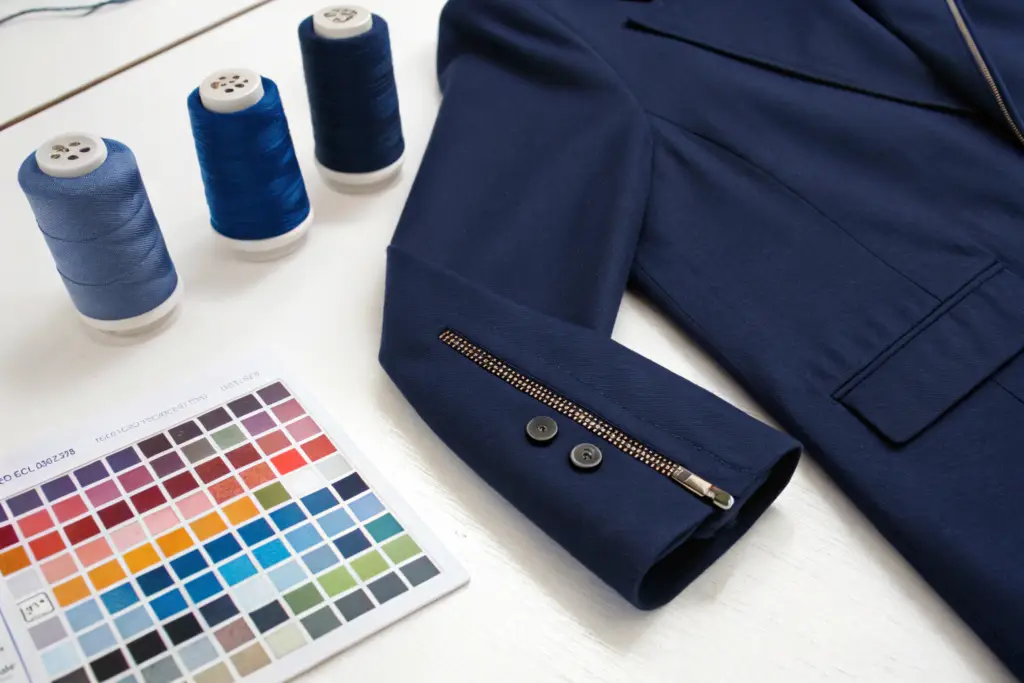
What Role Do Thread and Trim Dye Lots Play in Final Appearance?
A garment is a system, not just a piece of fabric. The sewing thread, the zipper tape, the buttons, and even the interlining all have colors. I once saw a beautiful olive-green military jacket get returned by a department store buyer because the stitching on the epaulets was a bright, yellow-toned olive, while the fabric was a cool, blue-toned olive. The jacket was perfectly sewn. It was materially defective in the buyer's eyes. Thread and trim dye lot matching is the forgotten step in color consistency. Most factories buy thread from a supplier who dyes it months ago to a stock standard. That standard might not match your specific lab dip.
Coordinating the dye lot of threads and trims with the bulk fabric requires a "color harmony review" before the first cut. Even if the Delta E between the thread and fabric is acceptable on a spectrophotometer, the luster difference—how shiny or matte the thread is—can still make it stand out against the fabric surface. This is especially critical for topstitching and contrast seams.
We treat trims as part of the color palette. They are not an afterthought.
Why Do Polyester Threads Reflect Light Differently from Cotton Fabric?
Polyester thread is essentially a plastic filament. It is smooth and shiny. Cotton fabric is made of natural fibers with a twisted, irregular surface. Dye them the exact same chemical formula, and the thread will look brighter and more saturated. This is because the smooth polyester surface acts like a mirror, while the cotton surface scatters light.
For a brand that sells workwear, this contrast might be desirable—a subtle, shiny contrast stitch. For a brand selling luxury basics, it is a defect. We had a client who wanted "tonal stitching" on premium pima cotton polos. We had to use a spun polyester thread, which is texturized to mimic cotton's matte finish, rather than a continuous filament thread. We sourced it from a supplier who could guarantee a Delta E of 0.8 against our specific dye lot. We tested it under D65. The stitching practically disappeared into the fabric, exactly as intended. I recommend buyers look at thread options from Coats or similar industrial suppliers who provide color-matching services tied to specific PANTONE codes.
How to Avoid Color Bleeding from Dark Trims onto Light Garments?
This is not about matching. This is about destruction. A red zipper tape on a white dress shirt is a ticking time bomb. If the dye on the zipper tape is not heat-set properly, it will bleed into the white fabric during the first wash, leaving a pink stain.
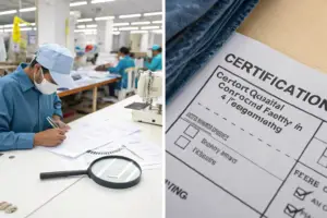
We perform a crocking test and a wash fastness test on every batch of colored trims. We cut a piece of the trim, sew it onto a piece of white test fabric, and wash it at 40 degrees Celsius. If any color transfers, the trim is rejected. I keep a "reject museum" in my office. One shelf holds a beautiful turquoise button that turned five white blouses blue. It cost the trim supplier their contract with us. At Shanghai Fumao, our trim inspection protocol uses AATCC test method 61 for colorfastness to laundering. We do not trust a supplier's certificate. We test it ourselves before a single button goes onto a shirt.
Conclusion
Color consistency does not happen by accident. It is a chain of precise, boring, and repetitive checks. It starts with a Delta E number written into the contract. It continues with a lab dip that accounts for the fabric's mechanical finish and the light source in your customer's home. It requires us to measure every single roll of bulk fabric with a machine that does not get tired. And it ends with a thread and trim check that ensures the stitch and the zipper melt into the garment, rather than screaming for attention.
We learned these lessons through hard experience. The Seattle brand that I mentioned at the start? We fixed the process. They are still our client today, and they have not had a single shade mismatch since we implemented the spectrophotometer requirement and the D65/TL84 double-check. When you partner with a factory like Shanghai Fumao, you are not just buying sewing capacity. You are buying a scientific approach to color that protects your brand from the silent revenue killer of a mismatched sleeve.
If you are tired of approving a beautiful sample only to receive a bulk shipment that looks like a faded photocopy of your design, let's change the narrative. We can walk you through our color standards book, share our measurement protocols, and prove that your palette is safe with us. Reach out to our Business Director, Elaine, at elaine@fumaoclothing.com. Let's make sure your next collection comes out looking exactly as you drew it.