
As an experienced apparel manufacturer working with U.S. brands, I've observed that many struggle with color coordination. A disjointed palette weakens brand identity and confuses customers, while a cohesive color story creates emotional connection and elevates your collection's perceived value. This strategic approach consistently leads to stronger sales and a more professional brand image for our clients.
A cohesive color story involves strategically selecting and applying a defined color palette across your collection to create visual harmony that resonates with your target audience. It transforms individual garments into a compelling, unified offering that tells your brand's story effectively.
Let's explore how to build a color story that performs in the competitive U.S. fashion market.
Why is a Cohesive Color Palette Crucial for Brand Identity?
A unified color palette establishes immediate brand recognition and professionalism. When customers associate specific colors with your brand, you build visual consistency that fosters trust and loyalty in a crowded marketplace. Major global brands demonstrate how disciplined color stories create instant identification.
A cohesive palette also enhances the shopping experience by enabling customers to easily mix and match pieces, increasing average order value and encouraging repeat purchases.
How Does Color Psychology Influence Consumer Buying Decisions?
Colors evoke specific emotions and associations that directly impact purchasing behavior. Blue conveys trust and dependability, making it ideal for corporate wear and denim. Red signals energy and urgency, effective for activewear and calls to action. Green associates with nature and sustainability, appealing to environmentally conscious consumers.
Your color choices should align with your brand's core values and target audience's aspirations. Luxury brands often use deep, rich tones like burgundy or navy to convey sophistication, while youth-oriented brands might select bright, saturated hues to express energy. The Pantone Color Institute provides valuable insights into color meanings and trends.
What Are the Common Mistakes in Color Selection?
Brands often choose colors in isolation without considering how they work together in a collection. Other common errors include blindly following trends that don't suit brand identity and failing to balance color roles effectively.
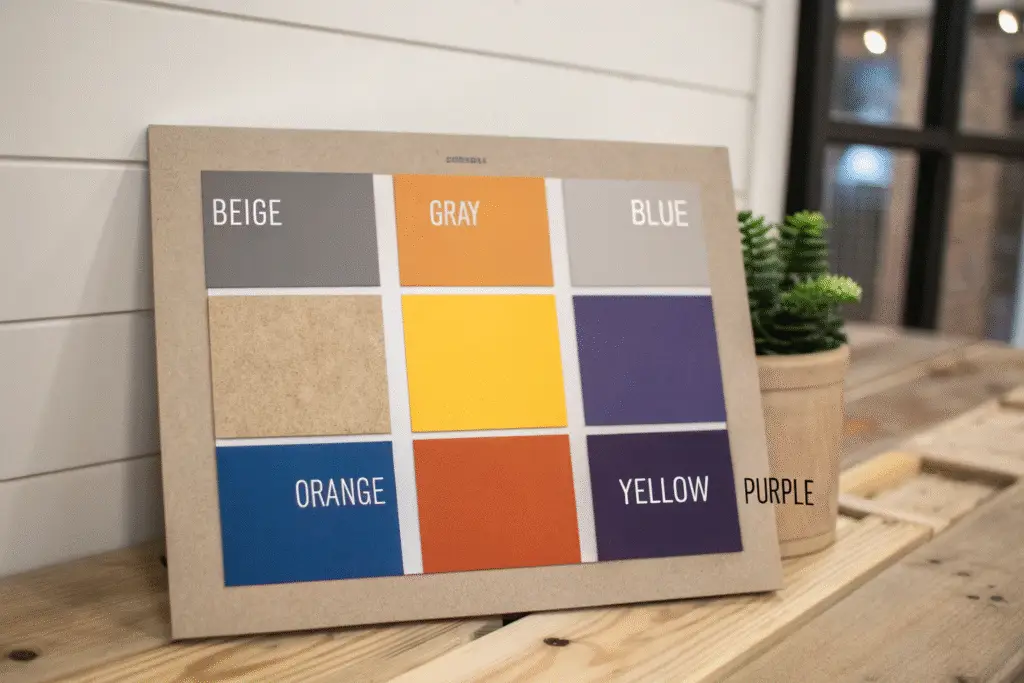
A successful palette requires:
- Anchor Colors: Neutrals (black, white, navy) that form the foundation
- Core Colors: Main seasonal shades defining the collection's mood
- Accent Colors: Strategic pops of color for visual interest
Many brands also overlook production realities, as colors appear differently on various fabrics. Working with an experienced manufacturer ensures proper color matching across materials.
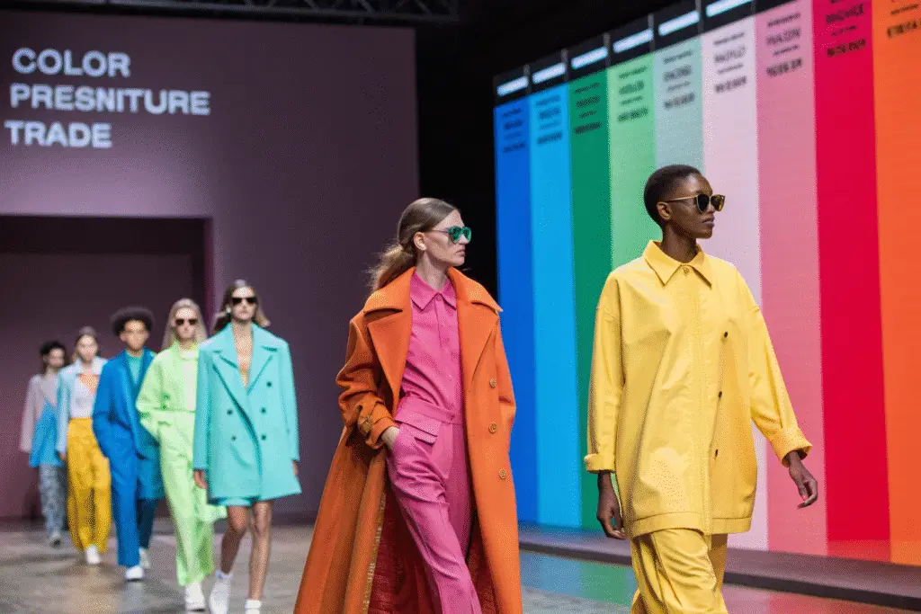
How to Research and Forecast Color Trends?
Effective color forecasting combines observation, research, and understanding your specific market. While trend forecasts from authorities like Pantone Color Institute and trade shows like Première Vision provide valuable direction, the most relevant insights often come from observing street style, art, and popular culture that influence your customers.
Where to Find Reliable Color Forecasting Resources?
| Resource Type | Examples | Purpose |
|---|---|---|
| Professional Services | Pantone, WGSN | Authoritative global trend forecasts |
| Trade Shows | Première Vision, Texworld | First-hand fabric and material trends |
| Digital Platforms | Instagram, Pinterest | Real-time consumer-driven trends |
These resources help understand the reasoning behind emerging color directions, enabling informed choices rather than random selections. Pantone's Color of the Year particularly influences product development across multiple industries.
How to Analyze Competitors' Color Strategies?
Competitor analysis helps identify market gaps and opportunities without copying others. Examine your main competitors' recent collections, noting their dominant palettes, color temperature (warm vs. cool), and use of neutrals versus statement colors.
This analysis reveals where you can differentiate while remaining commercially viable. If competitors use safe neutrals, a tastefully bold color story might help you stand out while still appealing to the shared target audience.
What Are the Steps to Build Your Color Palette?
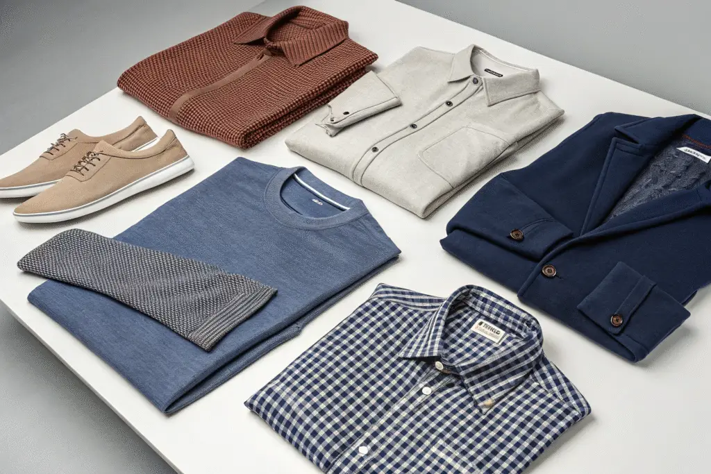
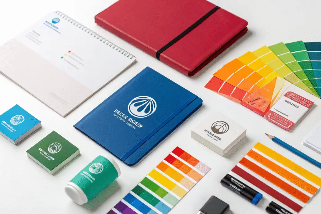
Begin with a mood board to visualize how colors work together before finalizing selections. A successful palette typically includes 5-7 colors: foundational neutrals, 2-3 core colors, and 1-2 accents. Clearly defining each color's role and using consistent naming improves communication with your manufacturing team.
How to Define Core, Neutral and Accent Colors?
Core colors establish the seasonal mood and theme, appearing across multiple key styles. Neutral colors (black, white, charcoal, khaki) provide balance and versatility for basics and mixing. Accent colors add energy through strategic use in prints, logos, or trim.
This structured approach creates visual depth without overwhelming the collection, ensuring commercial appeal and design coherence.
What Tools Assist Digital Color Selection?
Digital tools like Adobe Color help create harmonious palettes using complementary, analogous, or triadic color rules. The Canva color palette generator can extract colors from inspirational images.
However, digital colors must be converted to physical standards through lab-dip approvals, where manufacturers provide fabric swatches dyed to exact specifications. This crucial step ensures color accuracy before bulk production.
How to Implement Colors Across Garments and Fabrics?
Color application tests your palette's effectiveness, as the same color appears differently on various materials. Achieving consistency requires close manufacturer collaboration to adjust dye formulas for different fibers and fabric constructions.
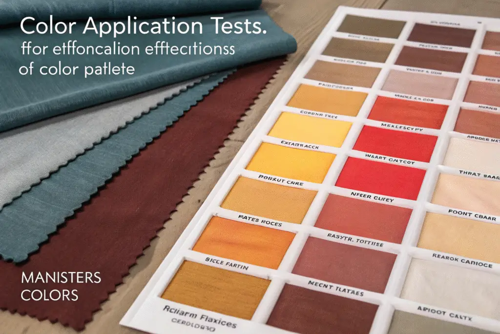
Why Does Fabric Choice Affect Color Outcome?
Fiber content and texture significantly influence color perception. Cotton accepts dye readily for vibrant results, while polyester may produce shinier finishes. Natural fabrics like wool and linen create softer, nuanced shades. Fabric construction also matters—jersey knit versus twill weave presents color differently.
Approving lab dips for each fabric type ensures color consistency across your collection, a critical aspect of quality control in full-package manufacturing.
How to Create an Effective Range Plan?
A range plan maps colors to specific garments, ensuring balanced distribution throughout your collection. This visual grid or spreadsheet helps visualize outfit combinations and prevents overusing or underusing any color.
| Example range plan: | Style | Black | Navy | Terracotta | Gold |
|---|---|---|---|---|---|
| T-Shirt | X | X | |||
| Polo Shirt | X | X | |||
| Woven Shirt | X | X | |||
| Chinos | X | X |
This planning tool, developed with your manufacturer, streamlines production and minimizes errors while ensuring commercial viability.
Conclusion
Developing a cohesive color story combines artistic vision with practical strategy. From understanding brand identity and customer psychology to implementing colors across fabrics, this process transforms good collections into memorable brand experiences. A powerful color narrative builds silent but compelling connections with customers, driving recognition and loyalty.
Your manufacturing partner should provide expertise in color matching, fabric behavior, and production scalability. If you're ready to create a cohesive, commercially successful apparel collection, contact our Business Director Elaine at elaine@fumaoclothing.com. Let us help transform your color story into market success.