
Capsule fashion isn’t just about cuts—it’s about color flow. Without balance, even a 6-piece line can feel chaotic.
When you apply color theory to your capsule line, every piece aligns—not just in hue, but in function, mood, and styling range.
Let me show you how we at Fumao Clothing use color strategy to make small collections feel big—and keep our international buyers coming back for more.
Using Neutrals to Build a Versatile Foundation?
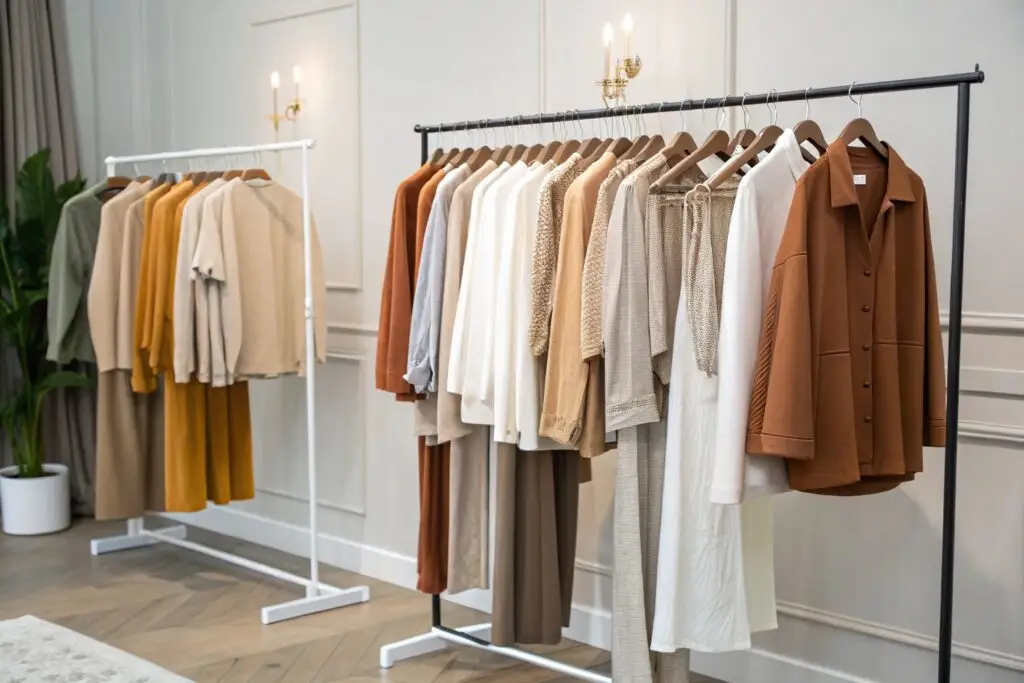
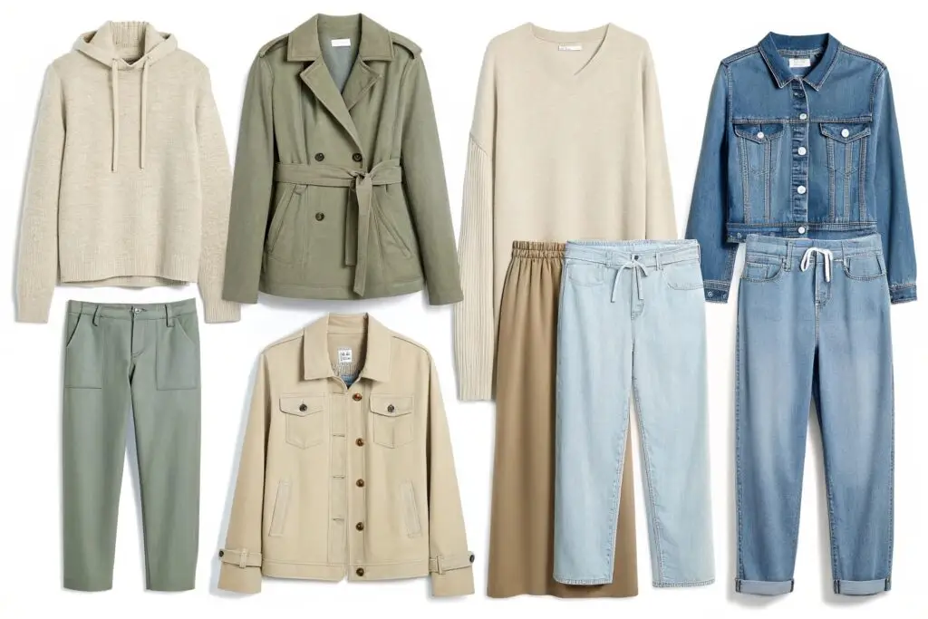
Most capsules fail because they start with too much noise. The real power begins with calm, flexible neutrals.
Neutral tones are the building blocks of a capsule—they allow repeat wear, seamless styling, and timeless appeal.
Why are neutrals essential in capsule fashion?
Neutrals:
- Pair with any accent color
- Reduce the risk of styling fatigue
- Work across seasons and regions
- Create a unified visual base
Here are capsule-friendly neutrals we frequently recommend:
| Neutral Type | Color Examples | Works Best In... |
|---|---|---|
| Cool Neutrals | Gray, charcoal, steel blue | Urban, minimalist, winter collections |
| Warm Neutrals | Camel, beige, ivory | Resort wear, casual, transitional pieces |
| True Neutrals | Black, white, navy | Officewear, multi-use capsules |
When starting any capsule collection, we suggest a 3:1 ratio of neutrals to accents. That way, buyers can rotate pieces daily—and still feel like they’re wearing something fresh.
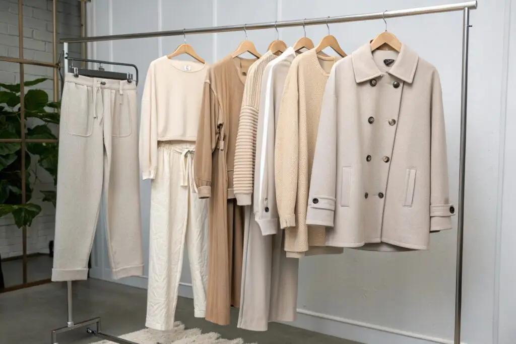
How can you avoid a “boring” look with neutrals?
The secret is in:
- Texture variation: ribbed knit, brushed cotton, matte poplin
- Subtle tone shifts: off-white, greige, soft sand
- Silhouette contrast: oversized top with fitted pant, or vice versa
In other words, neutrals don’t need to be flat. They just need to feel quiet enough to let your buyer express themselves daily.
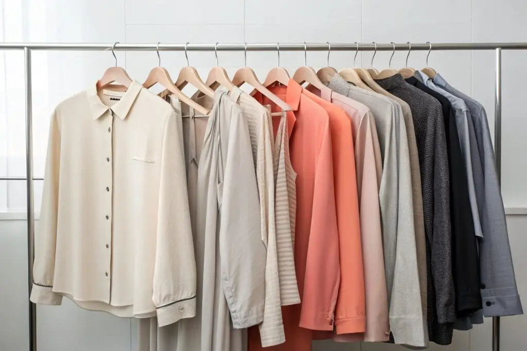
Accent Colors That Add Personality Without Clashing?
Every great capsule needs a twist. That twist is your accent color—but it must be used sparingly and smartly.
Accent colors give your capsule life, mood, and brand fingerprint—without overwhelming the rest.
How do you pick the right accent tones?
Use the color wheel and choose tones that:
- Complement your neutrals (e.g. camel + rust)
- Match your buyer persona (e.g. bold red for Gen Z, dusty rose for minimalist moms)
- Work well in limited touches (bags, inner linings, trims)
Here’s a chart we often share with clients:
| Base Neutral | Accent Color Options | Capsule Use Example |
|---|---|---|
| Charcoal gray | Emerald, cobalt, maroon | Button-down trim, contrast hem |
| Warm beige | Rust, forest green, peach | Layering tee, sock detail, scarf |
| Classic navy | Mustard, burgundy, stone | Collar facing, lining, top-stitch |
We typically apply accent colors to no more than 20% of the pieces in a 10-piece line.
What’s the risk of overusing accent tones?
- Outfit pairing becomes limited
- Stock images feel inconsistent
- Buyers can’t build stories around them
Think of accent color like spice in cooking. It wakes things up—but if it dominates, your core message gets lost.
How Warm and Cool Tones Influence Wearability?
You might love a palette, but if the undertones don’t match your buyer’s environment—or their skin tone—you’ll face returns.
Warm and cool tones shape both emotional response and physical flattery—impacting how wearable a capsule really is.
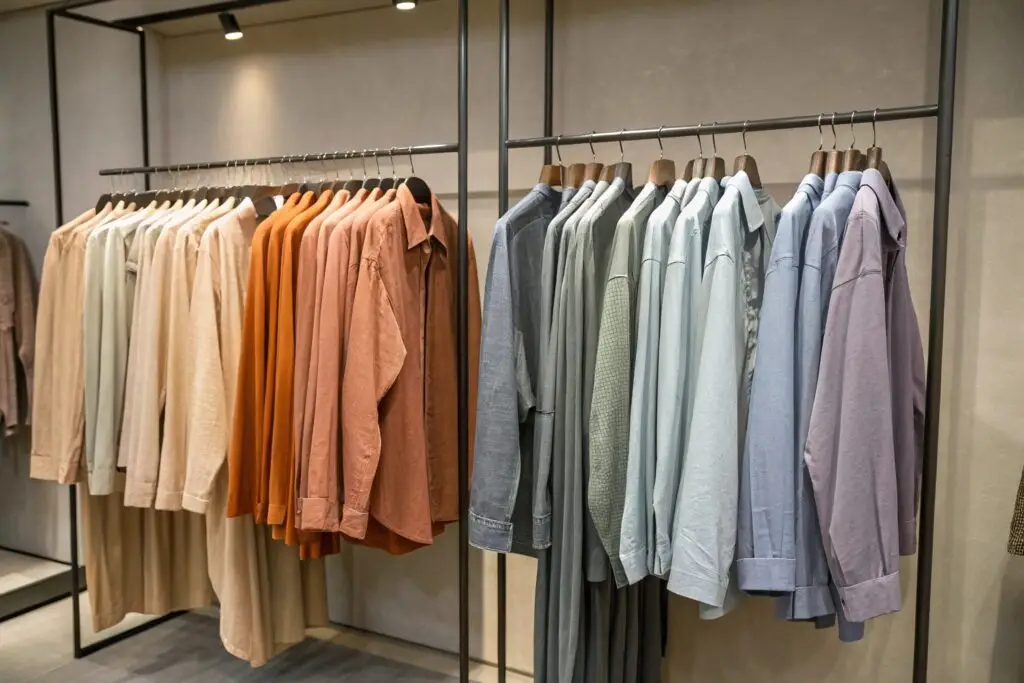
What’s the difference between warm and cool clothing tones?
| Tone Type | Color Examples | Best For... |
|---|---|---|
| Warm Tones | Terracotta, mustard, olive | Autumnal collections, resort, earthy brands |
| Cool Tones | Slate, lavender, icy blue | Urban style, winter collections, techwear |
Your buyers may not know color theory—but they feel it. A cool-toned buyer won’t love a saffron hoodie. A warm-toned shopper won’t reach for lilac.
How can you apply this to capsule planning?
Segment your offerings:
- For each capsule, choose one dominant temperature (e.g. warm neutrals with a rust pop)
- Use color undertones to unify your photography
- Offer one cool-toned and warm-toned accessory to appeal to both buyer groups
We once launched a unisex capsule with two base colorways:
- Cool base: Dusty gray, sage, ice
- Warm base: Sand, amber, olive
Result: Buyers could mix both or stick to their preferred tone family—without breaking the collection flow.
Applying Color Harmony for Cohesive Collections?
Harmony is the secret to turning separate items into a capsule. It’s not about matching—it’s about flow.
Color harmony ensures every item in your capsule feels part of the same world—even if worn separately.
How do you build color harmony into capsule design?
Use color relationships:
| Harmony Type | Method | Capsule Effect |
|---|---|---|
| Analogous | Choose 3 neighboring tones | Soft transitions, elevated mood |
| Complementary | Opposites on the wheel (e.g. blue/orange) | Bold pops, marketing contrast |
| Monochromatic | One color, various tones | Luxury feel, editorial style |
Example: A capsule built around dusty blue might include:
- Sky blue tee (base)
- Navy pant (depth)
- Slate gray jacket (balance)
- Silver zipper detail (accent)
All different—but emotionally united.
What are common harmony errors?
- Mixing too many wheel zones: Like pink, teal, mustard, and maroon—buyer gets confused
- Ignoring finish consistency: Glossy red next to matte beige = visual tension
- Breaking saturation logic: Muted tones next to hyper brights
At Fumao, we test harmony using wall visuals: we pin all swatches, trims, and finishings next to each other and squint. If anything screams—it's out.
Great harmony doesn't shout. It whispers confidence.
Conclusion
Color isn’t decoration—it’s structure. From foundation neutrals to layered accents, from warmth to tone flow, color theory turns fashion into systems. Use it right, and your capsule will never feel small again.