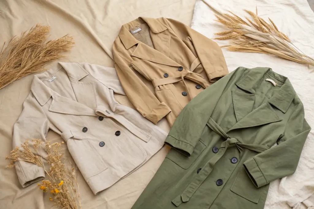
I was in a design meeting last September with the creative director of one of our largest brand partners. We were reviewing the color palette for their Summer 2026 collection. She had a wall covered in fabric swatches, and I watched her slowly remove more than half of them. The bright coral went. The electric blue went. The bold floral print went. What remained was a wall of the most beautiful, nuanced, and sophisticated neutral tones I had ever seen. She turned to me and said, "This is what my customer actually buys. This is what she wears again and again. The rest is just noise."
The must-have neutral tones for summer coats in 2026 are stone ecru, warm sand, soft oat, khaki, and sage green, forming a sophisticated, nature-inspired palette that offers timeless versatility and effortless coordination.
Neutrals are not boring. They are the backbone of a commercially successful outerwear collection. They are the colors that deliver consistent, reliable sell-through season after season. At Shanghai Fumao, our neutral coat sales consistently outperform our fashion color sales by a significant margin. I want to break down exactly which neutrals are essential for Summer 2026, and why these specific shades resonate so deeply with the modern consumer.
Why Are Neutrals the Undisputed Foundation of Summer Coat Sales?
A customer might be drawn to a bright coral coat on a mannequin. She might double-tap a vibrant lavender duster on Instagram. But when she opens her wallet and makes a purchase she intends to wear for multiple seasons, she overwhelmingly chooses a neutral. This is not a lack of adventurousness. It is a rational, value-driven decision. A neutral coat works harder. It pairs with everything she already owns. It will not look dated next summer. It is a safe, smart investment in her wardrobe.
Neutrals dominate summer coat sales because they offer the customer maximum versatility, timeless longevity, and the quiet confidence of knowing her investment will pay off for years to come.
The neutral coat is the customer’s trusted friend. The fashion color coat is her exciting new acquaintance. Both have a place, but the trusted friend gets invited everywhere. At Shanghai Fumao, we advise our partners to build their core buy on a foundation of neutrals, using fashion colors as the exciting, limited-edition accents. This data-driven strategy minimizes markdown risk and maximizes full-price sell-through.
How Do Neutrals Maximize Versatility and Cost-Per-Wear?
A woman buys a stone-colored trench coat. She wears it to work over a navy dress. She wears it on the weekend over a white tee and light-wash jeans. She throws it on over a floral summer dress for an evening out. It works with every single color and pattern in her wardrobe. A bright coral coat does not. It clashes with certain colors. It makes a statement that she might not want to make every day. The coral coat gets worn once a week. The stone trench gets worn three times.
This frequency of wear is the key to customer satisfaction and loyalty. When a customer wears a coat constantly, she feels brilliant about her purchase. The cost-per-wear drops to pennies. She associates that positive feeling with your brand. She becomes a repeat customer. We actively train our brand partners to sell the cost-per-wear story. A $200 neutral trench worn 100 times over its life has a cost-per-wear of $2. A $150 coral coat worn 15 times has a cost-per-wear of $10. The neutral coat is the better financial value. This rational argument is incredibly persuasive.
Why Do Neutrals Command a Quieter, Modern Form of Luxury?
Luxury is no longer defined by logos and loud statements. The modern definition of luxury is quiet, understated, and focused on quality. It is the feeling of a beautiful, natural fabric against the skin. It is the subtle sophistication of a perfectly nuanced neutral tone. A coat in a rich, warm sand color made from a textured, organic linen communicates luxury more powerfully than any logo ever could. It whispers. It does not shout.
The customer who buys into this quiet luxury philosophy is a high-value customer. She is discerning. She appreciates quality. She is willing to pay a premium for the perfect shade and the perfect hand feel. She is also a loyal customer once she finds a brand that understands her values. Our neutral color development process is incredibly detailed. We work for weeks with our dye houses to achieve the exact, nuanced undertone that feels warm, sophisticated, and luxurious. A slightly too-yellow beige can look cheap. A slightly too-grey khaki can look drab. The perfect neutral is a precise science.
What Are the Five Core Neutral Tones Defining Summer 2026?
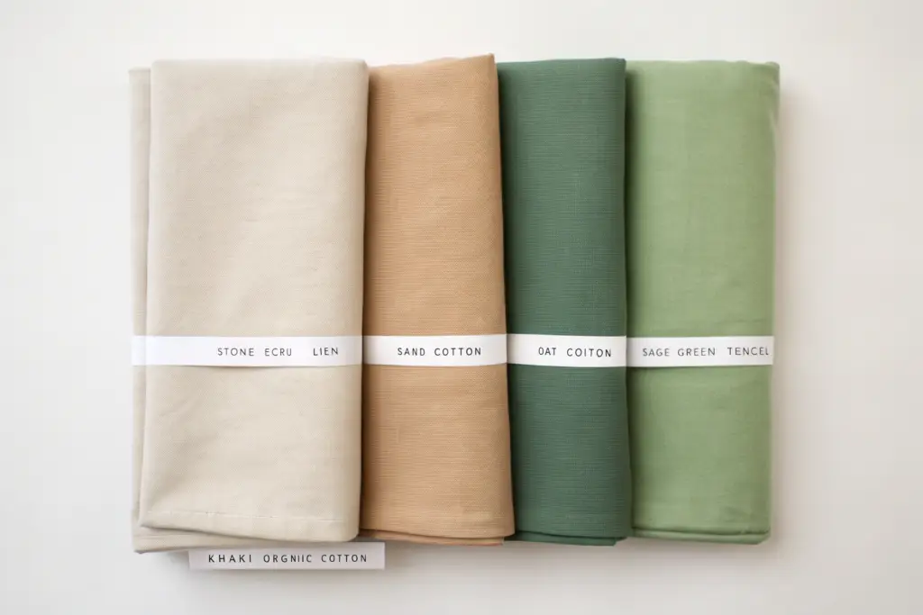
The neutral palette for Summer 2026 is not a random collection of beige tones. It is a carefully curated, five-color story inspired by the natural world. These five shades work together seamlessly. A boutique can stock all five and create a beautiful, cohesive outerwear wall that feels complete and intentional. Each shade has its own distinct personality and customer appeal. They are not interchangeable. They each play a specific role in the assortment.
The five core neutral tones for Summer 2026 are stone ecru, warm sand, soft oat, khaki, and sage green, each offering a distinct personality within the cohesive, nature-inspired palette.
These five shades should form the backbone of your summer coat buy. They are the colors that will generate the most consistent, reliable sales. At Shanghai Fumao, we have developed our custom versions of these shades based on extensive market feedback and sell-through data.
What Makes Stone Ecru the New Essential Light Neutral?
Stone ecru is the freshest, lightest neutral for 2026. It is not a stark, optic white. It is not a yellowish cream. It is a beautiful, nuanced shade with a subtle, cool, greyish undertone that gives it a very modern, sophisticated feel. It is the color of raw, unbleached linen. It feels pure, natural, and incredibly luxurious. It is the perfect summer alternative to winter’s heavy black and charcoal.
Stone ecru looks stunning in textured fabrics like linen and slub cotton. It pairs beautifully with every other color in the neutral palette, as well as with soft pastels. It is the hero color for our unlined, soft-tailored linen blazers. A buyer from a contemporary brand told me her stone ecru blazer was her best-selling single SKU last spring. The color communicated effortless summer elegance.
Why Is Warm Sand the Most Versatile and Commercially Safe Bet?
Warm sand is the anchor of the neutral palette. It is the most universally flattering and the most commercially reliable shade. It is a true, mid-tone beige with a distinct warm, almost golden undertone. It evokes the feeling of warm sand between your toes. It flatters a huge range of skin tones. It is the classic trench coat color, reimagined with a warmer, more modern feeling.
If a boutique buyer can only invest in one neutral, I always advise warm sand. It is the highest volume-selling neutral shade in our outerwear line, year after year. It is the safe, dependable foundation on which a profitable coat assortment is built. It works beautifully in classic, structured silhouettes like the trench coat and the wrap coat.
How Does Soft Oat Offer a Cozy, Textured Alternative?
Soft oat is the newest addition to the core neutral palette. It is warmer and softer than stone ecru, but lighter than warm sand. It is a gentle, comforting, mid-light neutral with a creamy, milky undertone. It is the color of a warm bowl of oatmeal on a cool morning. It has an inherently cozy, approachable, and soft feel. It is the perfect shade for more casual, textured pieces.
Soft oat looks incredible in brushed fabrics, soft cotton twills, and lightweight knits. It is the ideal color for a relaxed utility shacket or a comfortable, everyday duster coat. It is a neutral that feels like a warm hug. A lifestyle brand we work with launched their core utility jacket in soft oat, and it resonated incredibly well with their customer base who values comfort and approachable style.
Why Is Khaki the Grounding, Earthy Anchor?
Khaki is the darker, grounding anchor of the palette. It provides depth and contrast against the lighter neutrals. It is a classic, utilitarian shade with a rich, olive-brown undertone. It evokes a sense of adventure, utility, and timeless cool. It is the traditional color of the field jacket and the safari jacket, and it remains the most important color for utility-style coats.
In 2026, khaki is slightly greener and more sophisticated than the yellow-brown khakis of the past. It feels fresh and modern, especially when used in refined silhouettes like a belted safari jacket or a sleek, city trench. It is also an incredibly practical color. It hides dirt and wear beautifully, making it a smart choice for travel and everyday use. It is the best-selling color in our utility and safari jacket categories.
What Role Does Sage Green Play as the New Neutral?
Sage green has completed its journey from a fashion color to a core, accepted neutral. It is no longer a risky, trendy choice. It is a staple. It provides a beautiful, calming pop of color while still functioning as a neutral that pairs with almost everything. It brings a natural, organic, and serene feeling to the palette. It evokes the soft, silvery green of eucalyptus leaves.
Sage green is incredibly versatile. It pairs beautifully with stone ecru and warm sand for a tonal, natural look. It adds a sophisticated touch to casual silhouettes like shackets and dusters. A buyer from an upscale resort boutique told me her sage green duster was her single best-selling piece last summer. She said her customers were drawn to the color because it felt both calming and special. It was not just another beige coat. It was the perfect bridge between a neutral and a statement.
How Should You Merchandise a Neutral Summer Coat Assortment?
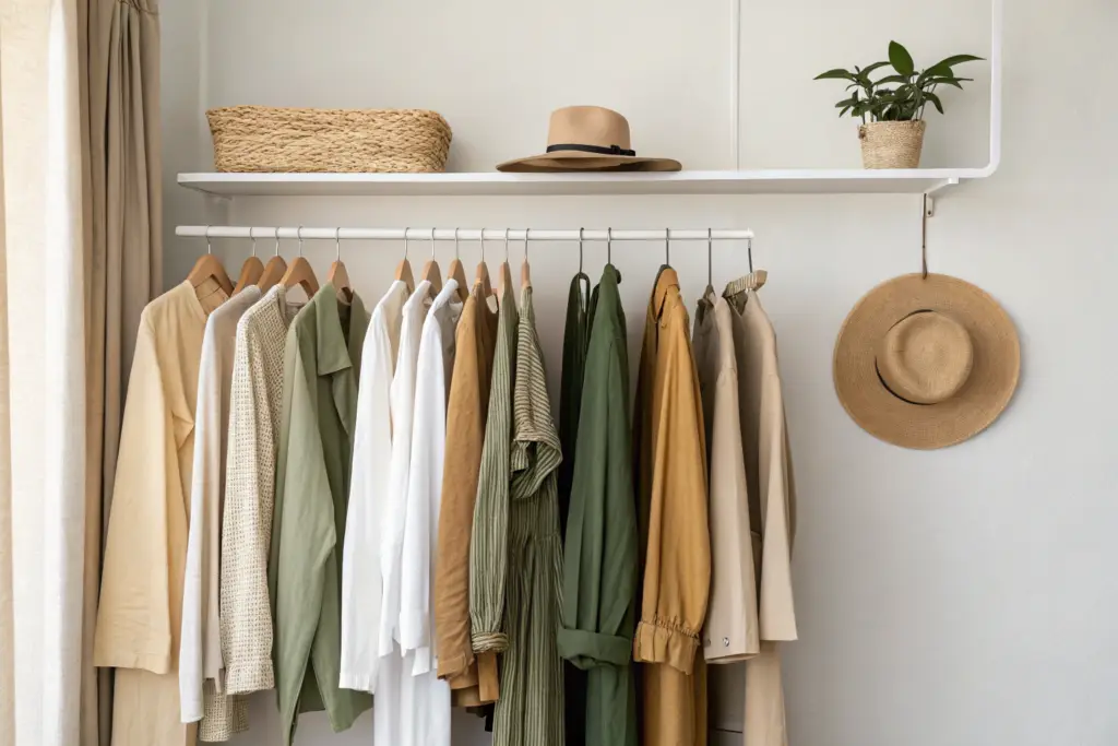
A neutral coat assortment can be a visual merchandiser’s dream or a boring sea of beige. The difference is entirely in the presentation. You must merchandise neutrals with intention and creativity. The goal is to showcase the subtle beauty of the different tones and textures and to inspire the customer with the endless styling possibilities. A beautifully merchandised neutral assortment communicates sophistication, calm, and quiet luxury.
Merchandising a neutral coat assortment successfully requires grouping by tone to create visual impact, styling monochromatic outfits to showcase texture, and using warm lighting to enhance the natural beauty of the colors.
This thoughtful approach transforms a simple rack of beige coats into a compelling, shoppable brand statement. At Shanghai Fumao, we provide our partners with visual merchandising guides and ready-made styling content to support their neutral coat sales.
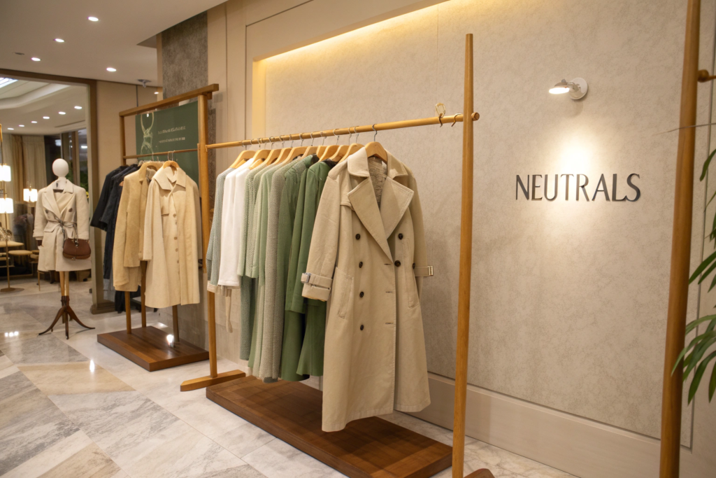
How Do You Use Tone Grouping and Texture Play to Create Impact?
Do not mix your neutral coats randomly on a rack. A stone ecru coat sandwiched between two khaki coats looks lost. The beautiful nuance of the color disappears. Instead, group your coats by tone. Create a section of light neutrals, stone ecru, soft oat, and warm sand. Create a separate section of the richer, darker neutrals, khaki and sage green. This tonal grouping creates a powerful, high-end visual impact. It looks intentional and curated.
Texture is your secret weapon when working with a neutral palette. A rack of flat, matte cotton coats can look dull. Mix textures deliberately. Hang a textured, slubby linen blazer next to a smooth, silky Tencel duster. Place a brushed, cozy soft oat shacket next to a crisp, structured khaki trench. The interplay of different textures catches the light in different ways and adds a layer of visual richness that keeps the neutral assortment feeling dynamic and luxurious.
What Are the Winning Styling Formulas for Neutral Coats?
The most powerful styling formula for neutral coats is monochromatic dressing. Style a warm sand trench coat with a cream silk camisole and cream wide-leg trousers. The tone-on-tone look is incredibly chic, expensive-looking, and elongating. It lets the subtle beauty of the coat’s color and texture take center stage. The second formula is the neutral blend. Pair a soft oat duster with a white tee and khaki trousers. The different neutral tones work together in perfect harmony.
The third formula is the neutral canvas for a color pop. Use a stone ecru coat as the quiet, sophisticated backdrop for a bright accessory. A vibrant printed scarf, a colorful handbag, or a bold pair of shoes. The neutral coat allows the accessory to shine without the overall look feeling chaotic. We provide all three of these styling formulas in the digital lookbook we send with every order. The visual inspiration is key for both the sales associate and the customer.
Conclusion
The neutral tones defining summer coats in 2026 are anything but boring. They are a rich, nuanced, and sophisticated palette inspired by the natural world. Stone ecru is the fresh, modern light essential. Warm sand is the versatile, commercially reliable anchor. Soft oat offers a cozy, textured warmth. Khaki provides earthy, utilitarian depth. Sage green completes the palette as the calming, accepted new neutral. Together, these five shades form the foundation of a profitable, sell-through-proof summer coat collection.
For the online or boutique retailer, the opportunity lies in curating these tones thoughtfully, merchandising them with intention, and styling them with creativity. When presented beautifully, a neutral coat assortment is not a compromise. It is the ultimate expression of modern, quiet luxury. At Shanghai Fumao, we have perfected our neutral palette over many seasons. If you are ready to build your Summer 2026 coat collection on a foundation of beautiful, reliable neutrals, I invite you to connect with our Business Director, Elaine. She can send you our complete neutral color card and fabric swatches. Reach her at elaine@fumaoclothing.com. Let’s find your perfect neutrals.