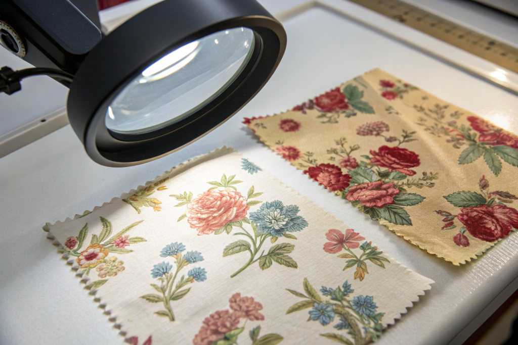
A brand owner from London sent me a fabric scrap two years ago. It was a 6-inch square of faded cotton voile. The print was a delicate, muted rose pattern from a 1940s tea dress she had found in a vintage market in Paris. The colors were washed out by 80 years of sunlight and washing. The outline of the petals was slightly blurred. She said, "I want this exact print on a modern A-line dress. Can you do it?" She had already asked three other factories. One said no. Two said yes but delivered samples that looked like a cartoon version of the original. The roses were too pink. The outlines were too sharp. The soul of the vintage pattern was lost in translation. She came to me as her last hope.
Yes, a skilled Chinese factory can replicate vintage floral patterns with high accuracy. The process requires a combination of high-resolution scanning, digital color matching, hand-drawn vector cleanup, and strike-off sampling on the intended base fabric. The key challenges are matching aged, desaturated colors and reproducing the soft, slightly imperfect edges that give vintage prints their soul. A factory that understands the difference between “copying a flower” and “capturing the feeling of old fabric” can achieve a 95% or higher match rate.
I have replicated dozens of vintage patterns for boutique brands. I have learned the technical steps and the artistic sensibility required. I want to show you exactly how the process works, where the traps are, and how to get a result that honors the original, not just copies it.
What Makes Vintage Floral Patterns Technically Difficult to Replicate?
A vintage floral pattern is not just a picture of a flower. It is a historical artifact. The original was printed using a specific technology from a specific era. A 1940s dress fabric was likely screen-printed with pigment dyes that sat on the surface of the fabric. Over decades, those pigments faded, abraded, and softened. The edges of the flowers, once sharp, became slightly feathered. The colors, once bright, became muted and complex. Replicating this is not just about color matching. It is about understanding the original printing method, the aging process, and the base fabric.
The three main technical challenges are: matching the desaturated, complex colors of aged fabric, reproducing the soft, non-digital edge quality of the original print, and selecting a modern base fabric that mimics the drape and texture of the original vintage cloth. Digital printing, which is the modern standard, produces perfectly sharp edges and bright colors. This is exactly what you don’t want for a true vintage replication.
The machine is too perfect. The skill is in making the machine lie.
How Do You Match Colors That Have Aged for 50 Years?
A fresh digital print uses clean, single-pigment colors. A vintage print has colors that have been through decades of washing, sunlight, and oxidation. The red is not just red. It is red with a hint of brown and a hint of grey. The white background is not white. It is ecru, or tea-stained, or slightly yellowed.
A standard color match uses a Pantone book. The printer picks the closest Pantone chip to the original. This produces a clean, modern version of the color. It looks wrong. It looks like a costume, not an authentic vintage piece.
The correct method is to analyze the color spectrophotometrically and then manually adjust the ink formulation. The base white is tinted slightly warm. The black is reduced to a dark charcoal. The red has a touch of yellow and a touch of black added. The color is intentionally “dirtied” to match the aged original.
At Shanghai Fumao, I work with a printing partner who specializes in vintage color matching. They have an ink technician with 20 years of experience. He mixes inks by eye against the original swatch under a calibrated D65 light booth. The digital spectrophotometer gets him close. His eye gets him the rest of the way. The result is a color that feels old, not one that measures old. The customer cannot articulate the difference, but they feel it. The dress looks authentic.
Why Do Digital Print Edges Look “Too Perfect”?
A digital printer lays down ink in microscopic dots. The edge of a printed shape is mathematically precise. A 1940s screen print was laid down by a squeegee pushing pigment through a mesh screen. The edge had a slight texture. The ink bled a tiny amount into the fabric fibers. Over time, washing eroded the edges further.
The result is a soft, feathered edge that is very difficult to replicate digitally. The digital edge looks like a sticker applied to the fabric. The vintage edge looks like the fabric grew the pattern.
The solution is to apply a digital “edge softening” filter to the artwork file before printing. The designer traces the original pattern in high resolution. Then they add a fractional Gaussian blur, about 0.5 to 1 pixel, to the edges of the floral elements. They might also add a very subtle texture overlay that mimics the screen-print mesh pattern. This is applied at 2% to 5% opacity. It is invisible to the naked eye on a single flower. It is perceptible as a “softness” across the whole dress.
I had a client from Melbourne who rejected three strike-offs because the edges were too sharp. On the fourth try, we applied the edge-softening filter. She held the sample next to the original. She said, “That’s it. That’s the feeling.” The filter cost nothing extra. The knowledge to apply it was the value.
What Is the Step-by-Step Process for Accurate Vintage Pattern Replication?
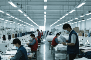
The replication is a process, not an event. It moves from physical to digital and back to physical again. Each step builds on the previous one. If one step is rushed, the final result is compromised. The process I use with my clients has seven distinct stages. It takes about two to three weeks from receiving the original swatch to approving the final strike-off.
The accurate replication process follows seven stages: high-resolution scanning of the original pattern, digital color separation and cleanup, vintage color palette matching, base fabric selection and preparation, first strike-off printing, physical comparison and revision against the original under controlled lighting, and final approval with pre-production sample. Skipping any stage results in a reproduction that looks “close” but not “authentic.”
Let me walk you through the most critical stages.
How Does the Original Swatch Become a Digital Artwork File?
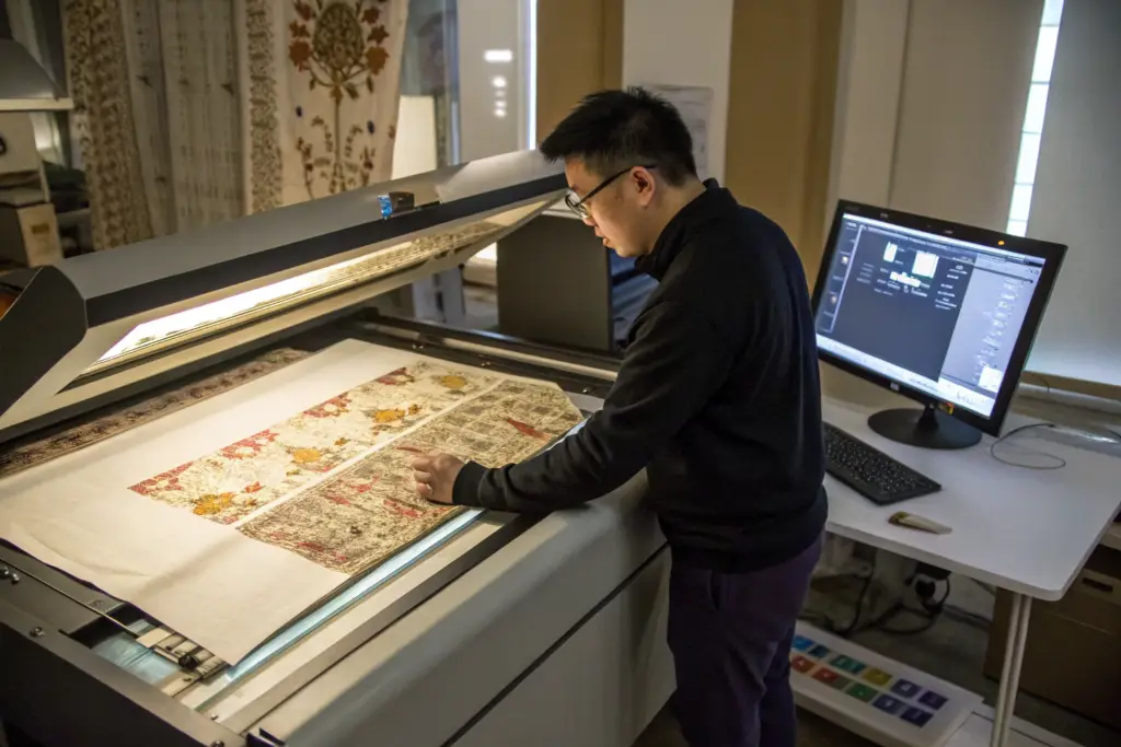
The process begins with a scan. The original vintage swatch is placed on a high-resolution flatbed scanner. The scan resolution is at least 600 dots per inch, often 1200 DPI for very fine patterns. The high resolution captures the fabric weave, the ink texture, and the edge softness of the original.
The scanned image is opened in Adobe Illustrator or a similar vector graphics program. The designer does not use an automatic tracing tool. Automatic tracing simplifies the shapes and removes the imperfections. The designer traces the pattern by hand, using a stylus and tablet. They carefully draw over every petal, every leaf, every stem. They preserve the slight asymmetries, the irregular spacing, the organic variations that make the original feel handmade.
This hand-tracing step is the most time-consuming part of the process. It can take 10 to 20 hours for a complex all-over floral pattern. It is also the most important step. A skilled pattern tracer is an artist, not a technician. They know which imperfections to keep and which to clean up. A slight wobble in a stem is character. A coffee stain on the original scan is a defect. The tracer must distinguish between the two.
I have a pattern tracer at Shanghai Fumao who has been doing this work for 15 years. She has replicated Victorian wallpaper patterns, 1950s barkcloth, 1970s Art Nouveau revival prints. She understands the historical context. She knows that a 1930s floral has softer outlines than a 1960s floral. She adjusts her tracing style to match the era. This is the difference between a technician and a craftsperson.
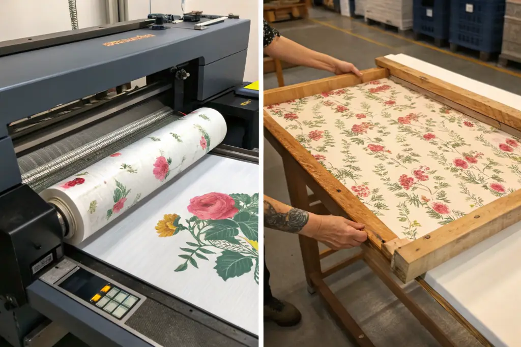
What Is a Strike-Off and How Do You Evaluate It?
A strike-off is a sample of the printed fabric. It is a small piece, typically 50 centimeters by 50 centimeters, printed on the actual production fabric using the actual production inks. It is the first physical output of the digital design. It is the moment of truth.
The strike-off is compared to the original swatch under a calibrated D65 light booth that simulates natural daylight. The comparison covers four points: color match, edge quality, print scale, and fabric compatibility. Are the colors correct? Are the edges soft enough? Is the scale of the pattern the same as the original? Does the print sit on the new fabric the same way the original sits on the vintage fabric?
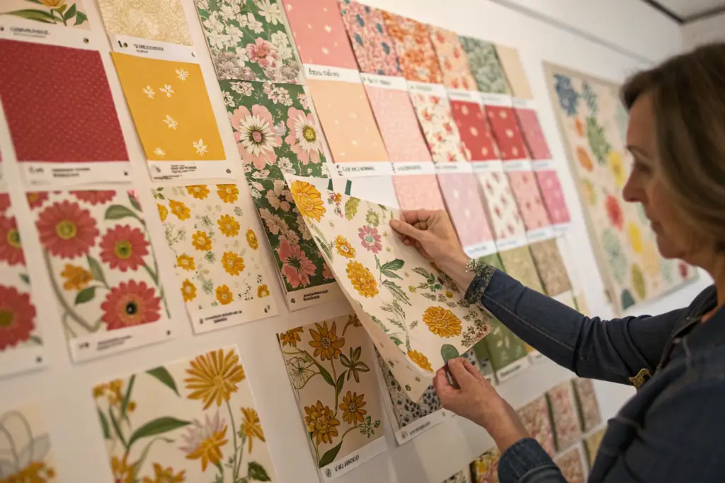
If any of these points are off, the file is adjusted and a new strike-off is printed. The cycle repeats until the match is approved. I have done as many as five strike-offs for a very difficult vintage pattern. The client and I evaluate each one together over a video call. I hold the strike-off and the original under the light. She says, “The green needs more yellow,” or “The outline is still too sharp.” I make notes. The printer adjusts. The next strike-off is closer. The process is iterative and collaborative.
How Do Fabric Choice and Printing Technology Affect the Vintage Look?
The printing technology and the base fabric are the canvas for the vintage pattern. You can have a perfectly matched digital file, but if you print it on the wrong fabric with the wrong technology, the vintage illusion shatters. The fabric must feel old. The print must sit on the fabric like an old print. The technology choice is a design decision, not just a cost decision.
Digital printing on a natural, slightly textured fabric like cotton voile, rayon challis, or linen works best for replicating most vintage floral patterns. The digital process allows for unlimited colors and soft edges. The natural fabric provides the matte, absorbent surface that vintage prints were originally applied to. Screen printing with pigment inks is the most authentic choice for replicating a true 1940s or 1950s feel, but it is more expensive and has higher minimums. The fabric hand and the ink penetration must match the original to complete the illusion.
The printer and the fabric are the final 10% of the replication. They make the difference between a print that looks vintage and a print that feels vintage.
Why Does the Base Fabric Texture Matter So Much?
A vintage 1940s dress was likely made of rayon crepe or cotton voile. The fabric had a matte surface, a soft drape, and a slight texture. The original ink sat on the surface of the fibers. Over time, the ink and the fabric aged together. The ink cracked slightly. The fabric softened.
If you print the same pattern on a modern polyester satin, the result is wrong. The satin is shiny. The ink sits on the surface differently. The drape is slippery. The dress looks like a cheap Halloween costume, not a vintage reproduction.
The base fabric must be chosen to match the era and the feel of the original. Cotton voile is a good match for a 1930s or 1940s day dress. Rayon challis is a good match for a 1940s or 1950s tea dress. Linen or a linen-cotton blend works for a rustic, 1970s vintage feel.
At Shanghai Fumao, I offer a range of vintage-appropriate base fabrics. I send my clients a fabric swatch book before we begin the pattern work. They feel the fabrics. They compare the drape to the original vintage garment. They choose the base that feels right. The print is then developed on that specific fabric. The ink formulation is adjusted to the absorbency of the chosen cloth. This is a tailored process, not a generic one.
What Is the Difference Between Digital and Screen Printing for Vintage Replication?
Digital printing uses inkjet technology. Tiny droplets of ink are sprayed onto the fabric. The resolution is very high. The color gamut is wide. The setup cost is low. This makes digital printing ideal for small-batch vintage replication. The disadvantage is that the ink sometimes sits on top of the fabric rather than penetrating into it. The print can feel like a plastic layer on the surface. This is solved by using reactive dyes on natural fibers, which bond chemically with the fabric. The feel is soft and integrated.
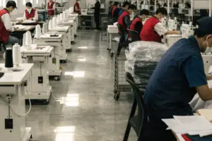
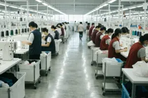
Screen printing uses a physical screen for each color. The ink is pushed through the screen with a squeegee. The ink penetrates the fabric. The edges have a characteristic softness. The print has a depth and a texture that digital printing struggles to replicate. The disadvantage is the cost. Each color requires a separate screen. A complex floral pattern with eight colors requires eight screens. The setup cost is high. The MOQ is high. Screen printing is for brands that are producing thousands of units and want the absolute highest authenticity.
Most of my boutique clients choose digital printing on a natural fiber base. The result is beautiful, authentic, and achievable at a 200-unit MOQ. A few heritage-focused brands choose screen printing. They pay more. They wait longer. The result is indistinguishable from the original vintage fabric.
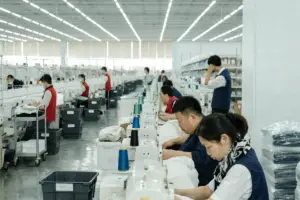
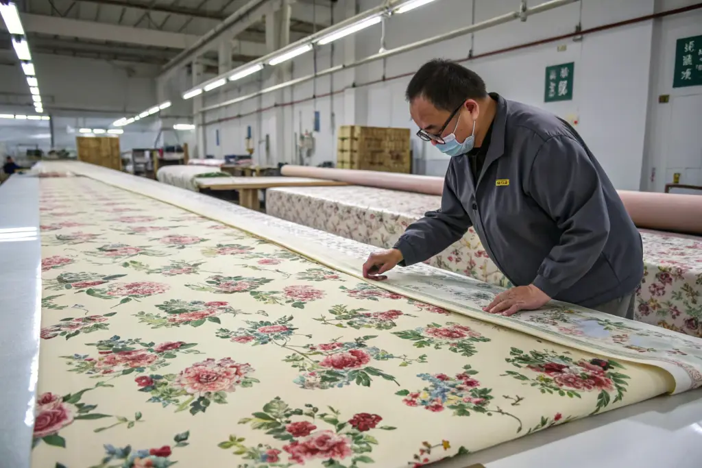
How Do You Maintain Consistency Across a Bulk Production Run?
The strike-off is perfect. One meter of fabric is beautiful. Now you need 2,000 meters for a bulk production run. The question is: will every meter match the strike-off? Bulk consistency is where many replication projects fail. The first batch is great. The second batch is slightly different. The third batch is noticeably off. The brand receives dresses in two different shades of vintage pink. The customer notices. The returns begin.
Maintaining bulk consistency requires a locked digital file, a fixed ink formulation, a master strike-off sealed in a lightproof bag, and batch-to-batch comparison under controlled lighting. Every new dye lot must be checked against the master strike-off before printing begins. A tolerance of 95% color match is acceptable. Below 95%, the batch is rejected and the ink is reformulated. The master strike-off is the only reference standard. Memory and screen images are not accurate enough.
Consistency is a discipline, not a technology. It is about refusing to ship a batch that is “close enough.”
What Is a Master Strike-Off and Why Is It Sealed?
The master strike-off is the final approved sample. It is signed by the client and by the factory. It represents the exact color, edge quality, and fabric finish that the entire bulk production must match.
This master is sealed in a lightproof, acid-free bag. Light and air degrade printed fabric over time. If the master is left on a desk for three months, it will fade slightly. The printer will then match the faded master, and the bulk production will be off-target. The sealed master is preserved as a constant reference.
Every new production batch begins with a side-by-side comparison of a fresh print sample against the sealed master. The comparison is done by the same QC technician, in the same light booth, with the same viewing angle. The human eye is the final judge. The spectrophotometer provides data. The eye provides the verdict.
I have a client in Paris who is extremely particular about her vintage rose pink. It is a dusty, complex shade. Every season, we pull the sealed master from the archive. We print a new batch. We compare it. We adjust the ink slightly to compensate for any subtle drift in the dye lot. The dresses from Season 1 and Season 4 are an exact match. Her customers collect her dresses by season. The consistency is part of the brand promise.
How Do You Handle Print Scale Across Different Dress Sizes?
An A-line floral dress in Size Small has a skirt panel that is, say, 30 inches wide. The same dress in Size 2XL has a skirt panel that is 45 inches wide. The floral pattern has a certain repeat size. If the pattern is not adjusted, the Size Small dress shows two full repeats of the floral. The Size 2XL dress shows three full repeats and a partial repeat. The visual density of the pattern is different. The dress looks like it has a different print.
The solution is to grade the pattern scale. The artwork file is adjusted so that the pattern repeat is proportionally larger for larger sizes. A Size Medium has a 10-inch pattern repeat. A Size 2XL has an 11.5-inch pattern repeat. The number of repeats across the skirt panel remains the same. The visual proportion is consistent.
This is an advanced technique. It requires a separate artwork file for each size grade. It adds cost and time. It produces a dress that looks identical across all sizes. The floral print sits on the body the same way. A boutique brand from New York uses this technique. Her plus-size customers tell her, “The dress looks the same on me as it does on the Size Small model.” That is the goal. The print is not just placed on the fabric. It is scaled to the body.
Conclusion
Replicating a vintage floral pattern is a collaboration between history, technology, and craft. The original swatch is a window into a past era of textile design. The scan and the hand-tracing translate that history into a digital language. The color matching, the edge softening, and the fabric selection honor the original’s soul, not just its appearance. The strike-off process iterates until the new fabric feels like it belongs next to the old fabric. The bulk consistency discipline ensures that every dress carries the same authentic vintage feeling.
A Chinese factory that understands this process is not just a manufacturer. It is a custodian of a design heritage. I have helped brands revive patterns from the 1920s through the 1970s. Each project is a detective story and a love letter to textile history. The technology exists. The skill exists. The missing ingredient is the care to do it right.
If you have a vintage floral pattern you want to bring back to life, I want to see it. Send a photo or a scan of your original swatch to our Business Director, Elaine, at elaine@fumaoclothing.com. She will arrange a free initial assessment of the pattern complexity, the replication feasibility, and the estimated cost and timeline. Your vintage inspiration deserves a modern reproduction that honors the original. Let’s make it together.